EuroMOMO is a high-traffic mortality monitoring tool whose message was obscured under an outdated, low-capacity website. Our fast overhaul emphasizes legible, trustworthy data with interactive visuals that simplify engagement with the site for both its managers and users.
Scientific Rigour in and Beyond Design
Design and the sciences rely on each other to produce and communicate knowledge. Even as this relationship is increasingly called into question as the perceived legitimacy of both fields fractures under misinformation campaigns, we view the interreliance of the two as an earnest priority. Much of our work relies explicitly on our ability to operate across the spheres of science and design. This is particularly true in our overhaul of the website of EuroMOMO, or the European Mortality Monitoring Project. EuroMOMO is an online analytical tool that tracks mortality data across 29 European countries. The website began in the 1990s as a minor public health project funded by the Statens Serum Institut, the arm of the Danish Ministry of Health responsible for preparedness against infectious disease. While some European countries make their mortality data public through national websites, EuroMOMO is the only place to view and compare data of all its participating countries simultaneously. These wide-reaching sets of data allow users to observe morbidity around specific events, such as earthquakes or H1N1 outbreaks, against more average rates.
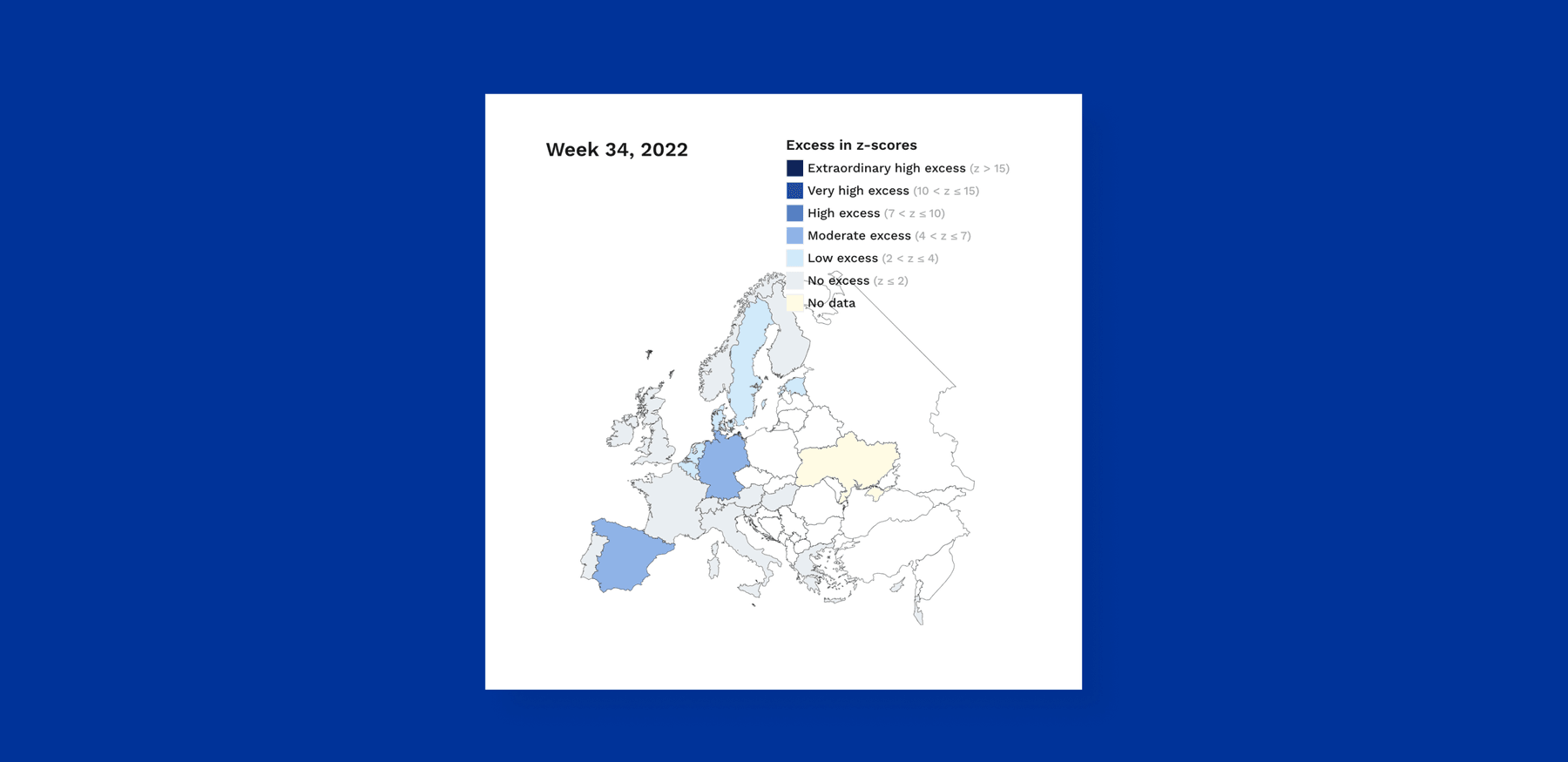
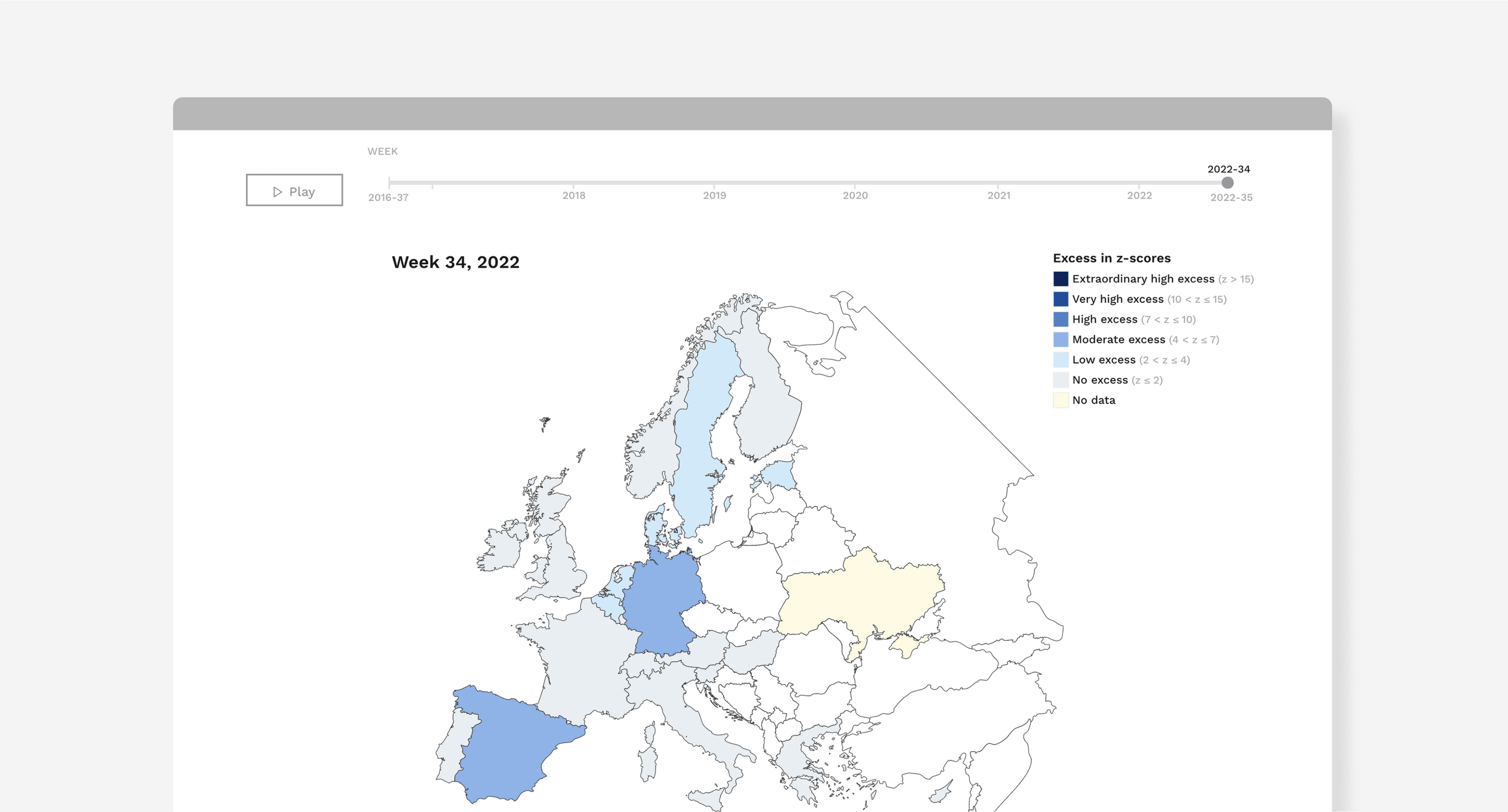
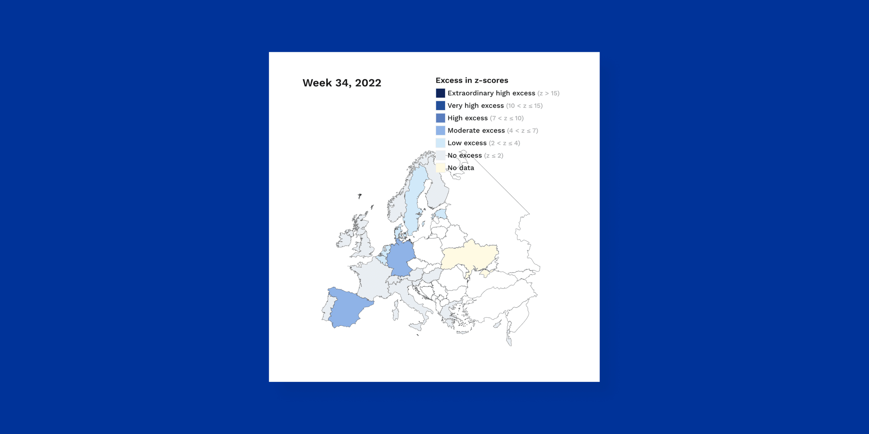
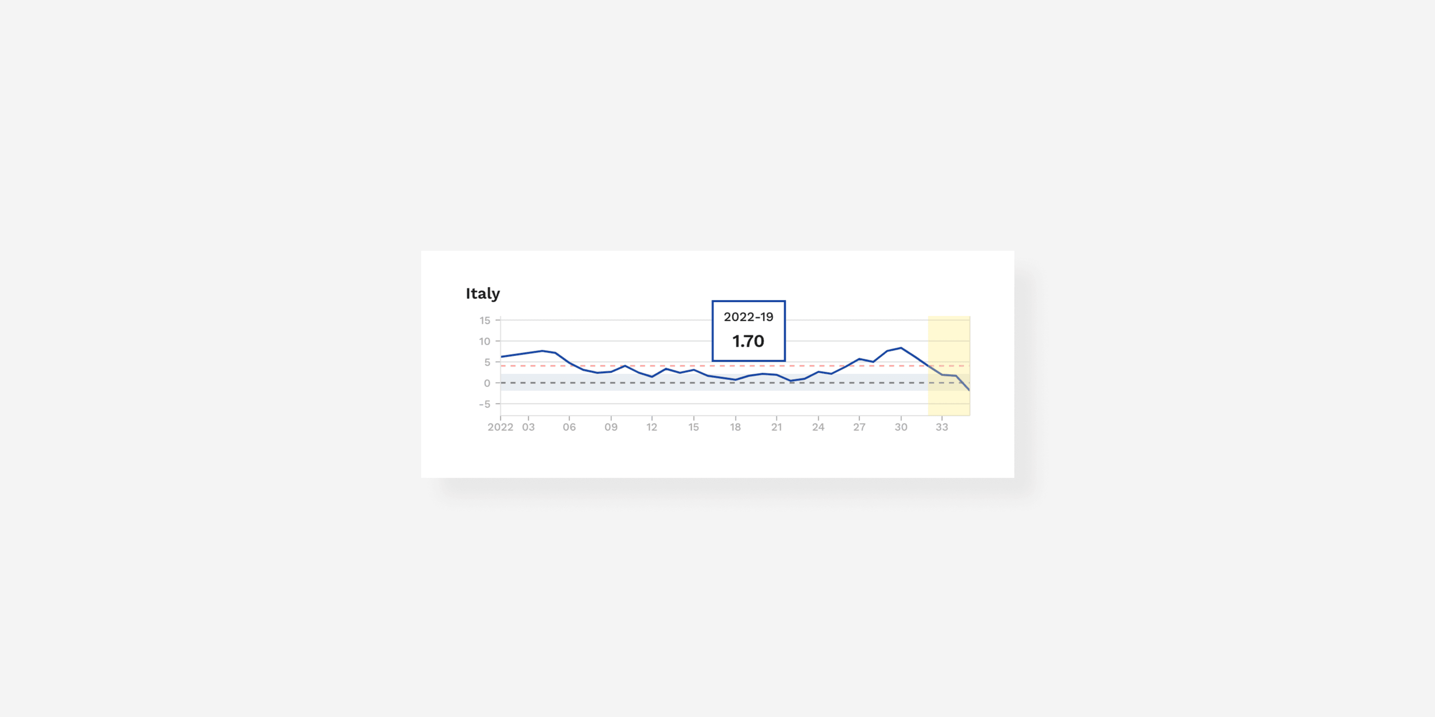
Map of z-scores by country allows users to explore the deviations in mortality
A Workflow that Couldn’t Keep Up
At its inception and throughout most of its history, EuroMOMO received no more than a few hundred visitors per month, most of whom were researchers and data enthusiasts. Each week, the original website showed users the newest data received from national government agencies in composite form via various graphs. Each graph was a static image, a low resolution PNG that had to be uploaded manually to the site. Aside from creating tedious work for the web manager, EuroMOMO’s previous data management reduced the site’s functionality for its users. Professionals went to great lengths to extract more granular information than what the flat images readily contained, resorting to counting the pixels between axis labels.
With more than three million monthly visits to their website—a 2000% increase from previous peaks in traffic—it became clear that the decade-old euromomo.eu website needed an emergency redesign.
As the course of 2020 took a sharp turn, so too did EuroMOMO’s function in public health. Nationstates hurried to update infectious disease strategy while the novel coronavirus lacerated its way through Europe, thrusting humble EuroMOMO into a critically important role for officials, media outlets, and concerned citizens in grasping the unfolding of what would become a pandemic. EuroMOMO’s analytical style, which measures the present weekly deaths against an average and, like infectious disease, reaches across borders, proved especially important to monitoring COVID-19. Specific epidemiological data for the disease was neither instantaneously available nor methodologically standardized across nations, meaning that a comparative approach was the best option to determine its effects. The website’s monthly user base exploded into the frenetic millions, and the workflow that had sustained it until this time could no longer keep up with its transforming function. EuroMOMO needed a new digital infrastructure for an era in which more data flows more quickly and is more scrutinized than ever. Responding to pressure to improve upon the site’s utility as quickly as possible under ever-changing public health conditions, we were able to complete a redesign of the website and an overhaul of its management system in just 10 days. We designed an entire analytical pipeline that takes a large amount of data from the back end and visualizes it reliably for an audience of diverse backgrounds.
The project included a retouch of EuroMOMO’s visual identity to match the brand’s perception with the rigor, precision and trustworthiness of their data.
Communicating Trustworthiness - Reality Still Exists!
The coronavirus pandemic has tested the ability of science to communicate with the public, and has shown science’s vulnerabilities in the face of attempts to undermine it. Even as funding and commendation for the arts and design continue to decline, it is precisely this expertise in human communication that can mobilize societies to act toward a common good. We have larger quantities of data on ever more granular topics, but find ourselves lacking the ability to make much of it. Even when they do successfully reach the public, graphs like those EuroMOMO creates can be manipulated to depict harmful non-realities, such as a downward climb in new cases when the opposite is true. For many of us, data visualizations like graphs and charts carry an air of scientific objectivity, and nefarious actors can capitalize on this misplaced certitude. In these cases, design is anything but decorative. Done correctly, design can make up the crux of science’s ability to be received accurately by individuals. In this high-stakes, time-sensitive project, we prioritized both legibility and trustworthiness to further indicate EuroMOMO’s reliability as a source for mortality information in the region.
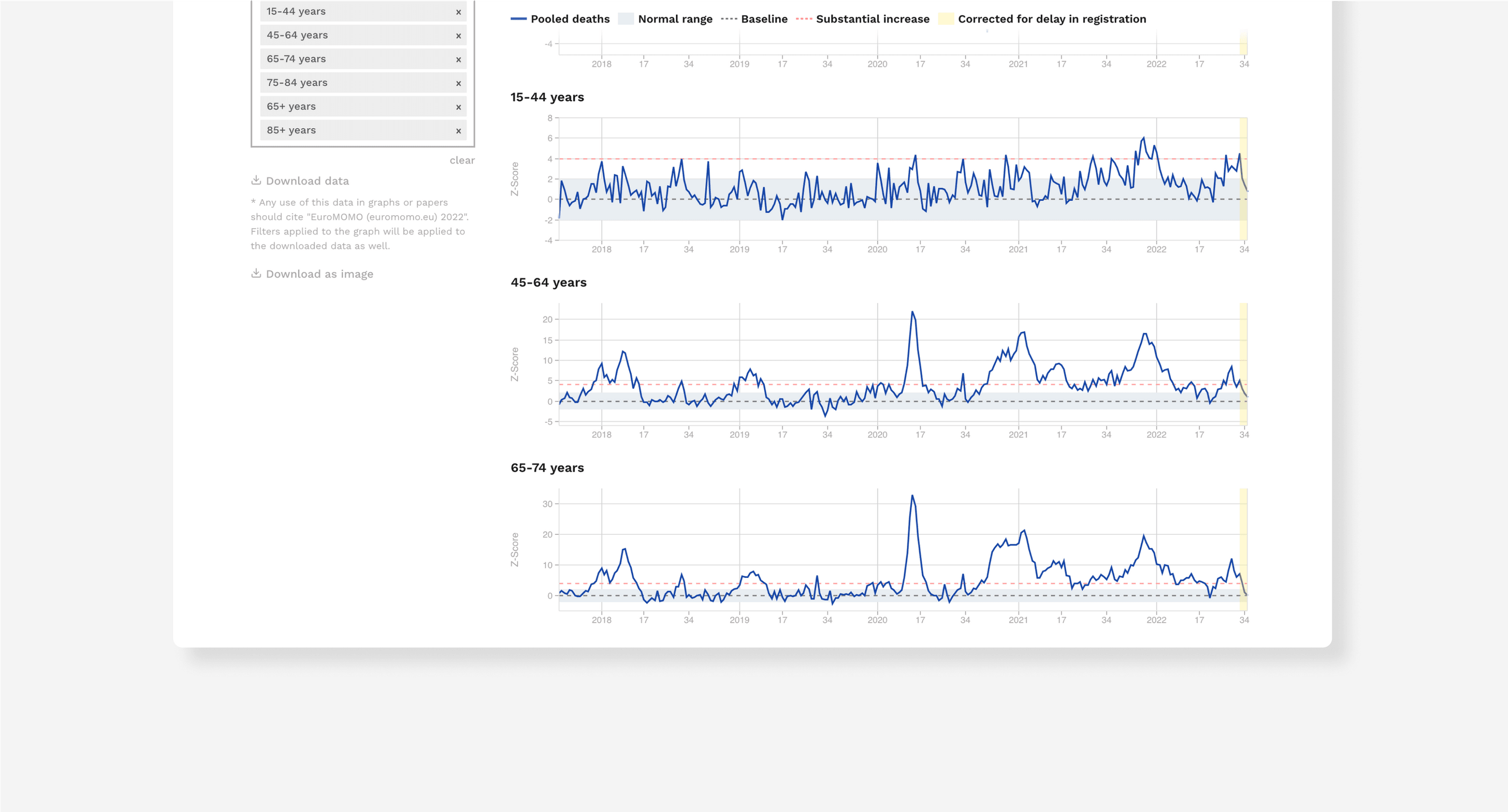
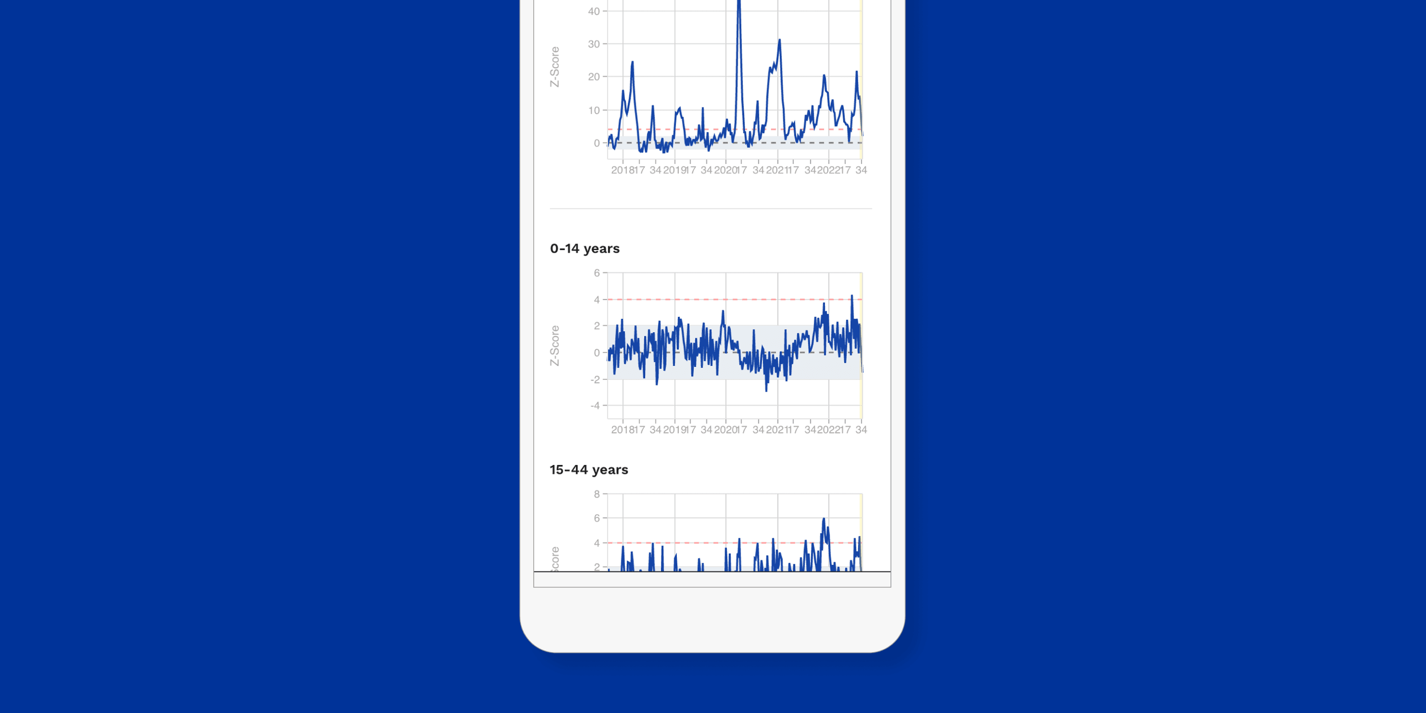
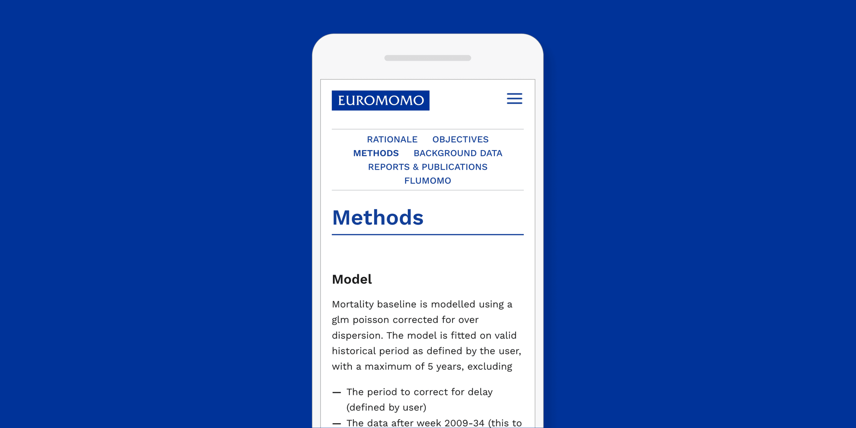


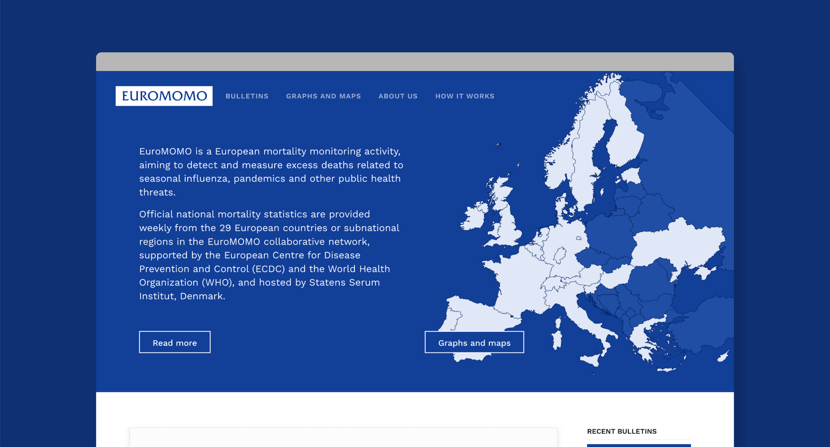
A strong blue theme sets the tone on the homepage of EuroMOMO’s new website, serious enough to handle such a difficult topic without becoming macabre. Users are immediately confronted with the public health project’s affiliations, including the European Centre for Disease Prevention and the World Health Organization, establishing a foundation for transparency. We anticipate a user who is skeptical of her information sources, eager to look deeper into where data comes from and what stakeholders are involved in its collection and dissemination. A “how it works” tab, not present in the previous website, populates the main menu and contains a breakdown of EuroMOMO’s objectives, rationale, methods, and more. The adjacent “about us” tab includes a glossary of all participating countries, complete with email addresses of individual points of contact, as well as a history of the project. Across these sections of the site, short paragraphs of black, sans-serif text, broken up with thick headings, sit on top of a contrasting white background. By keeping visual clutter and nested menus to an absolute minimum, we not only maintain consistency in the professional tone, but encourage distraction-free interrogation of readily digestible information.
Legibility at the Smallest Scale
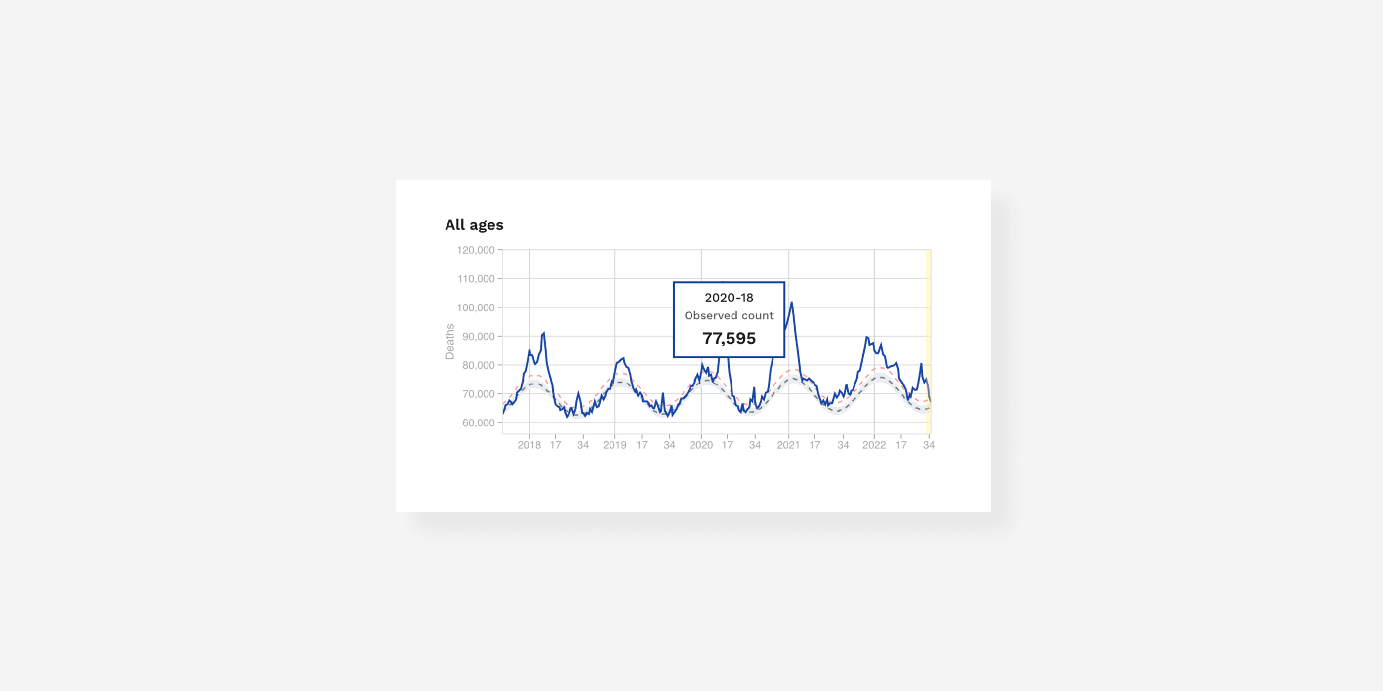
After scrolling down from the landing page, which also maps EuroMOMO’s participating countries, users see a bulletin of the most recent week’s mortality data. This bulletin is an abbreviated version of the previous website’s, showing an updated graph of pooled mortality across participating countries over the last four years. Several disclaimers use both text and graphic elements to reinforce each other: bold typeface provides notes about data collection in Germany and Ukraine, while an italicized warning about delays in data is mirrored with a yellow highlight over the corresponding section of the graph. At the top of the bulletin, the blue header is updated with a simple, factual interpretation of the graph below, communicating in the most basic terms whether the mortality estimates are at, below, or above the typical rates. It’s a minimalist update that provides accuracy even for users just briefly checking in on EuroMOMO.


Helping Data Speak for Itself
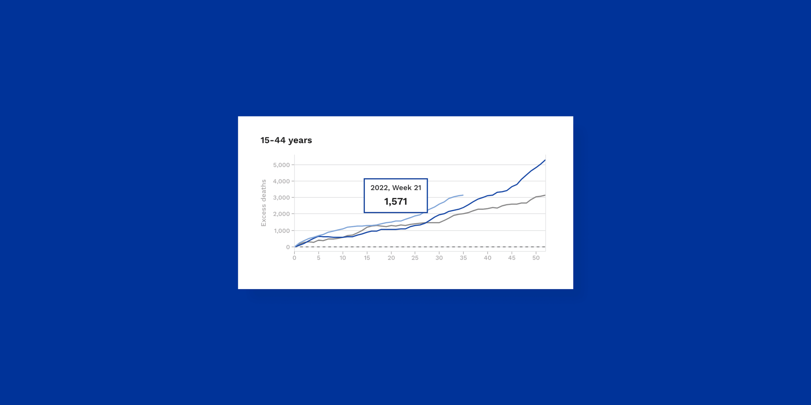
Separate from the weekly bulletins is a new website tab called “graphs and maps.” This section contains a variety of data visualizations that we selected together with the EuroMOMO team. While they’re based on the original website, the visual form the graphs and maps take is entirely overhauled to increase their functionality for the website’s staff and users both. The same formal, trustworthy color scheme of blue and grey makes up graphs of pooled mortality rate by age group, excess mortality (based on the expected level), and z-score, which is a statistical tool used to allow comparison between individual countries without exposing the sensitive raw numbers they share with the project. The “rolling average” graphs from the previous website have been discontinued, as they made the spikes in the data look smaller than they actually are, and thus aided the downplay of various mortality drivers.
The new website provides users with a variety of interactive tools.
Whereas the previous website’s static images had to be created and uploaded each week, and were able to convey only a small selection of information, the new interactive visualizations widen their effectiveness. EuroMOMO staff can simply enter the newest mortality information received into a large administrative data file, preview the visualized outcome, and instantly update the website to reflect it. The new website and its back end also better facilitate EuroMOMO’s collaborations with publications like the New York Times and The Economist, enabling yet a wider audience to benefit from the international sharing of mortality statistics.
EuroMOMO’s data is regularly featured in international media outlets, including the New York Times, The Economist, WSJ and many more.
On the user side, each visualization on the new EuroMOMO website contains several interactive components. Individuals can set the date range with sliders, and can add and exclude age ranges and countries (when relevant) from comparison. Within the graphs themselves, the data points of each plot line can be viewed in detail with a popup box displaying precise information from each axis as users move their mouse over the lines. When they’re done customizing, users can download PNG images of their own graphs, the distribution of which has been part of EuroMOMO’s DNA since its earliest stages. When DSI launched the new website, long-term EuroMOMO users tweeted their excitement about the new system and the end of statisticians manually plotting on top of pixelated images.
A custom CMS allows users to easily upload new data, publish new bulletins and update existing visualizations.
Empowering Exploration for All Audiences
The multiple forms of interactivity turn what were basic images into fully fledged graphic tools of analysis. They do allow serious users to access the particular scale of data they need in a clearer way than before, but they also encourage more casual users to explore the various elements and dig deeper into their understanding of the images in front of them. With high contrast, low clutter visuals and minimal quantities of simple text, the intimidation factor in approaching new information is lowered. Users can feel empowered in their ability to understand the source data themselves, rather than turning to more subjective, narrative-based sources. Even without meandering exploration, users are readily able pick up on the trends that the visuals illustrate with their blue plotlines and dotted grey baselines, all of which are consistent across the website.
DSI did not take the stakes of this project lightly. With its millions of monthly visits, EuroMOMO is the highest traffic website we’ve built. Behind these numbers are individuals seeking reliable information concerning the safety of themselves, loved ones, and an entire region involved in constant, global movement. These individuals deserve access to the most accurate knowledge available— information that science continues to produce, but often struggles to convey to the public before it gets skewed towards an agenda, if acknowledged at all. We see the new EuroMOMO website, from its formal visual language of trustworthiness to its data organization that invites thoughtful engagement, as a chance to help actuate the initiative’s potential. That 29 countries willingly share their current mortality data on a platform available to anyone with an internet connection is an exceptional model for the scientific cooperation our current age calls for, and it merits an exceptional website to match. DSI drew from our expertise as a highly technical design studio to allow EuroMOMO’s purpose to come to the forefront, unburdened by a web environment that has changed drastically since its inception.
