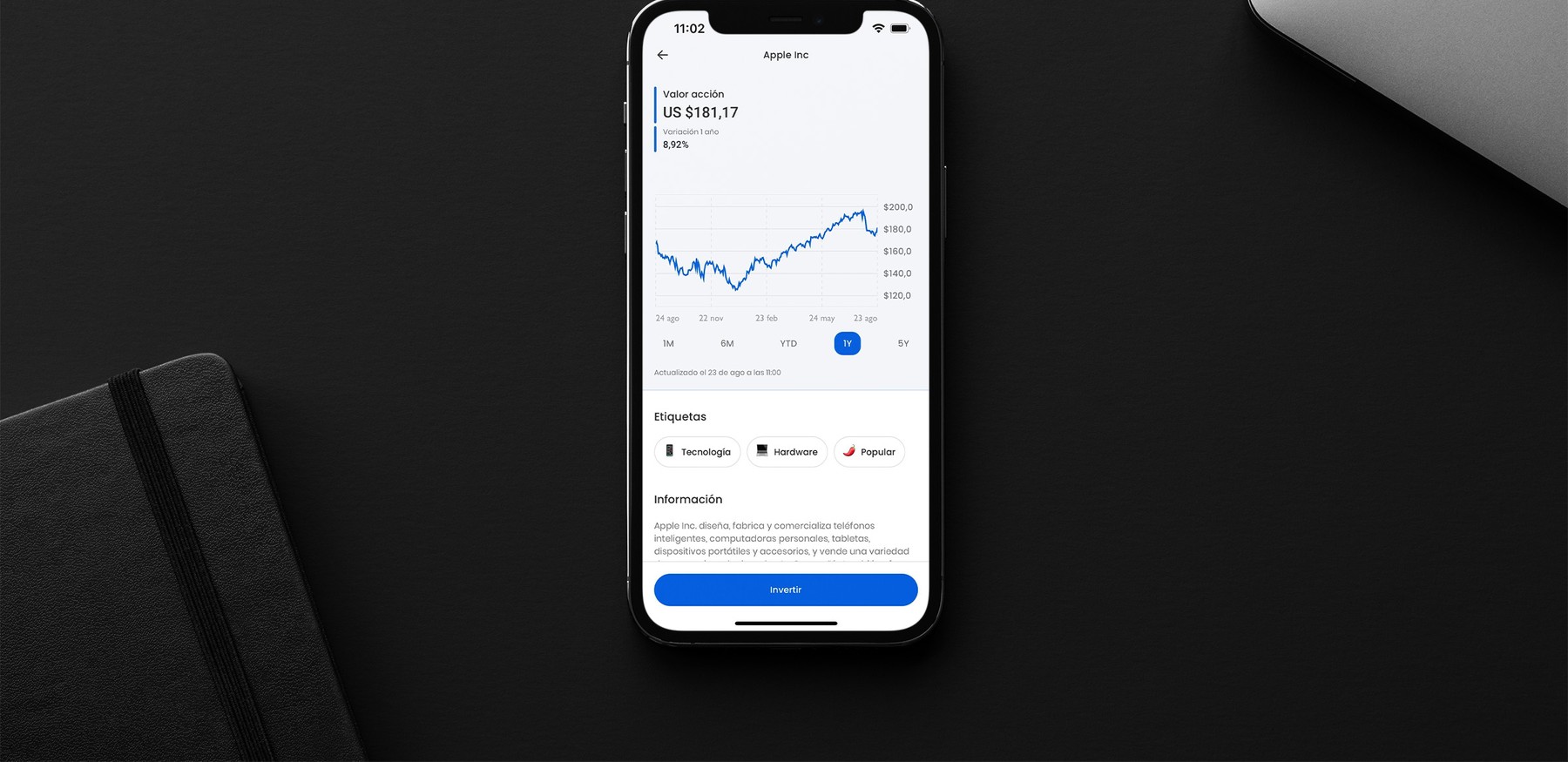
A cross-platform design system helps the financial technology company Fintual innovate on functionality and rapidly scale their product to new markets.
Fintual is a Latin American FinTech company pioneering new ways of saving and investing by making it more accessible, intuitive and affordable. The digital platform enables users to invest in asset categories such as index funds and ETF’s through their easy-to-use web and mobile applications. Founded in Chile in 2016, Fintual has participated in Y Combinator twice, was the first Latin American company to be backed by Sequoia Capital, and is now one of the leading FinTech companies catering to a younger demographic in South America.
During a period of rapid growth, Fintual found it challenging to maintain a consistent product design while developing new features for their expanding user base. We worked with the company to solve this problem by creating a new design system along with their newly formed Design System Squad, with shared components and proper tooling for managing their design-to-development workflow.
Creating a shared vocabulary
Design and development had long been structured as two different teams with their own responsibilities and processes at Fintual. What worked in the initial phases of the company now had an increasingly amount of friction when designs needed to be turned into code, and the result was a product with visual inconsistencies caused by teams implementing functionality from scratch in every new feature with different details getting lost in the process.
We worked with Fintual to combine the decision-making and best practices from both of these disciplines in a new cross-functional team – the Design System Squad. This team not only oversees the design and development of Fintual’s new design system, but also works to increase awareness of the design system inside the organization at large.
The look and feel of Fintual’s applications is one of its core customer touchpoints. Having a team focused on a shared source of truth had many healthy side effects besides the making of a better product. Most importantly, it helped free developers and designers from doing repetitive work by allowing them to use their time on ideating and implementing new features rather than doing repititive manual work such as figuring out the correct border radius for a button over and over again.
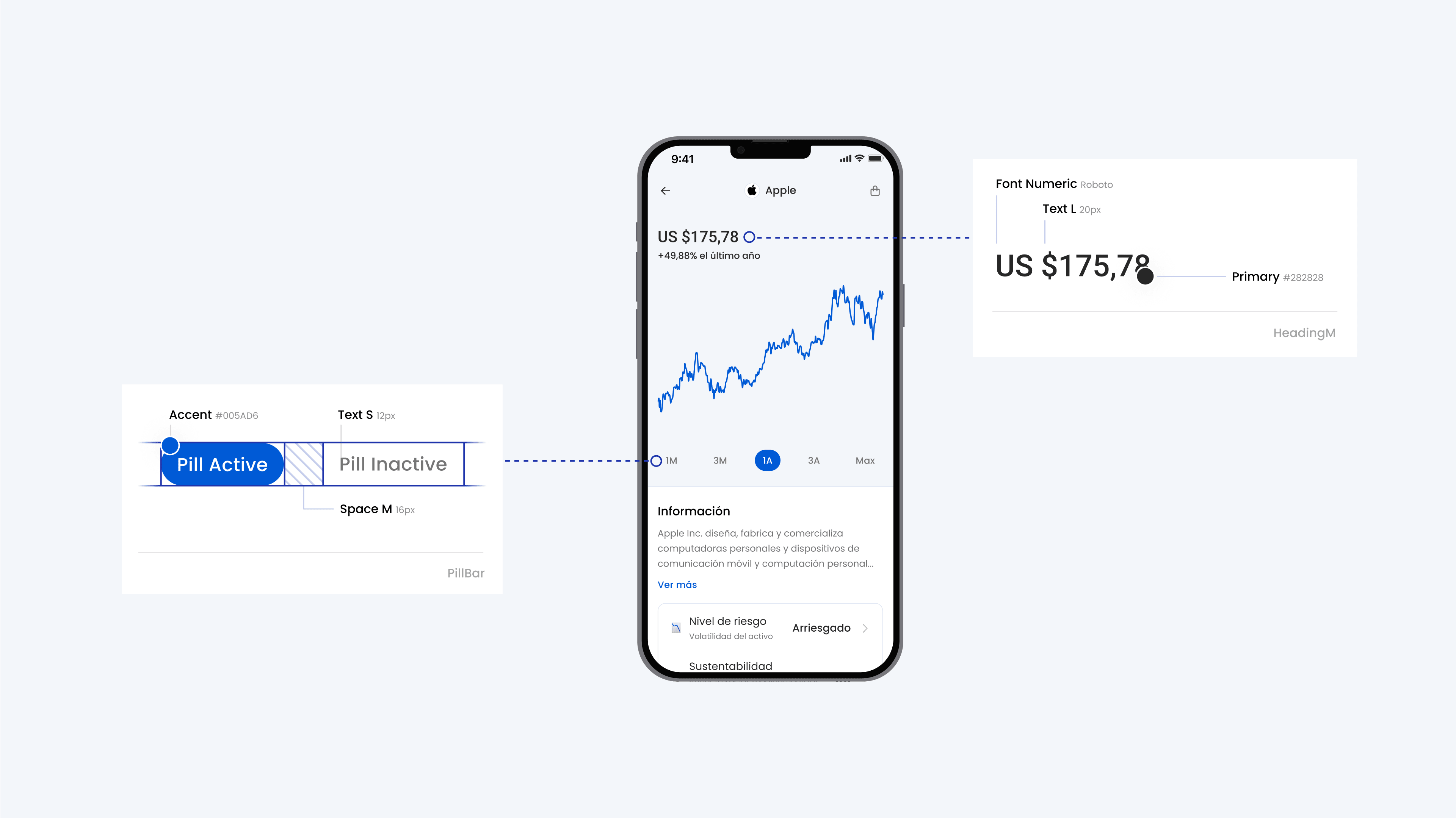
Tokens become components and components are composed to form views.
Kicking off our collaboration with Fintual, we worked with their design team to evaluate previous designs and define a clear vision for Fintual’s unified visual language moving forwards.
From this we distilled the core building blocks of the visual language into a shared vocabulary of design tokens. We reworked the color schemes to base them on equidistant scales and helped systematize spacing and typography. These and other building blocks make up the set of Fintual’s design tokens, each value with an assigned name. The names were based on a new action-based labelling strategy meaning that each name was chosen to clearly represent the intended use of the token (e.g. using “fill-accent-active” instead of “blue“).
These tokens were encoded and documented in code, as well as reflected in the names of color and text styles in Figma to ensure the same token names were used by both developers and designers, making it easier to talk about the visual details of the system.
Putting documentation in the spotlight
To ensure the design system can be put to good use, we put particular emphasis on making it accessible to the entire organization through a central documentation website, creating a main entry point for anyone looking to work with or on the design system.
To achieve this, we introduced a process of documentation-centric development. Components–the interactive building blocks of the design system–are created, refined and evaluated in the same tool they are documented in. Automatic checks serve as additional guardrails, making sure proper documentation is always added before a new component can be added to the system.


The main touchpoint of the design system is a set of composable and standardized React and React Native components that behave consistently on both web and mobile. Every component is thoroughly backed by extensive tests using React Testing Library and fully typed in Typescript.
This not only gives developers more confidence when using components, it also makes getting started with the design system easier, as each component comes with Typescript-based auto-completion in the code editor.
Rich interactive components like data visualizations were explored and prototyped directly in code.
Treating code as the main material of the design system allowed for a shift in mindset within Fintual’s team. New components and interaction were soon prototyped in code directly, using tokens and existing components as a starting point. This way of working allowed the entire team to contribute new ideas to the design system and opened the door to easily explore rich interactions that would be hard to achieve in a static design tool.
Improving workflows, establishing best practices
A design system can only ever be as successful as its adaption by the organization. To create visibility and accessibility, we set up the entire design system in a monorepo using Turborepo. In this way, the code for tokens, web components, mobile components and shared tooling lives in a single place, making it easy for developers to get started contributing to the design team.
Tokens are stored in plain JSON format as key-value-pairs processed by StyleDictionary. Having this single source of truth for tokens not only allows to build specific output format for web and mobile, but also allowed parsing the tokens into the custom documentation site very simple.
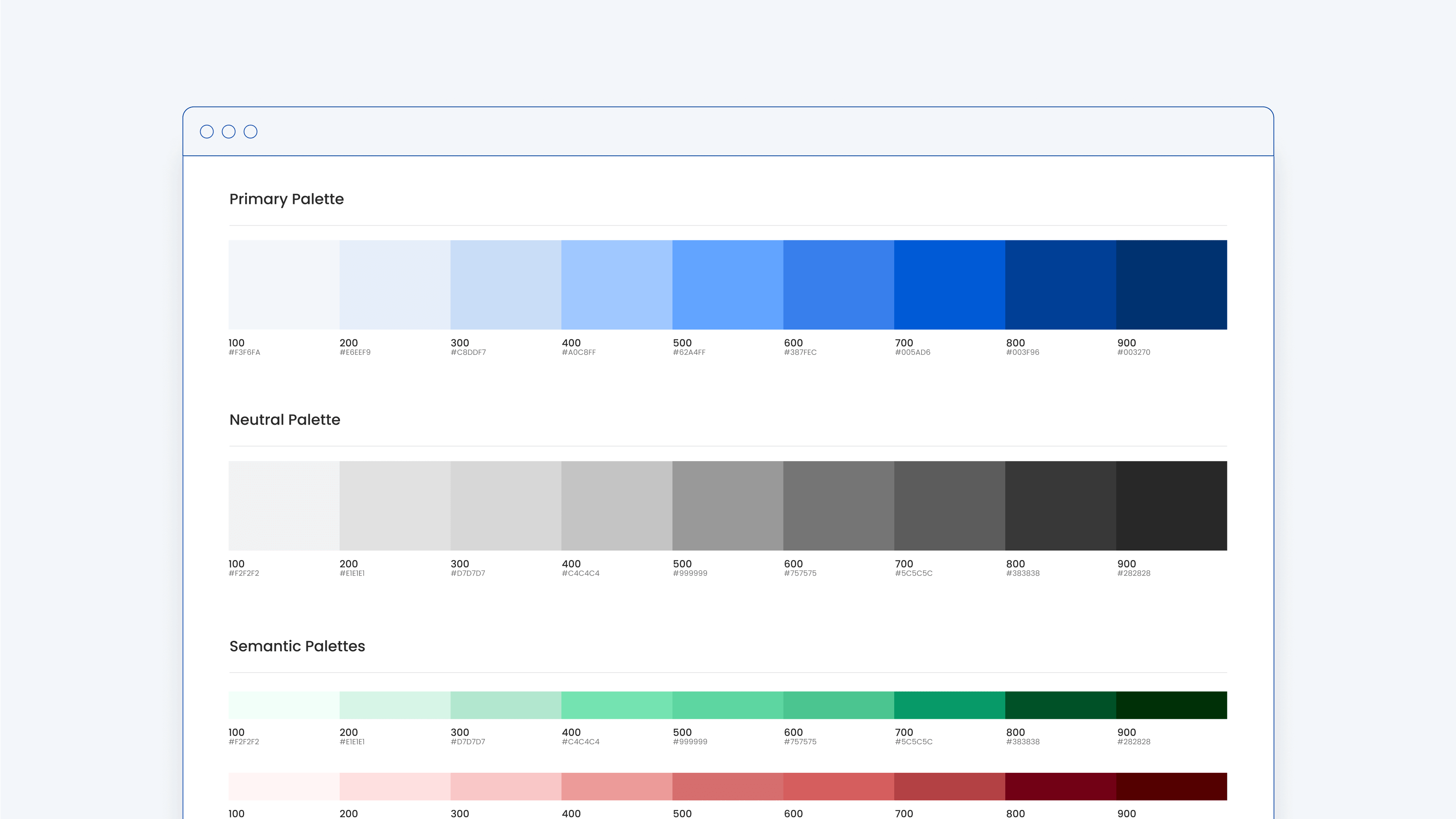
An automatically generated website combines all documentation in a single place.
Working closely with Fintual’s development team we set up a development workflow around Storybook. Storybook allows developers to interactively document components, the re-usable building blocks of the design system. Treating Storybook not only as documentation but making it the center piece of developing new components makes sure documentation always reflects the up-to-date state of the design system.
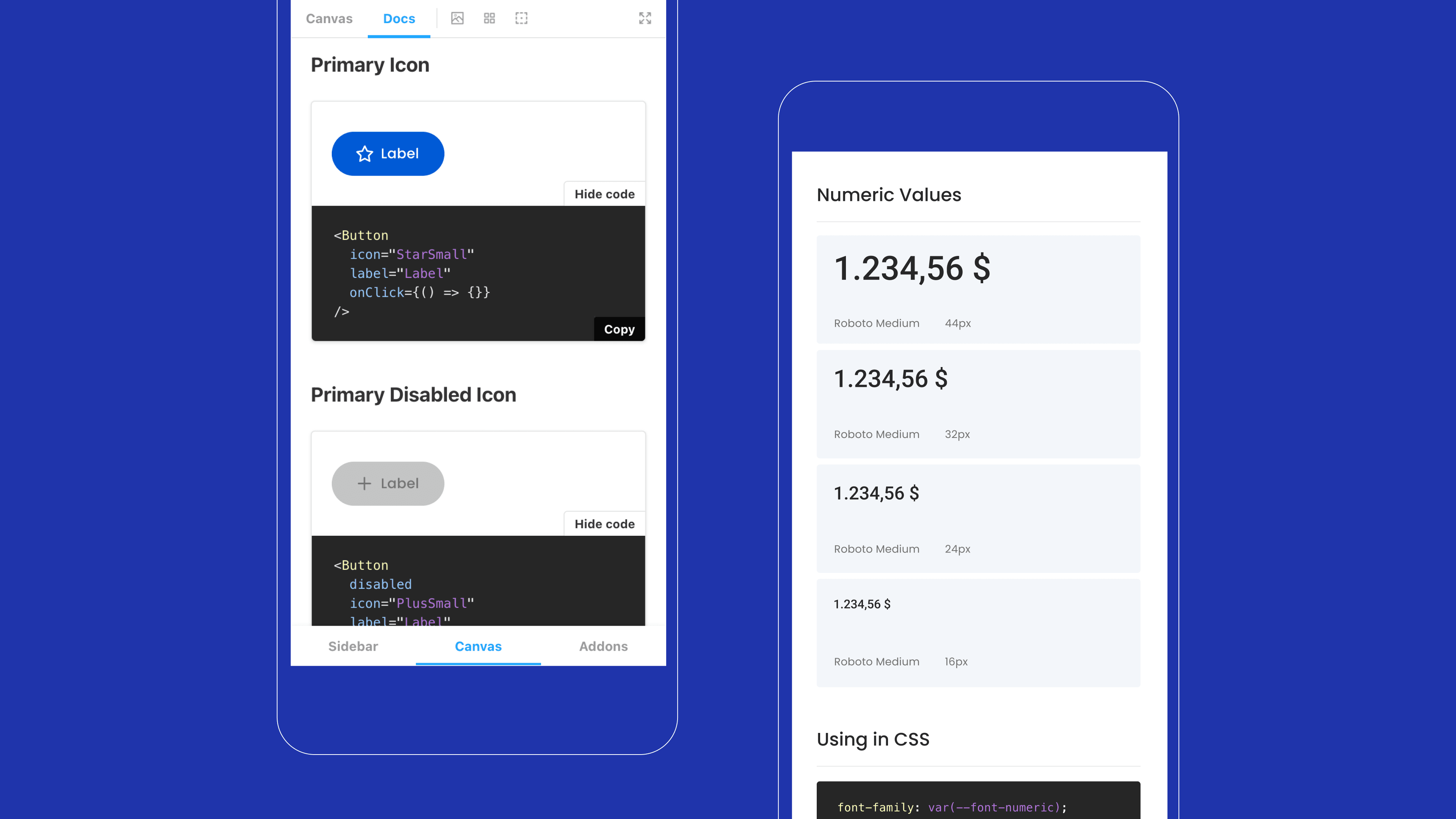
Mobile documentation is available as an app using the same technology as Fintual’s mobile app.
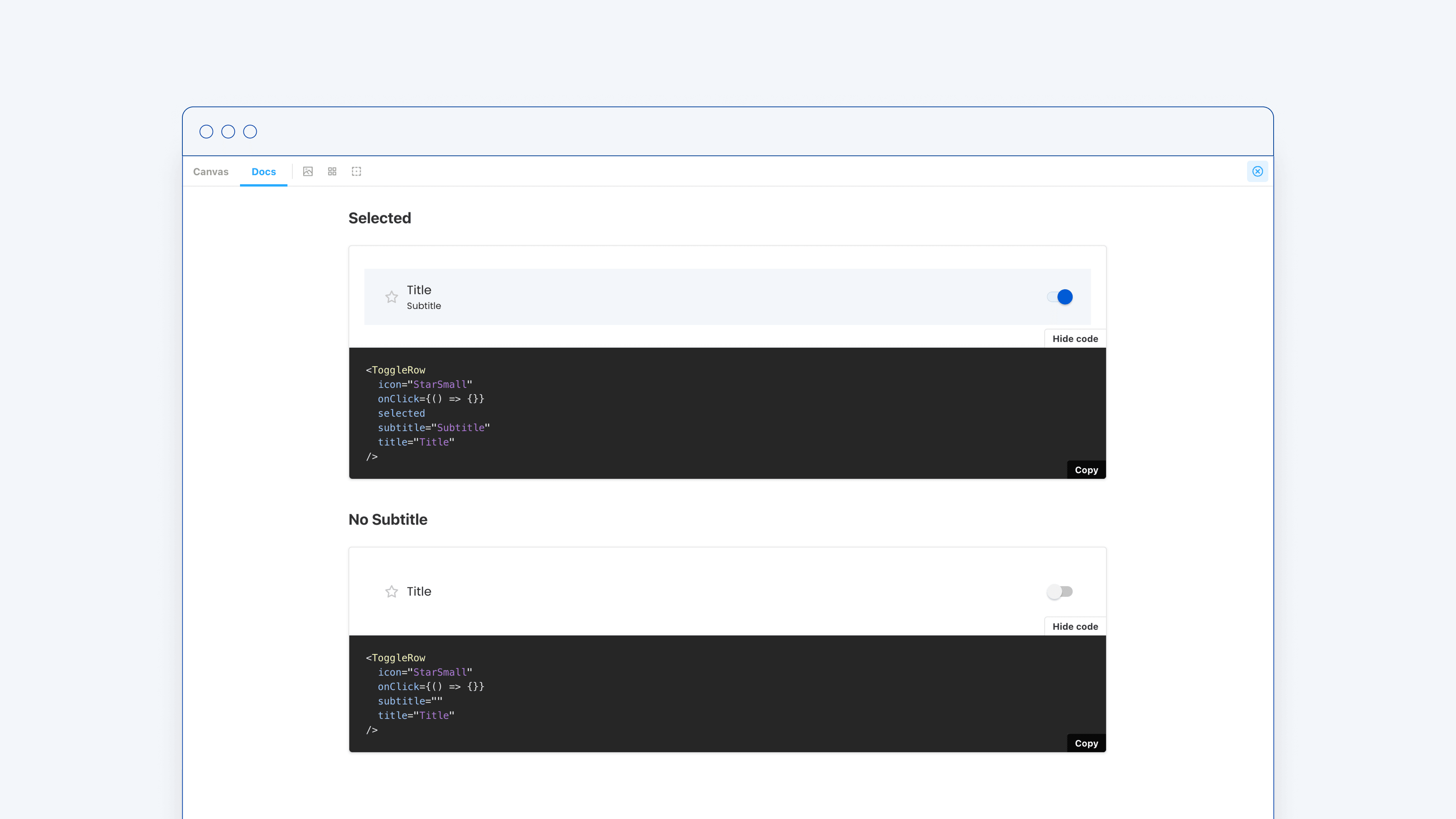
Aiming at designers and developers the documentation combines visual previews with ready-to-use code snippets.
The most effective approach to ensuring best practices is by making it effortless to follow them.
Additionally, we created small custom CLI tools that automate common tasks of the design system like bootstrapping a new component with the correct setup for types, tests and storybook files or working with a local version of the design system in another app.
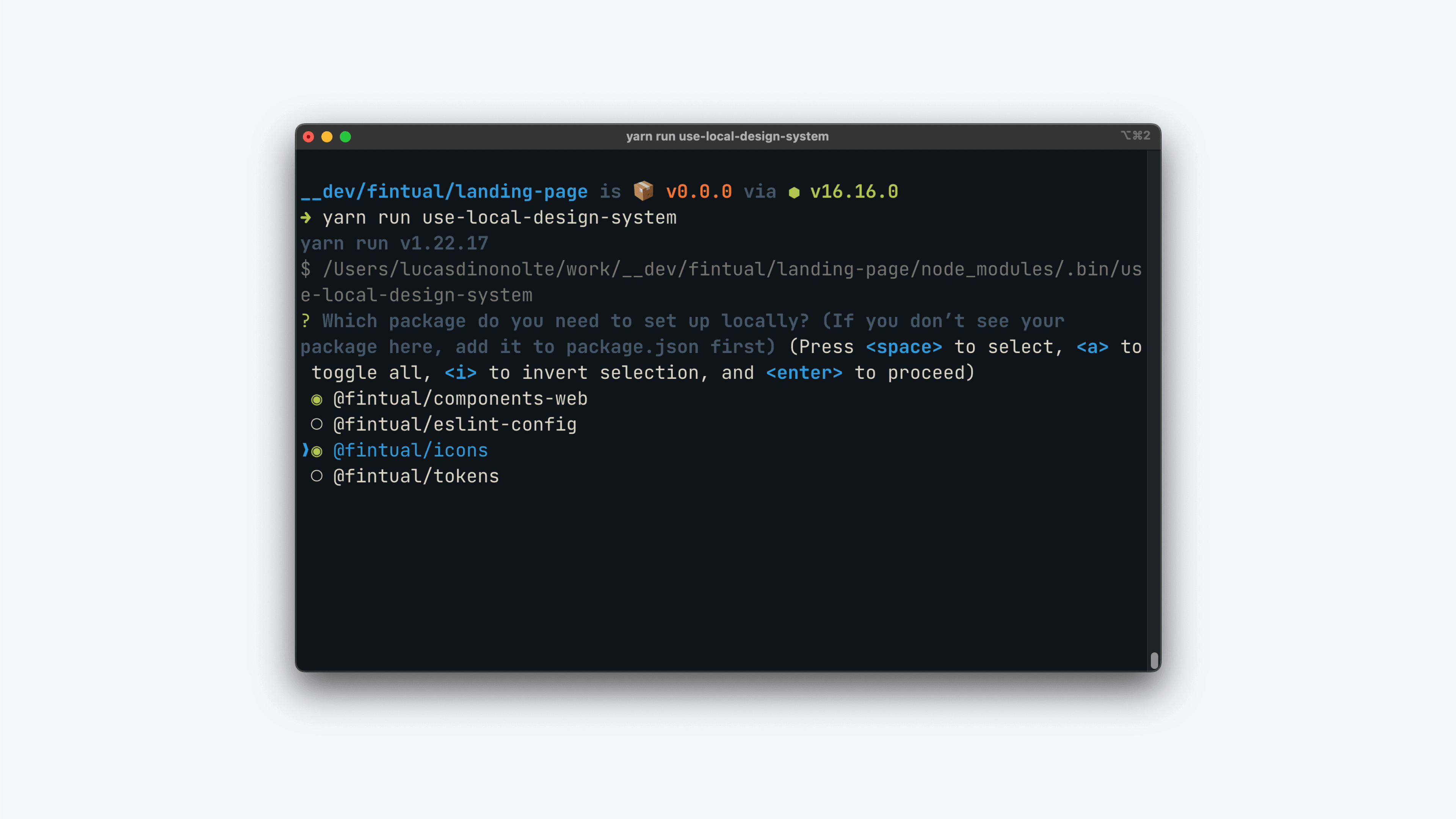
A custom command line tool automates common design systems tasks like creating new components.
All in all, the development of Fintual’s new design system was as much about people than it was about technical solutions. Many organizations struggle with their process of turning static designs into code, and this project demonstrates how a larger company with a complex infrastructure can transition from a “throw it over the wall” workflow towards a more modern and flexible collaboration approach.
Successful design systems are like successful Open Source projects. They need welcoming documentation on how to use the software, excellent documentation on how to contribute, a thriving community around the project, and a clear set of owners.
