The ask
We worked with the leading music promoter in Chile to develop the visual identity for Purísima, a new venue and cultural center set to open in late 2021. The new venue was intended to be the home for a wide range of activities and programs: a restaurant and bar, a record store, a beer garden, and a venue with events ranging from concerts to parties to poetry readings.

The Purísima logo.
What we did
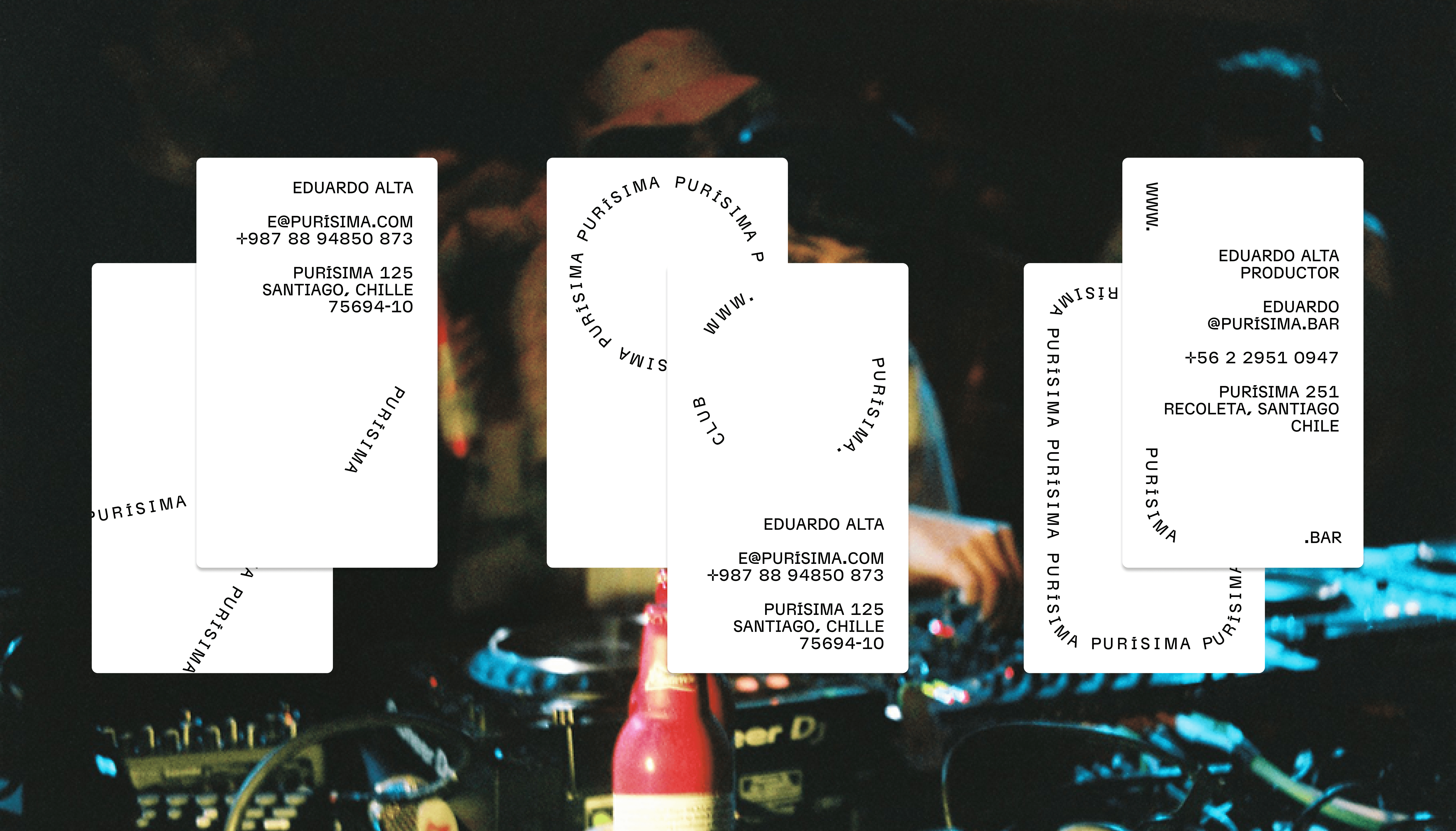
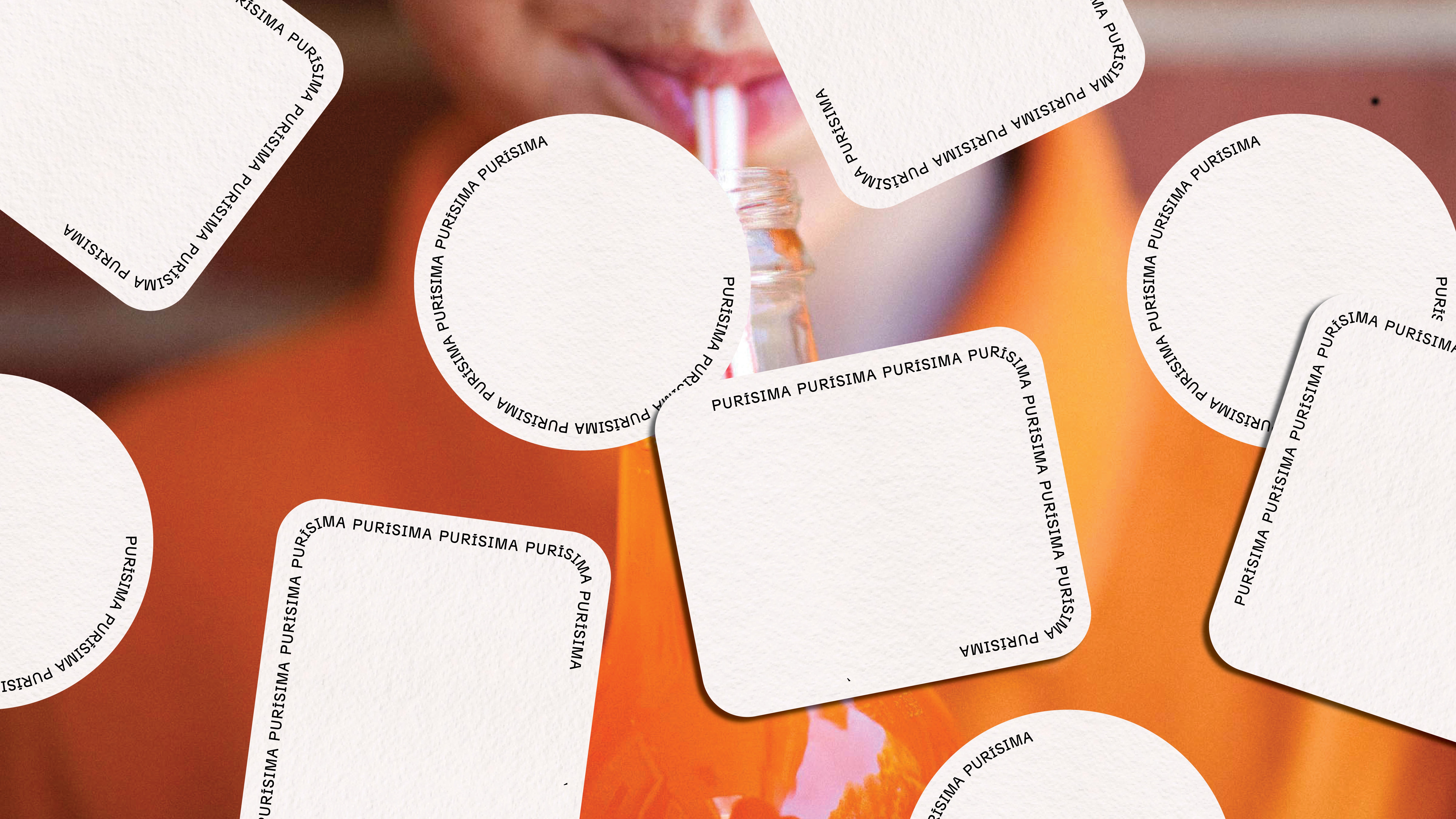
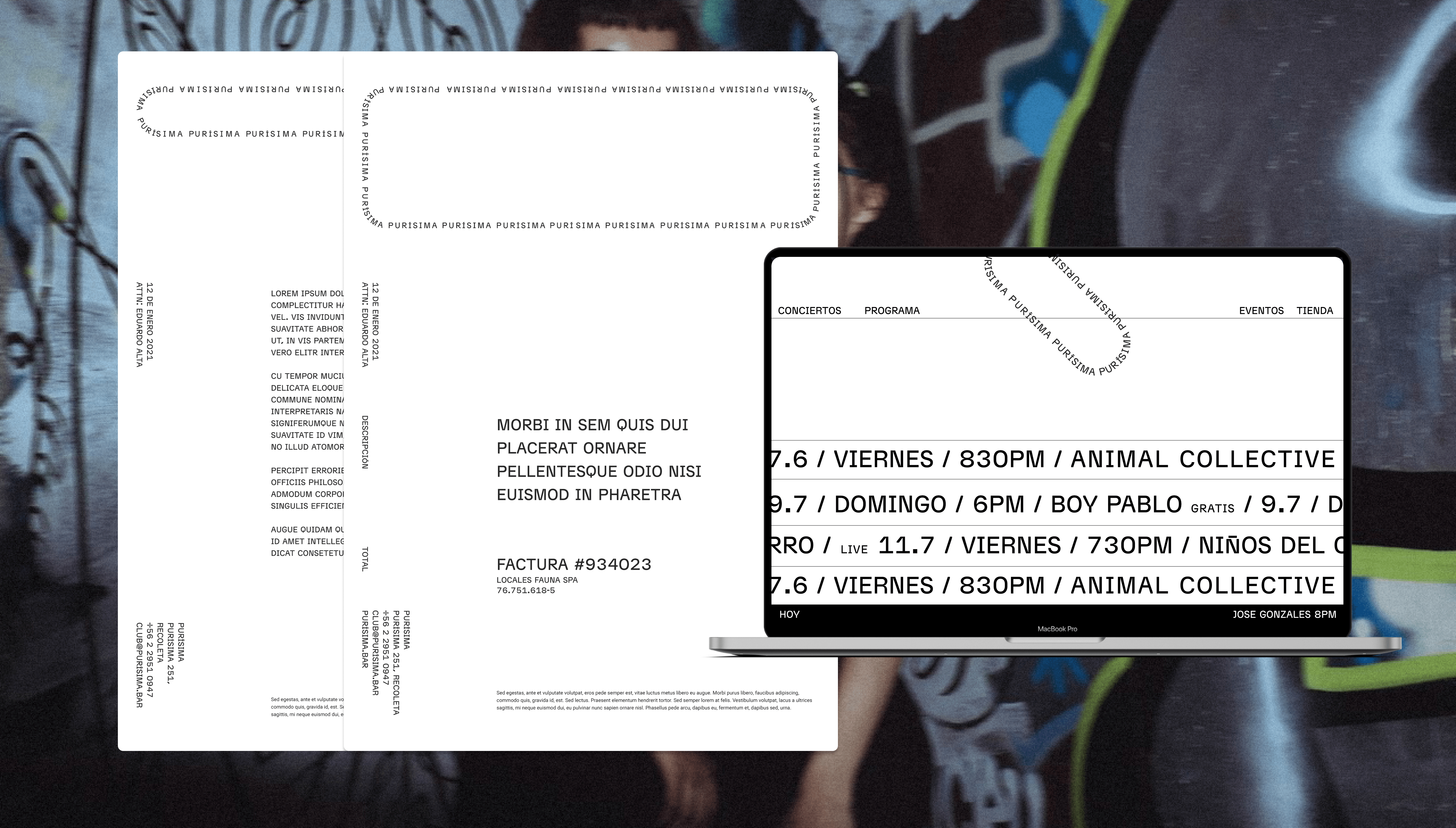
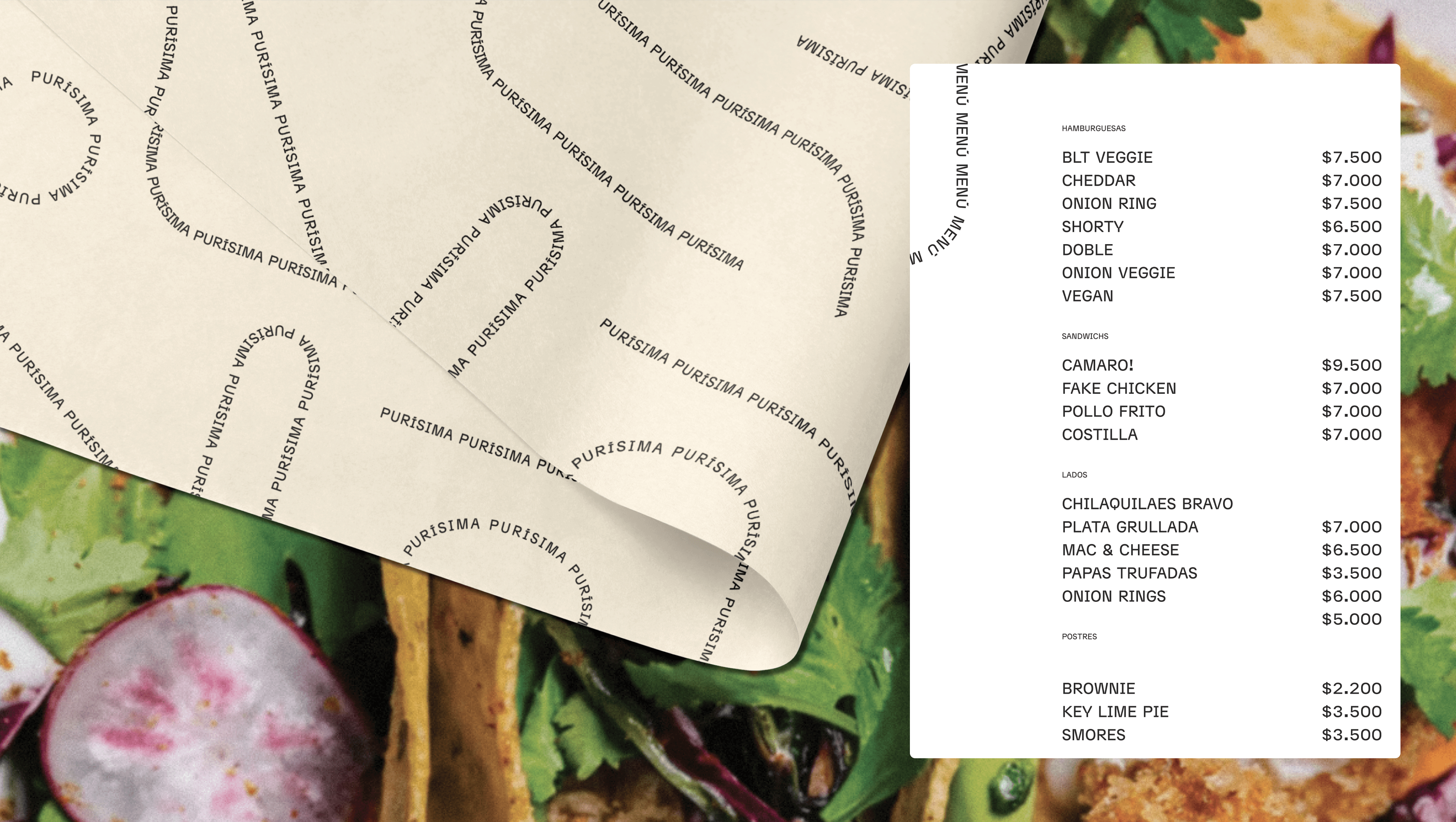
We created a system that took a novel interpretation of classic marquee signs found in shops and venues, using a bent stripe of endless text flowing through it. This provided a playful canvas while providing a cohesive visual language for the venue. Without a background, the bending words form the path, creating a sense of movement and a playful layering effect with other visual assets.


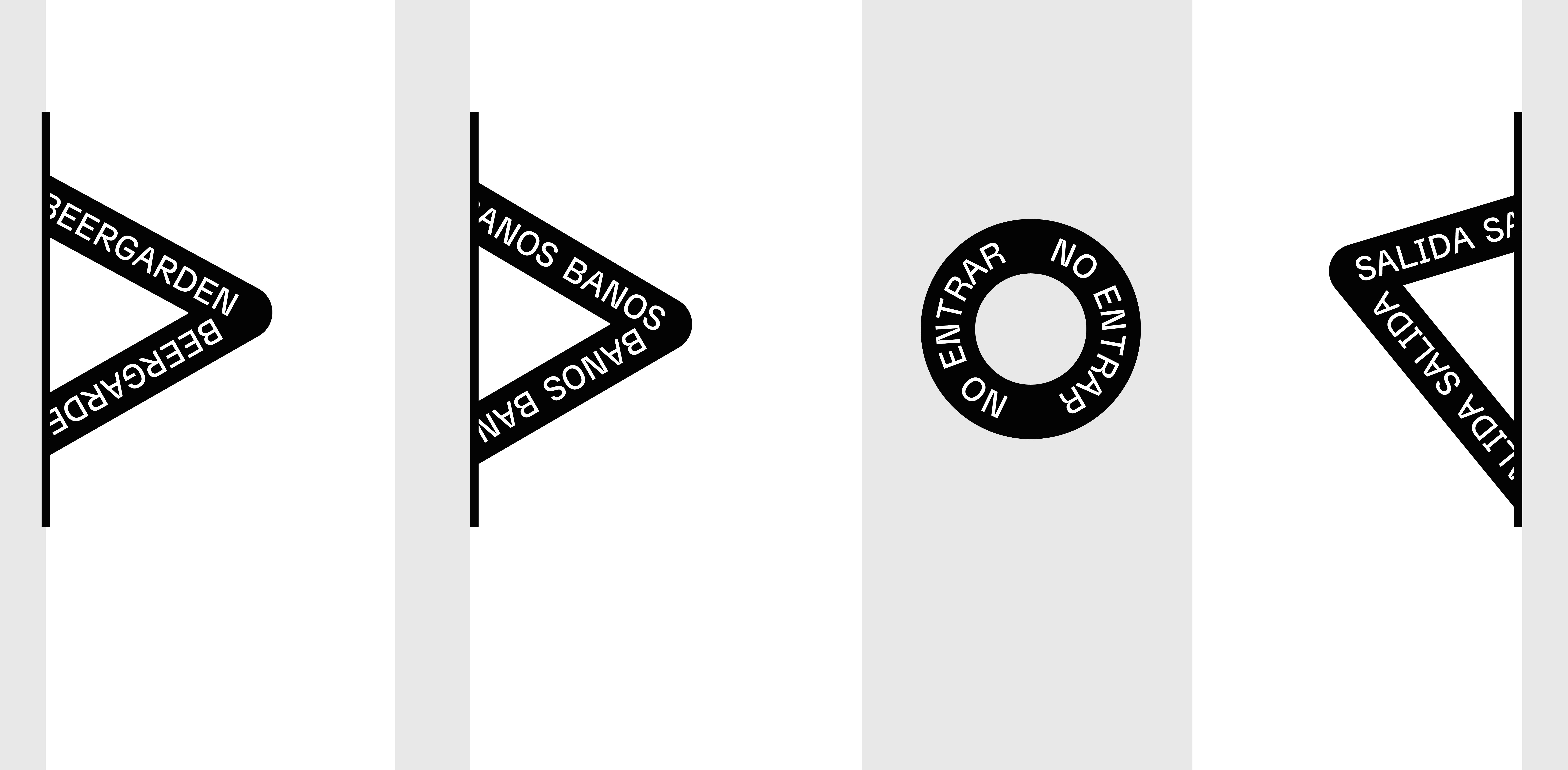
Indoor wayfinding.
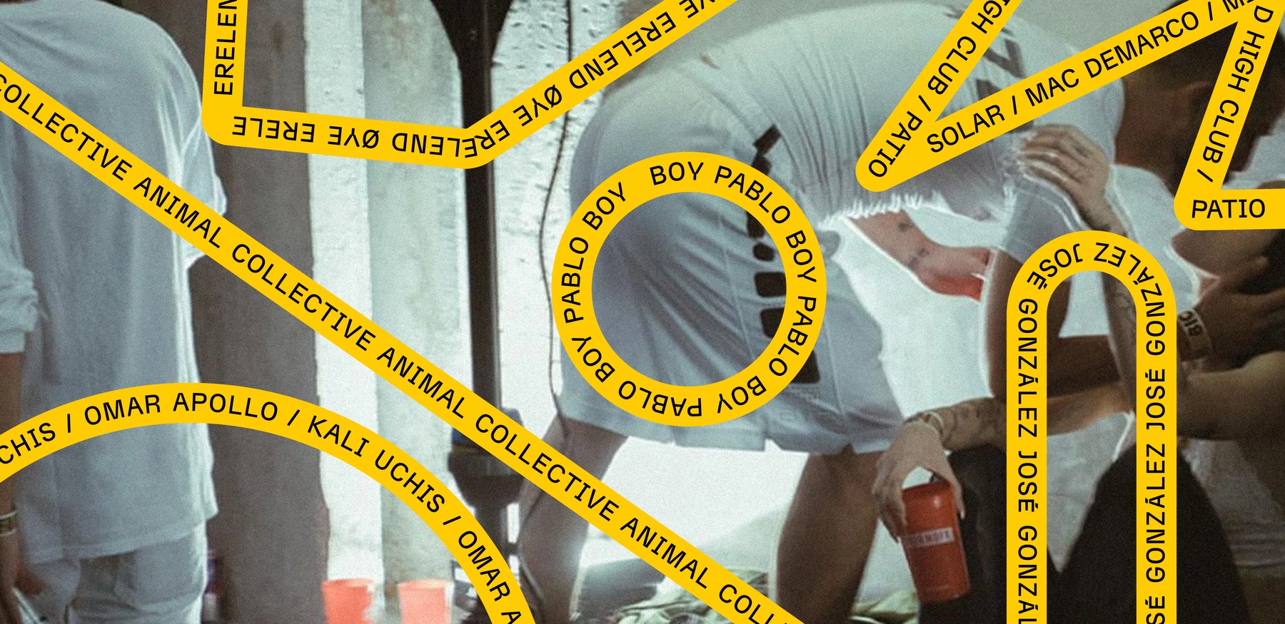
Posters for different events and promotions.
At the same time, the Purísima venue required a system that could easily create assets for different lines of parties, DJ sets, and events, all under the same roof. A variant of the bent marquee, with a yellow background was created to differentiate it from the core system while helping unify the wide range of asset styles provided by the artists.

The Purísima sala logo.

Additional colors.

Different marquee compositions without content.
Process and technical breakdown
Our exploration of the visual language included experiments on how the marquee movement and physicality could work both on the venue itself and various graphics, including digital applications. For this, we used our in-house framework Mechanic to explore the behavior and movement of the marquee directly in code.
The final version of these tools would help their team produce the vast amount of graphic assets necessary to run the communications of the space. Each new concert meant a new poster that could be easily designed by using an artist's photo on the background and the text-stripe language on top. If necessary, a variation of this poster could be built without assets, just text and color.
The visual system became a vessel for the multiplicity of activities happening in the space, allowing fast production of graphic materials and striking a balance that gives the flexibility needed to accommodate the multiple content needs while being easily recognizable as part of Purísima.
Posters for different events and promotions.
