We communicate immersive capability for VR studio Superbright’s new visual identity and website. Grounded in historical reference, our typographic texture and imaginative renderings communicate a novel way of building space in the virtually real.

A Material Identity
Superbright is an experience design studio whose work in emerging technologies is made rich with a reverence for traditional storytelling media. The studio recognizes that while virtual and mixed realities often receive frenzied predictions of total industry disruption, disciplines like architecture, design, and the arts have always been immersive. Superbright bends these more classic elements into nascent dimensions using tools such as virtual reality, physical computing, motion capture, and the internet of things. Their work deepens narratives into experiential stories at the crux of the real and virtual. In designing a new visual language and website for the studio, we knew that this project needed to be more than a symbolic representation of the studio’s work. Instead, it’s a means of demonstrating Superbright’s capabilities through any interaction potential clients have with the studio across the website, merchandise, physical installation setups, and elsewhere.
From a logo to a grid
Superbright as a Surface
Superbright’s new visual identity starts with an understanding that surfaces bring reality into the virtual. Any old website or app is technically providing an experience in virtual space, but it’s often the introduction of forms that allow us to feel like we’re someplace, some version of our world with its own things to see and resulting physics to comprehend. Superbright understands these principles and uses them to inform its work in building environments. In the virtual world, quadrilaterals are stretched and compressed to compose visible surfaces that make up anything from walls to plants to animated characters, all made of the same sets of vertices and lines in infinite variations. The wireframe grid these quadrilaterals constitute is an invisible surface, a key part of the infrastructure on which immersion and narrative are built. Throughout its projects, Superbright constructs this grid and lays surfaces of meaning on top of it. We’ve unfurled this fact into a visual language of identity-as-surface: Superbright itself becomes a material that can both form and be draped over any surface, physical or virtual. “SUPERBRIGHT” is transformed from a set of letters into a boundless grid.


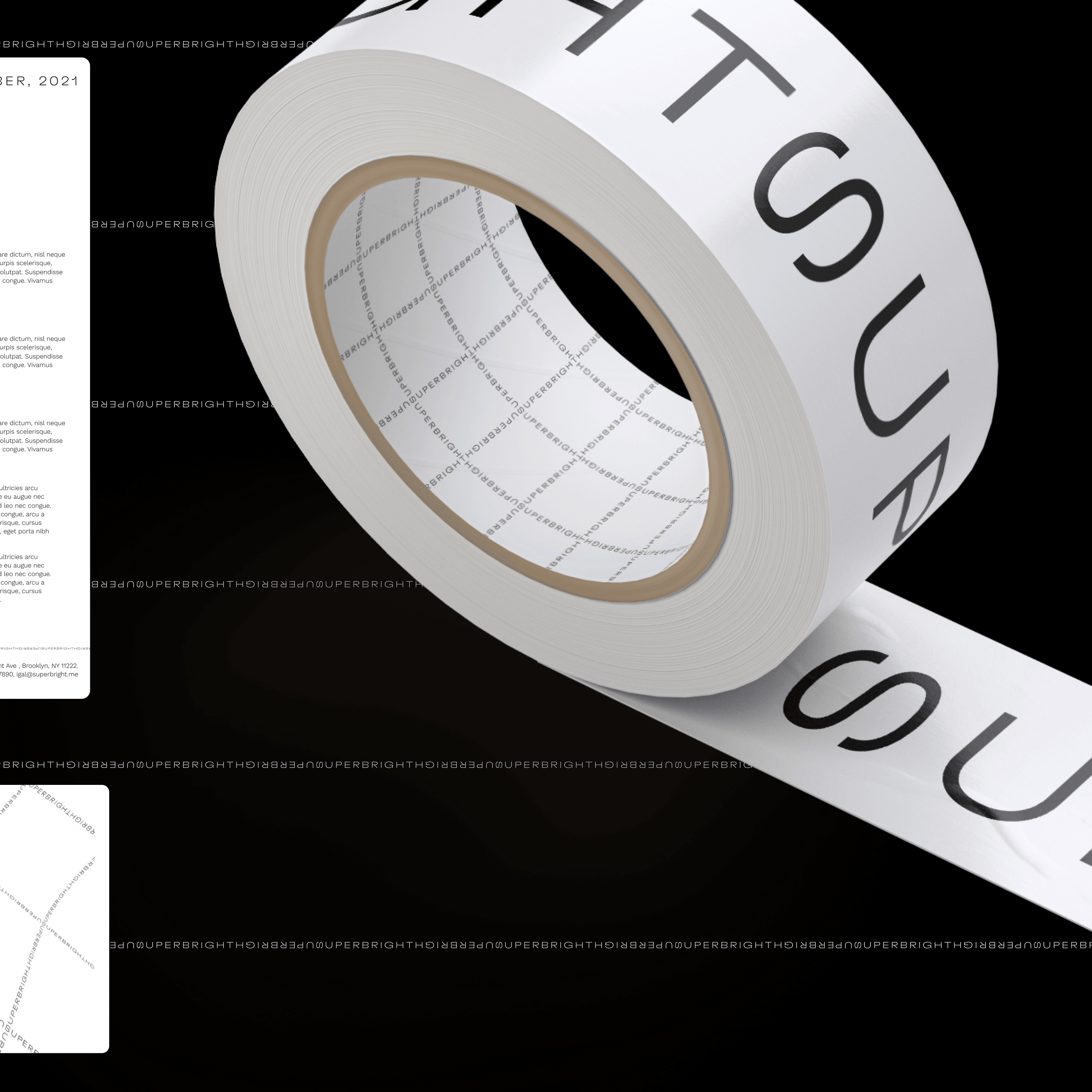
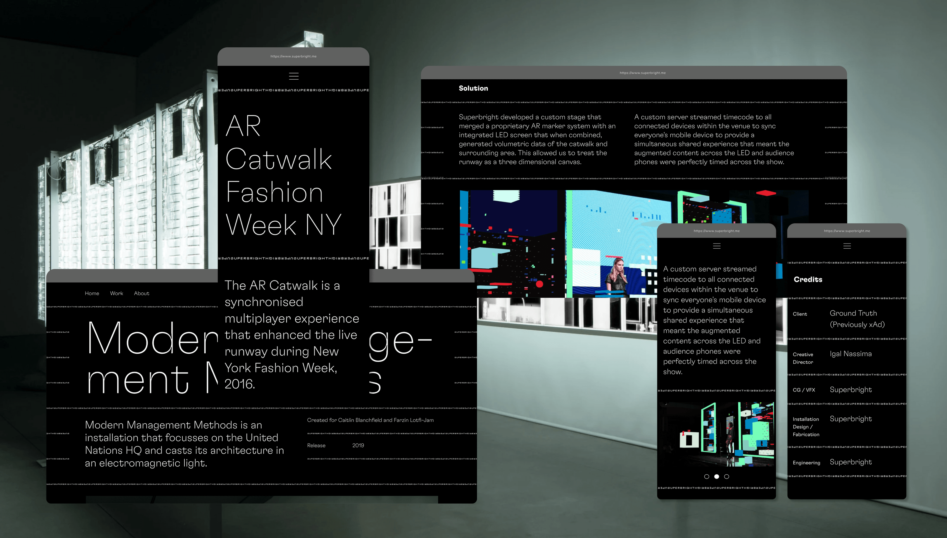
A variety of small but significant typographic decisions allow the letters to tesselate into an infinite material. We make use of a variable typeface, which allows for dynamic manipulation of font vectors. We assign each glyph a square dimensionality, allowing us to rotate the S as the direction of the grid changes. The glyphs in the grid follow a variable weight to provide an illusion of homogeneity to the texture. As the text scales up and down in different contexts, its weight becomes lighter and heavier accordingly. On the website, users watch as the new Superbright logo, with its sideways S, shrinks and then expands, first into a line and then a grid filling the screen. As users scroll, the perspective tilts downward, drawing them deeper into the website. The effect gives a spatial dimension to the page, hinting at the studio’s ability to create places out of a digital void. SUPERBRIGHT remains recognizable even as it takes on a graphic quality as part of the site’s structural material. The website is more than simply a container to hold the studio’s portfolio pieces; it’s an immersive environment in itself that previews components of its technological worldmaking capabilities. In it, SUPERBRIGHT is the interface through which users encounter the studio, the surface on which portfolio projects can take shape. In the physical world, it defines the outlines of t-shirts, business cards, notebooks, and other merchandise objects. The tape we designed covered with the studio logo is a tangible version of what the grid embodies: Superbright as a generative surface.
Superbright as a generative surface
Grounding the Hyper-present
While Superbright’s applications of technology are cutting edge, the studio maintains a humbleness in its role in design and storytelling history. It views itself as inventing novel iterations across a span of disciplines with their own great lineages. To honor this important part of the studio’s identity, we embedded allusions to the past, even throughout the visual language of the hyper-present. The grid material, for example, references historical precedents in the virtual-physical intersection the studio occupies. Think Italian architecture firm Superstudio’s iconic illustrations of impossibly massive grid edifices sprawling across landscapes. Meanwhile, the website’s layout, as well as the variable typeface, follow the Swiss modernist tradition. This gives a familiar navigability to potential clients without sacrificing the more experimental typographic texture, which takes the place of what would normally be solid lines breaking up each section of content.

Website layouts
Solid as a Virtual Rock
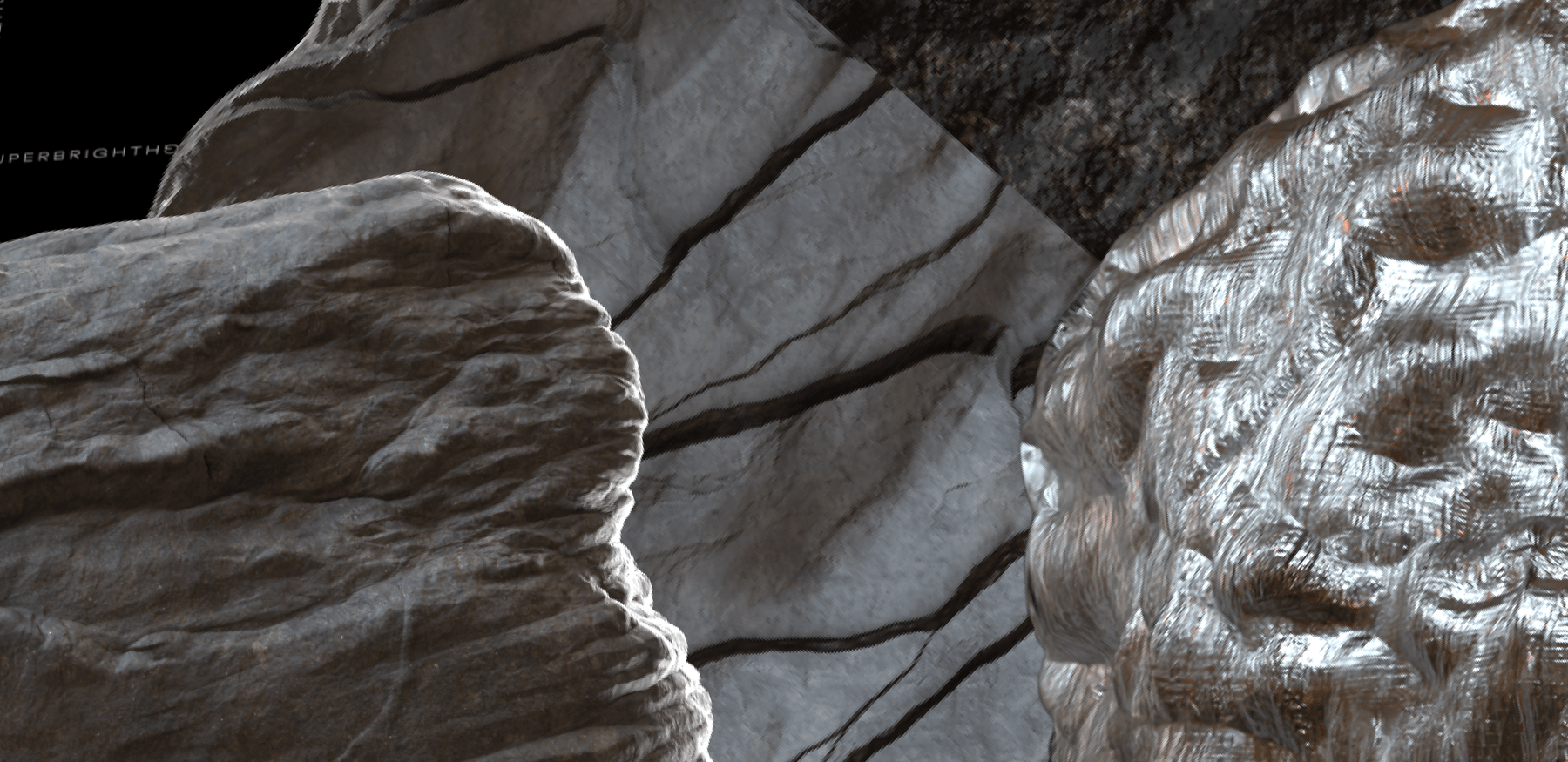
With so much focus on setting this technological, infrastructural stage and laying down its historical roots, we knew that a full portrait of Superbright must show its worldmaking capabilities. Cue the floating boulders. We place multicolored rock models, gently rotating like asteroids in zero gravity, throughout the website. Their organic irregularity and dimensionality stand out on top of the black and white typographic texture, imbuing the page with a further sense of placeness. The effect is real enough for our brains to perceive as “rocks” and “physics,” but springs forth from a set of rules far more imaginative than what’s possible in purely physical realities. The studio’s own artists modeled the boulders from scans of real rocks, then split them into otherworldly slices of contrasting materials. Of course, they’re not found in nature, but each component— the ridges and indentations on each rock; the way the light hits shiny versus matte surfaces; the opacity of the materials— are all painstakingly precise. They hint at the experiences Superbright is able to bring to life. Paired with the rest of the website, the rock forms illustrate Superbright’s breaking of the binary between the real and the virtual. Worlds are enabled in this intersection that are more than the sum of their parts, but they require expertise from both sides that the studio is able to showcase before visitors even see their portfolio.
Multicolored rock models
Worldbuilding for the Worldbuilder
In their own work, Superbright is careful that every new incorporation of technology adds something to the storytelling at the root of the project. No dazzling virtual medium is brought in just for the sake of it. Our new visual language for the studio adheres to the same principle. Each element of the design fulfills the basic task of developing unique recognizability for Superbright, but they also demonstrate a novelty that arises from careful reinterpretation of familiar references. Together, the website and visual language represent abstractly and demonstrate practically that Superbright allows clients to “walk into worlds,” while providing one of its own to serve the studio’s purposes. It is a name that becomes a pattern, texture, surface, and object, creating a language whose distinction is strong enough to disappear into the background when it’s time to showcase another Superbright world.

