A new logo program, visual language, and website bring the human element forward for the people-first Processing Foundation. With a blend of art, play, and technology, the new brand honors the organization’s 20-year legacy while preparing it for its next phase of growth.

The Processing Foundation acts as a bridge between the fields of visual arts and technology, working to make the use of software accessible in the arts, and the arts present in technology, especially among underrepresented practitioners. It’s been building this bridge since 2001, with the release of its program and coding language Processing. In the 20 years since, Processing has been a deliberately unfenced introduction to tools that can otherwise be intimidating for students, artists, designers, and other beginners.

Processing Community Day 2017 held at the MIT Media Lab
“Community” is a word that gets thrown around so often that it can mean nothing, but The Processing Foundation has actually built something real and human around its vision for technology. In time for the 20th anniversary of Processing, Design Systems International updated the visual language of the Processing Foundation and its projects with new logos, colors, typography, and a website for its Processing project. A new visual identity would need to support the existing community base in flexible, easy-to-adapt ways, while amplifying the message of accessibility of this teaching tool to future friends, students, and colleagues.
The new visual language speaks to this wide spectrum of users in a language that’s already been set by Processing itself: a blend of art, play, and technology that’s extremely friendly to new coders, familiar to longtime fans, and functional for all. True to the dynamism of the Processing Foundation, the final design is programmatic, rather than a static set of images, and covers a new visual identity, a program to derive logos, and a custom set of tools.
The new Processing logo and its wordmark.
Logo as Program
The Processing Foundation is ever-changing, containing its multiple software projects with the potential for more initiatives in the future. For an organization that’s concerned with lowering barriers of the creative cutting edge, the new identity allows for infinite newness in the form of a custom logo program which produces logos according to a set of simple rules. An 8x8 grid functions as a canvas legible to machines. The program is limited to drawing only sets of three lines connecting the intersections of the grid. The program can draw curves, but their bezier handles must also fall on intersecting points.
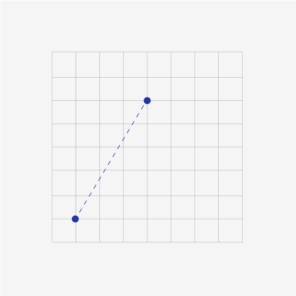
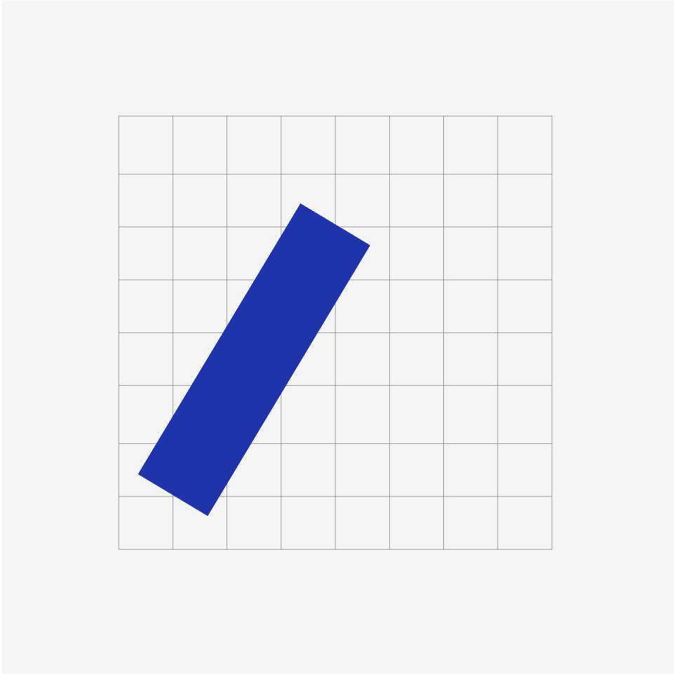
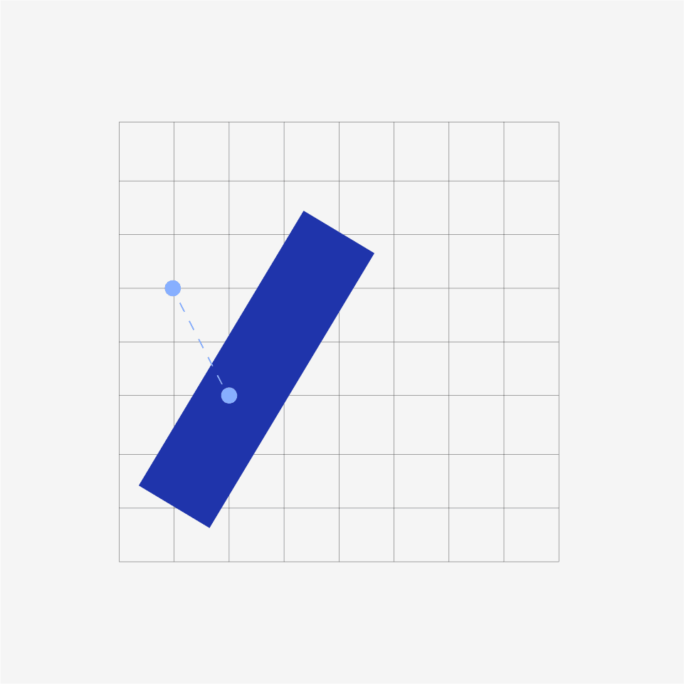
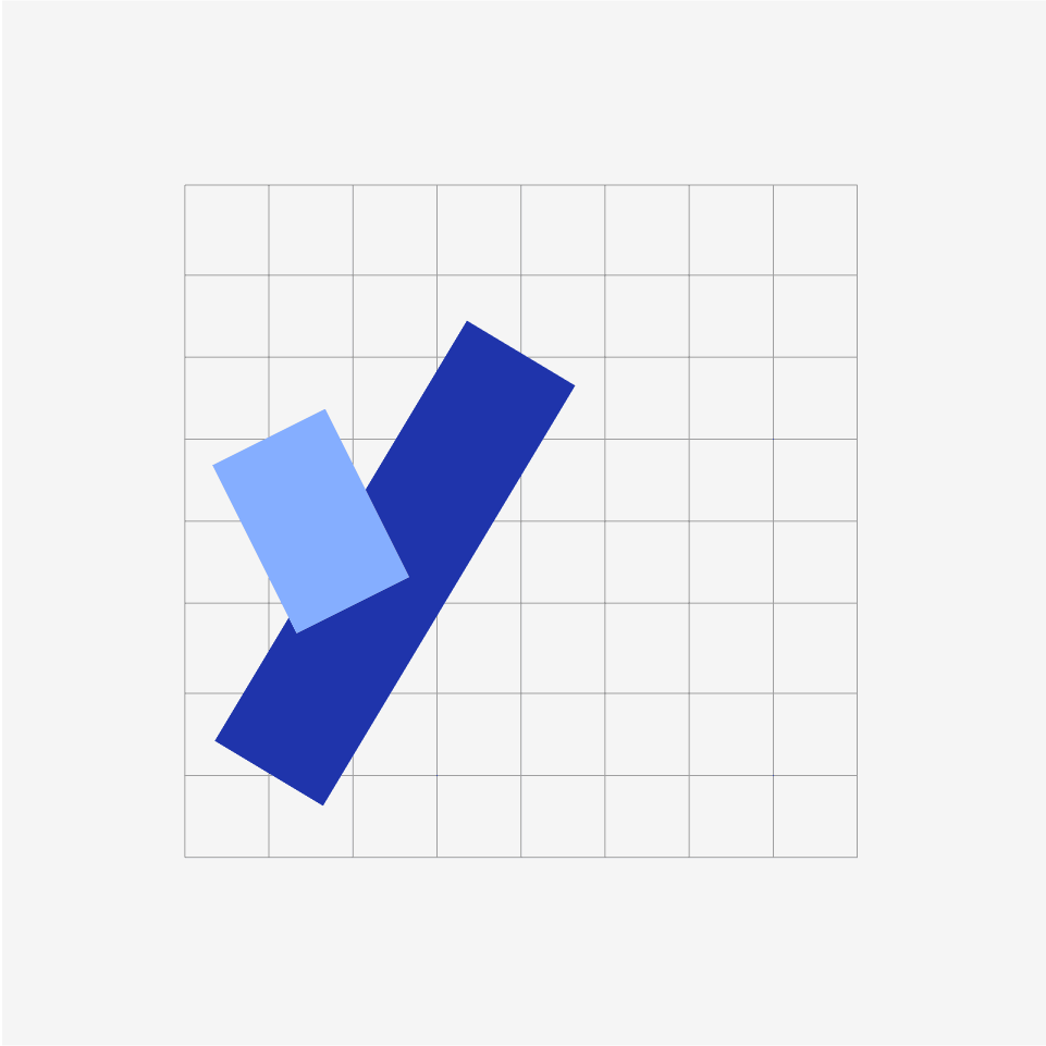
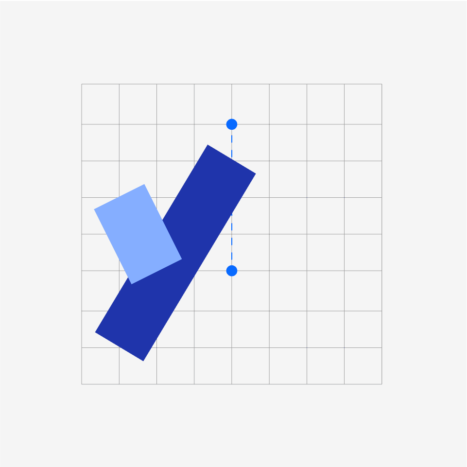


Lines are drawn at 1.5x the thickness of that of the grid modules, and with flat ends. Within these constraints, infinite combinations of intersecting lines can be made. Depending upon the shapes and colors chosen, the sea of potential logos turn into Rorschach inkblots eliciting everything from wiggly mascots to minimalist polygons without forgoing a visual continuity across all areas of the organization.
The logos can easily be expressed in Processing code. Feel free to play with the program yourself.
The logos can easily be expressed in Processing code.

In the Processing Foundation logo, one long squiggle connects two vertical lines in a purple hug. The logo puts across the spirit of collaboration and knowledge sharing across backgrounds, identities, and generations.

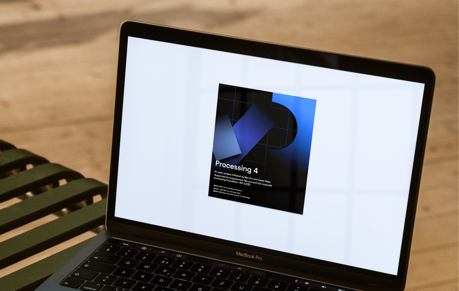
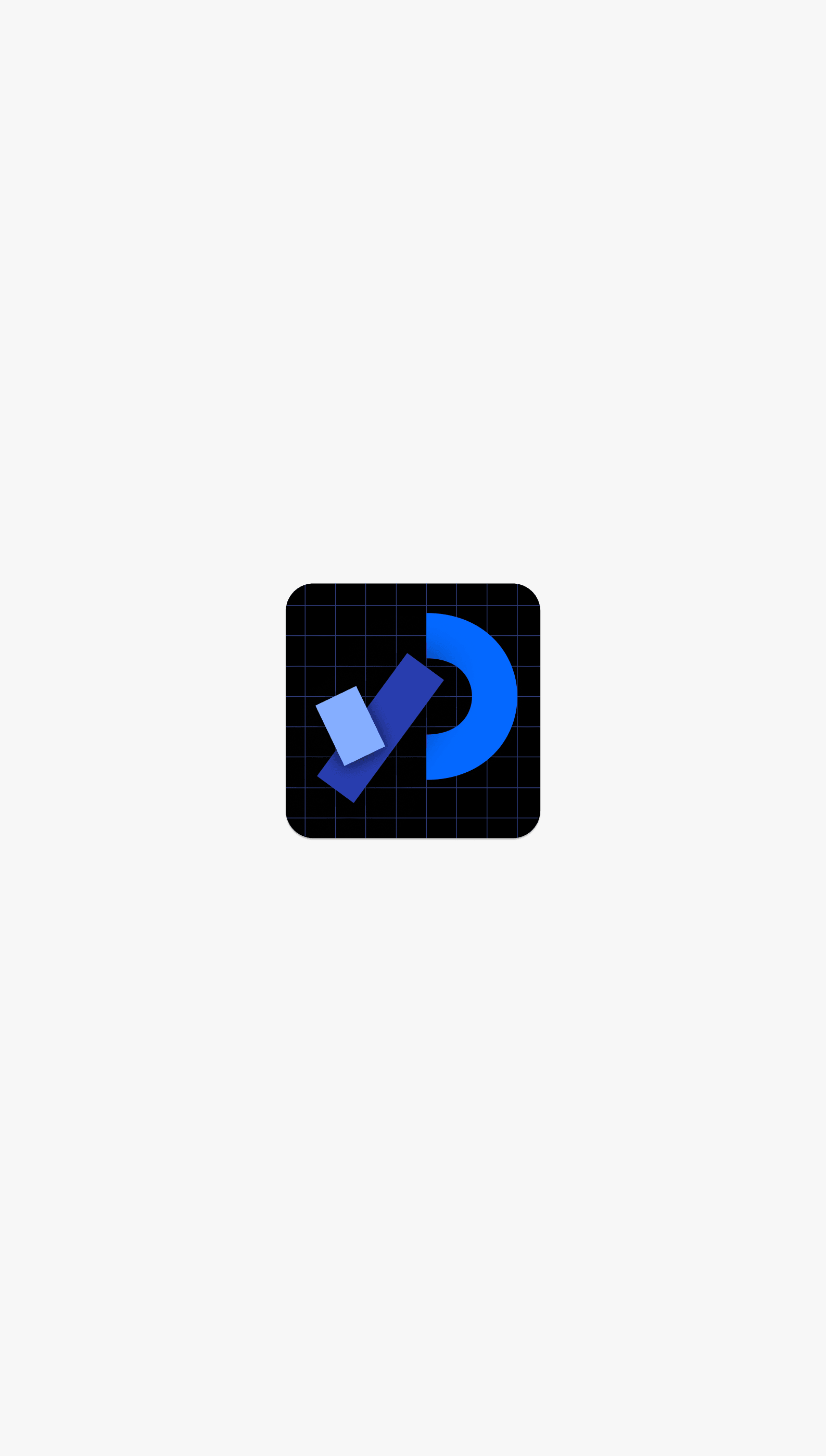
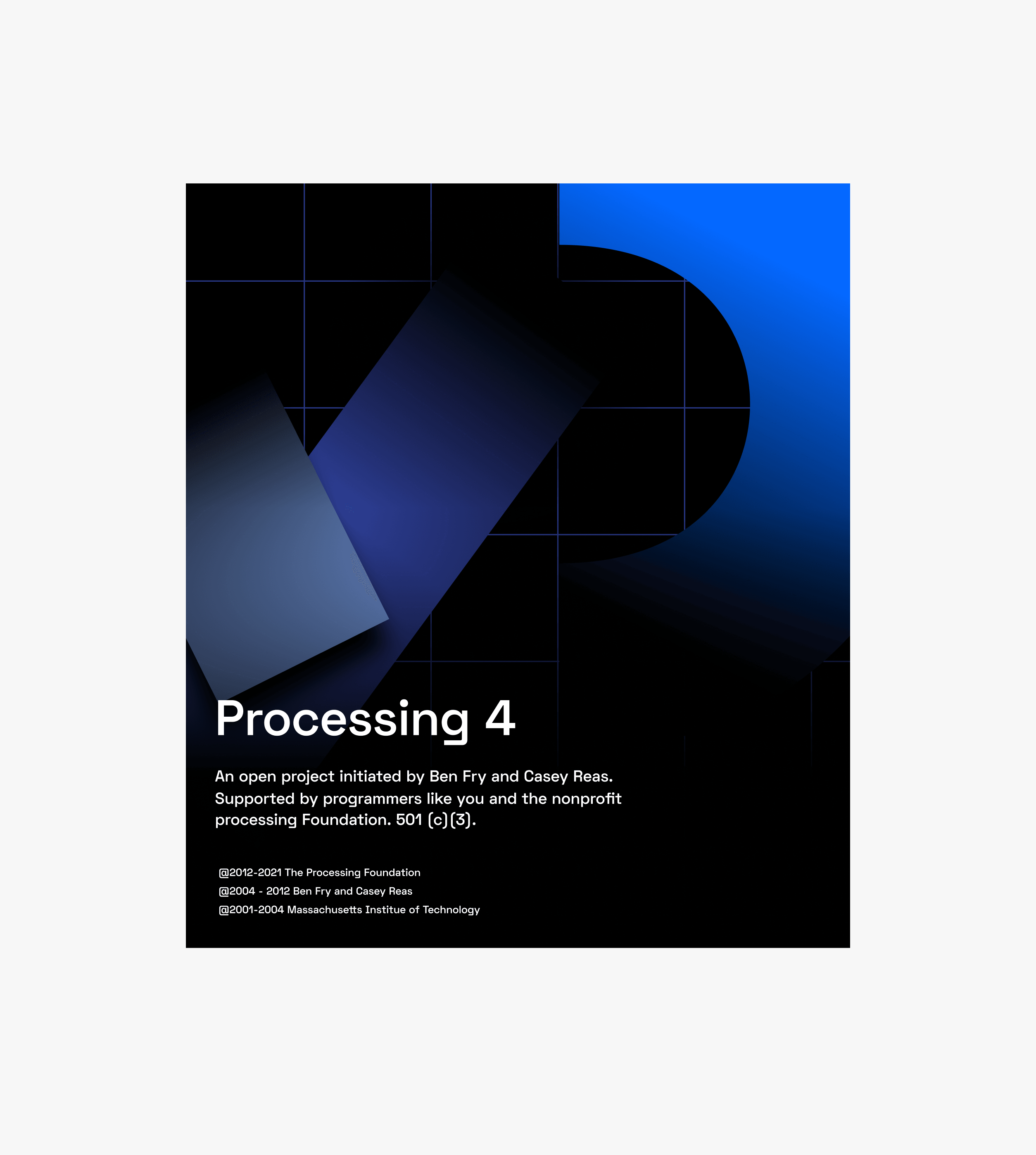
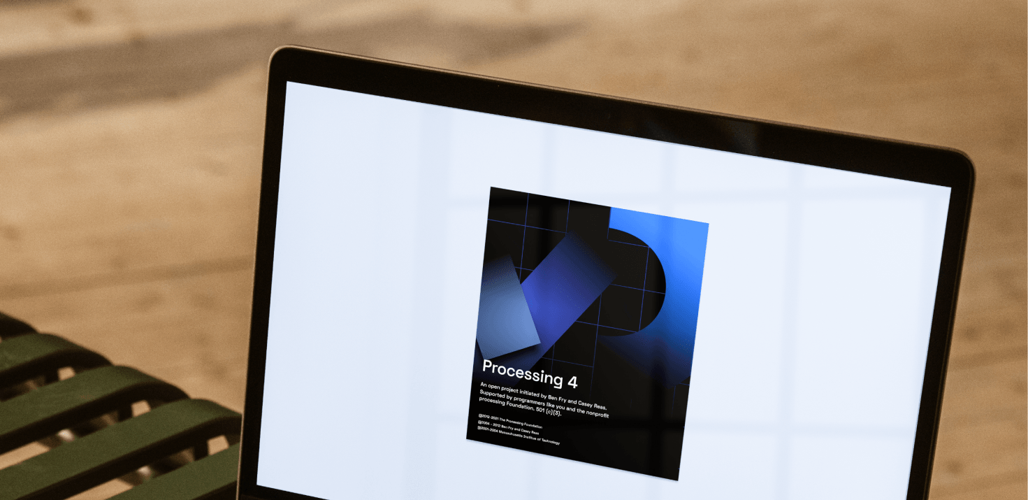
The Processing logo balances legacy and a forward-thinking vision by reviving its former P logo with subtle tension and playfulness brought on by projecting it onto the grid.

The Processing Android logo uses the logo program to draw a visual connection with the classic Android character.

The Processing Python logo draws resemblance to a snake, loosely referencing the classic mirroring snakes in the Python logo.
Across all logos, the grid remains the invisible, unifying background, while the shapes themselves evoke friendly-faced zoomorphic cartoons (and yes, we did try putting googly eyes on them). The updated color palette of blues, purples, and pinks is familiar to longtime Processing fans and still provides enough of a poppy kick to stand out in visual materials meant to help grow the diverse community. Apart from these three fixed logos, our system can be used to create endless icons across the Foundation, be it additional logos for future projects, educational materials, merchandise, or communication pieces for Processing Community Days. An interactive sketch of the logo system is also open to all users via the Processing website, enabling anyone to hack the logo and create one of their own.
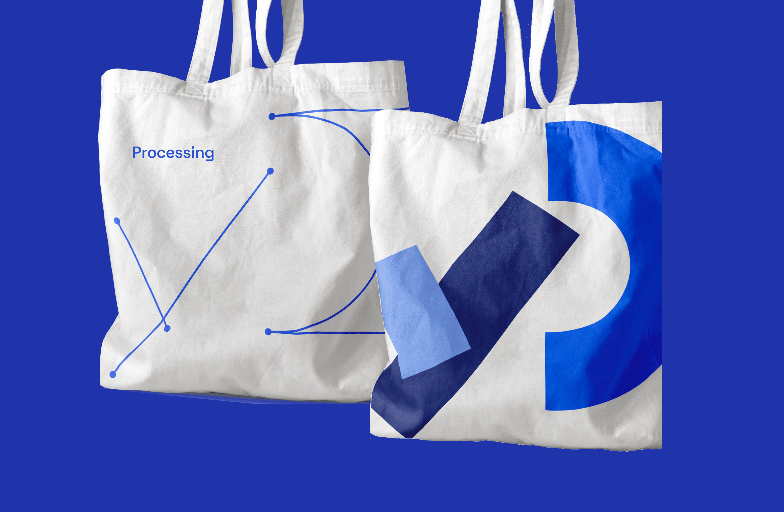
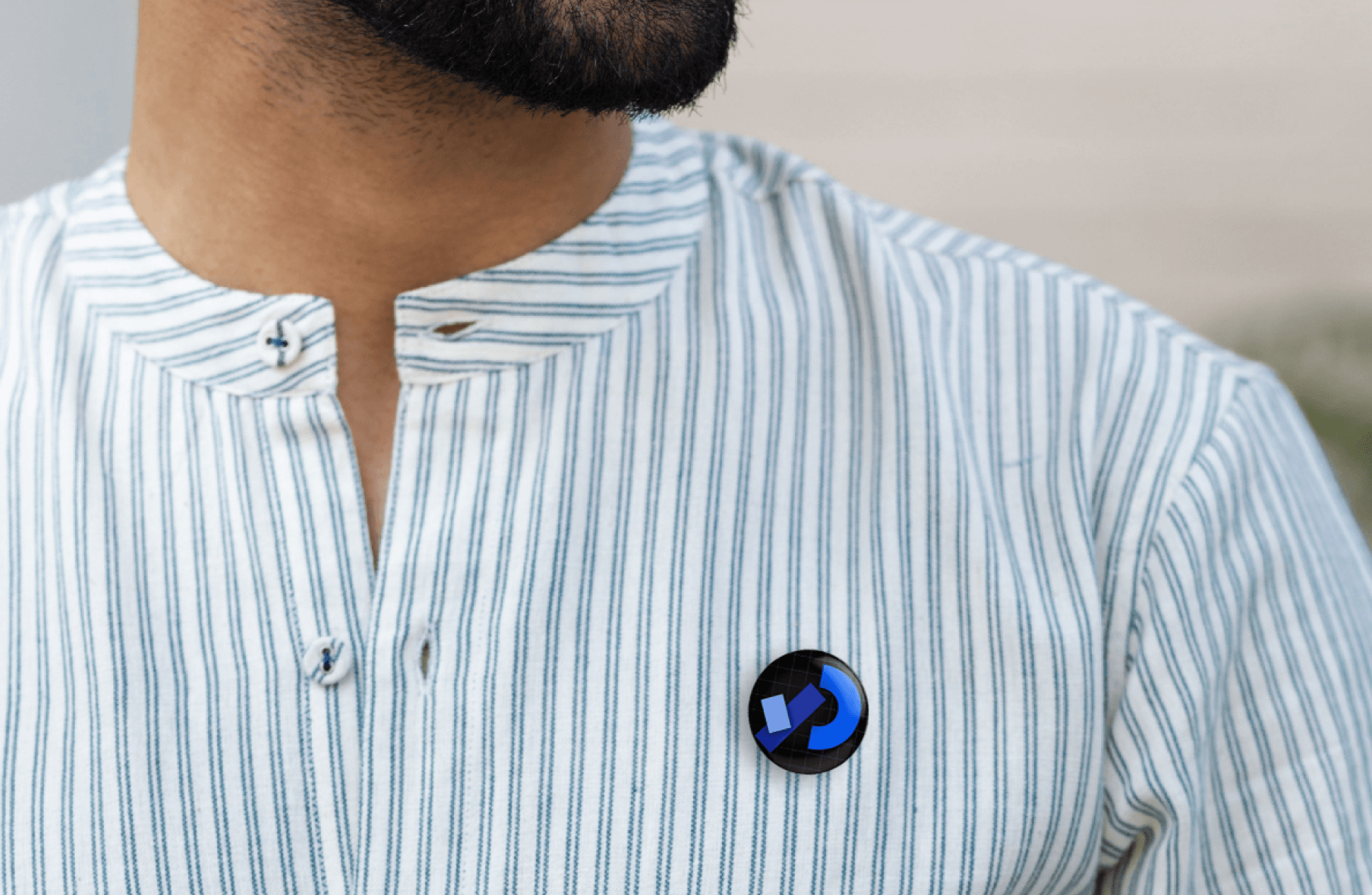
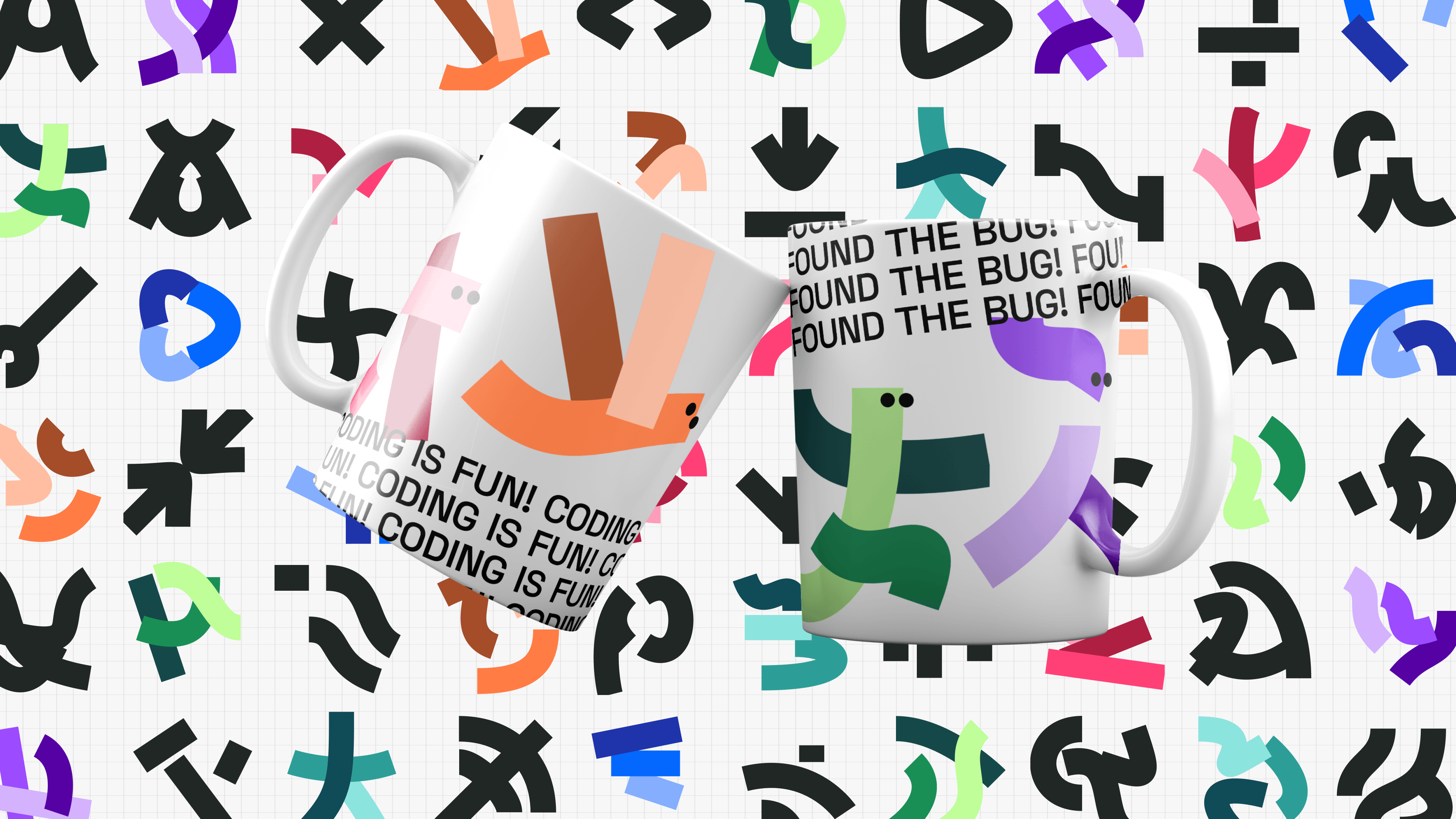
Mugs
A Website Based around Open-source Ethos
If the logo uses a custom program to introduce users to the open source, creative spirit of the Processing Foundation, the website is the interface through which those promises are fulfilled. The Processing and p5 websites are crucially functional tools for their community members. They host example projects, tutorials, teaching materials, and a reference library detailing how to use the programming languages. Processing is entirely open source and truly co-produced by their users, whose work influences future iterations of the libraries. The new website takes conceptual and visual cues from the logo system as it exposes its existing community backing in an accessible, fresh style that shows cohesion throughout the organization.
As soon as users enter the new Processing site, they are greeted with a fully interactive version of the logo program, matching Processing’s open-source identity by giving visitors a transparent x-ray view of the program. The source code opens next to the Processing “P” logo, with each mutable line of code highlighted to invite some messing around. The logo changes with each tweak of the code, with some special annotations, like the temporary appearance of bezier curve handles that will feel like home to visitors coming from more traditional design tools. The user’s tweaked version of the logo is automatically saved and set to reappear on any subsequent visits to the site. The success of the logo program is constituted around the same truth as that of Processing: technology is not merely passively received, but something everyone should be able to shape. New users’ very first experience of Processing is thus not only a pain-free experience with code, but a customization of its visual identity – something that is so tediously inviolable to most any other organization.
A library of UI components helps bring the new Processing identity to the forefront of the new processing website.
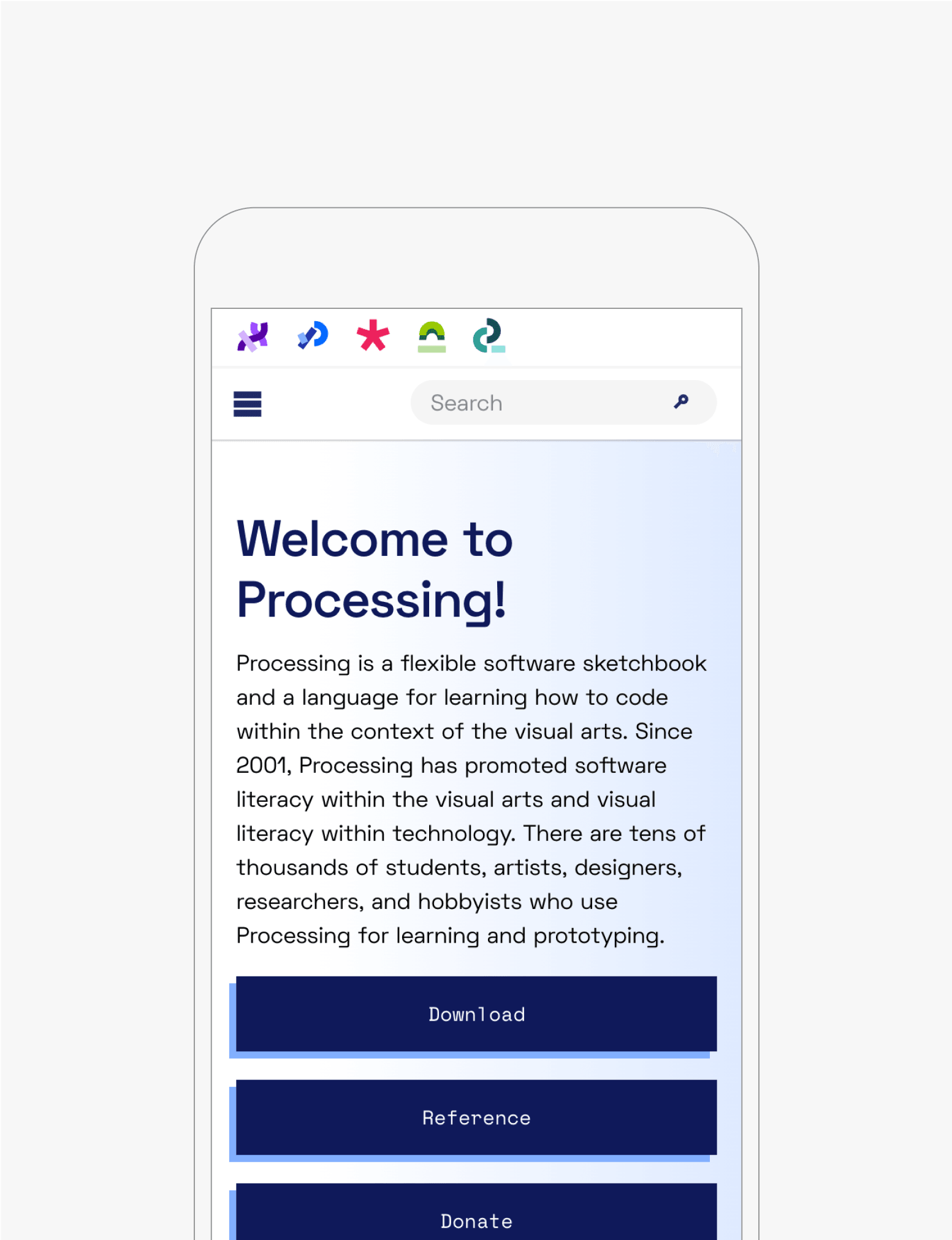
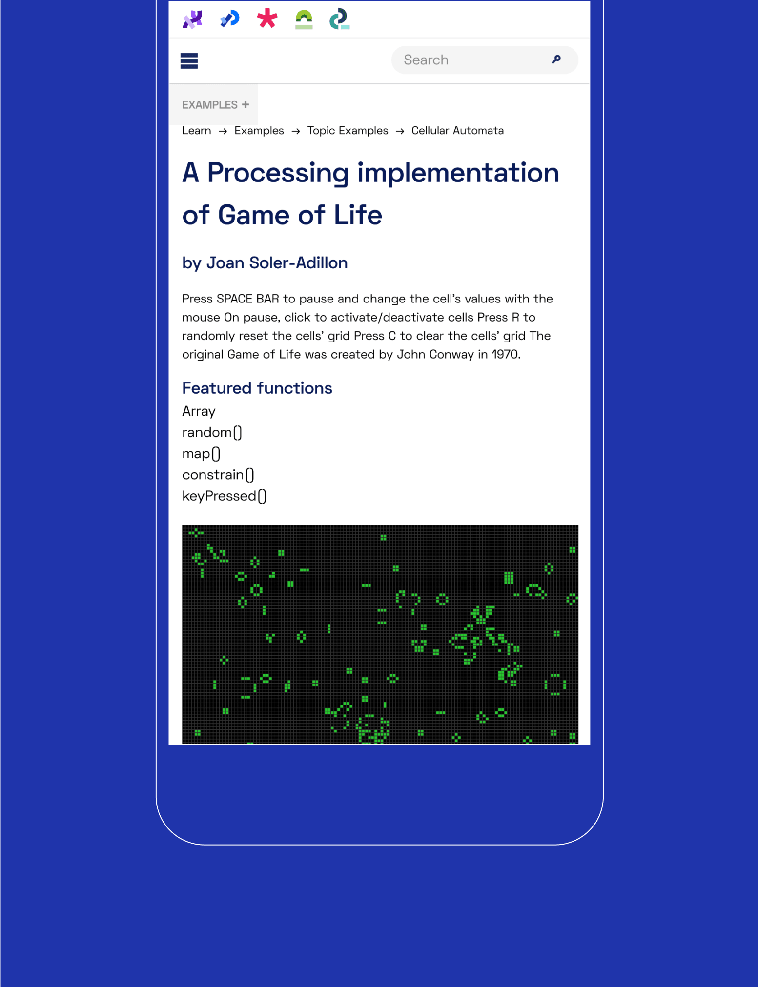
The new website is accessible on screens of all sizes.
Processing itself is a deeply visual software intended for the visually inclined. It’s an IDE, or integrated development environment, meaning it provides an interface on which users can both write programs– called sketches– and see their visual output next to the code. User-authored examples of creative Processing sketches are plentiful, and the new website unsheathes these example sketches from behind their text descriptions and brings them to the Processing homepage. Visitors can click on each visual to view its interactive sketch and the code behind it. The result is image-forward, true to the software.
Supporting Processing’s Next Phase
This project brings Processing’s ethos of accessibility, which has been in the making for two decades and is upheld by a dedicated international community, to the forefront of its entire visual identity. The logo system is open to everyone. The website code is fully open source and available on GitHub. From the zoomorphic shapes produced by the logo program to the clean and functional new website, the Processing Foundation and its projects come across as so warmly inviting, you’d likely never realize the complexity of the underlying tools powering the new visual identity. And that’s exactly the point. What matters– open access, learning, creative co-creation, and a space for community– stands in the foreground, and these systems are there to simply enable them. The new visual language honors the history of the organization in stylistic nods to the orienting goals it has held since inception, while bringing it up to date for its newest set of co-producers. This new logo program, website, and visual identity serve as a solid preparation for the Processing Foundation’s growth as it enters its next 20 years.
