Creating an environment of trust between a one-of-a-kind research laboratory and its diverse audiences through an expansive brand system.
PHOTOJOURNALISTS ON THE STREETS OF ALGORITHM CITY
Launched in 2022 out of Princeton University’s Center for Information Technology Policy (CITP), Digital Witness Lab is pushing new, innovative approaches to public interest investigations through tools that help independent journalists and researchers investigate instances of misinformation and harms in digital technology.

Digital Witness Lab is a program at the Center For Information Technology Policy (CITP) at Princeton University.
The lab’s core values center on collecting hard-to-reach data and making it accessible to a global audience. They needed a robust visual identity to embody those values and reinforce their credibility as an approachable source of trust in exposing how digital technology impacts society.
“We’re proud outsiders, bridging silos in journalism, education, and tech to carve out a distinct identity beyond our academic roots at Princeton. We needed a credible identity capable of communicating the same.”
THE PATHWAY FORWARD STARTS WITH A NAME
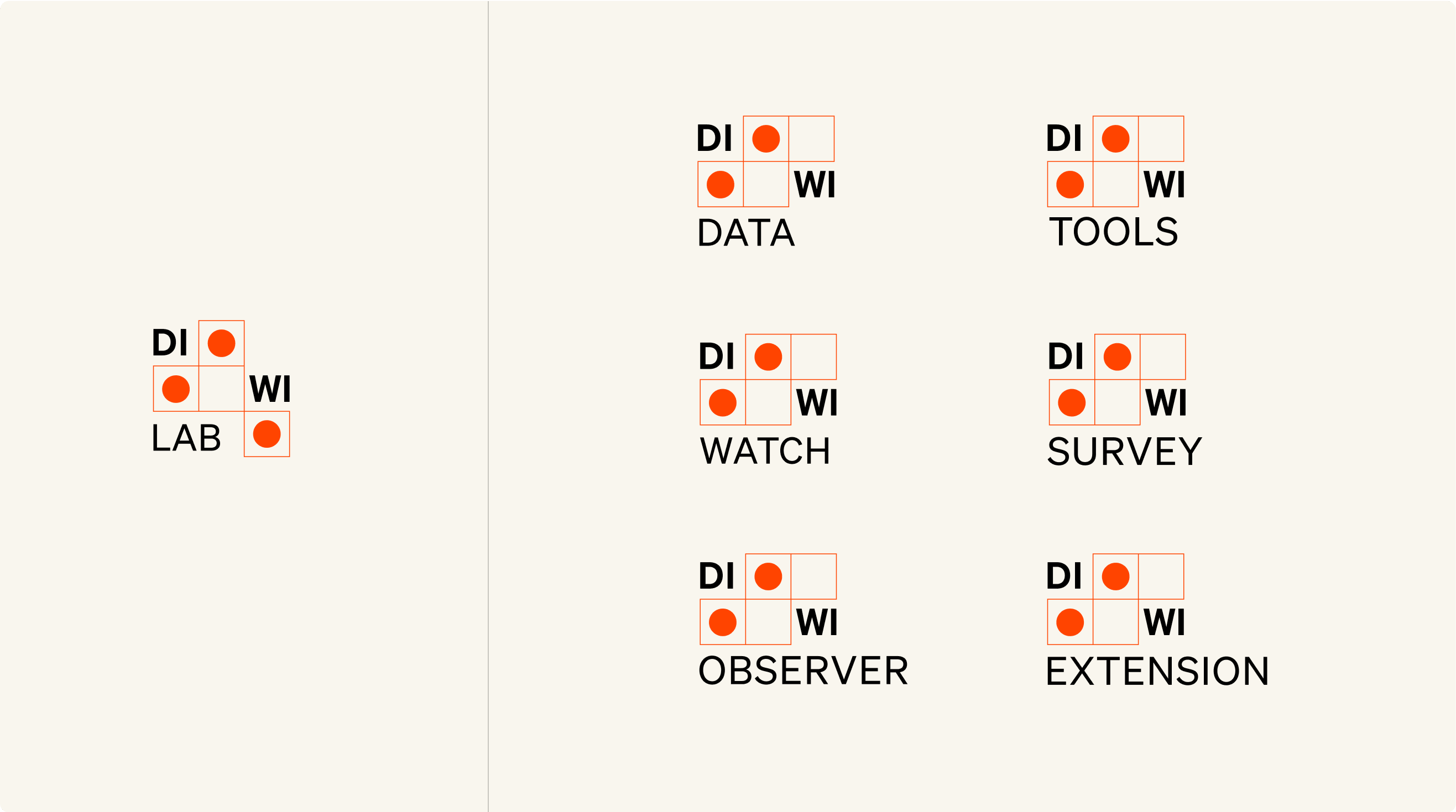
Digital Witness Lab needed a shorthand version of its name that was succinct, up-beat, and inclusive. To help strike that balance between technical precision and approachability, we based the brand around a condensed, more welcoming version of their name: Diwi Lab.
With the updated name and logo, Diwi Lab’s brand becomes instantly recognizable, enabling them to take ownership of their visual identity — especially as they expand into other sub-categories and products.
A WORKFLOW ROOTED IN LOGIC AND PRECISION
Enabling a smooth and simplified process through human-computer collaboration ensures the brand would thrive in digital ecosystems while remaining vastly flexible across screens and platforms. A friendly custom tool was set up for the lab so they could extend their visual language across mediums with ease, lending them greater autonomy over how their core brand elements show up in the world.
SIMPLIFYING THE COMPLEX
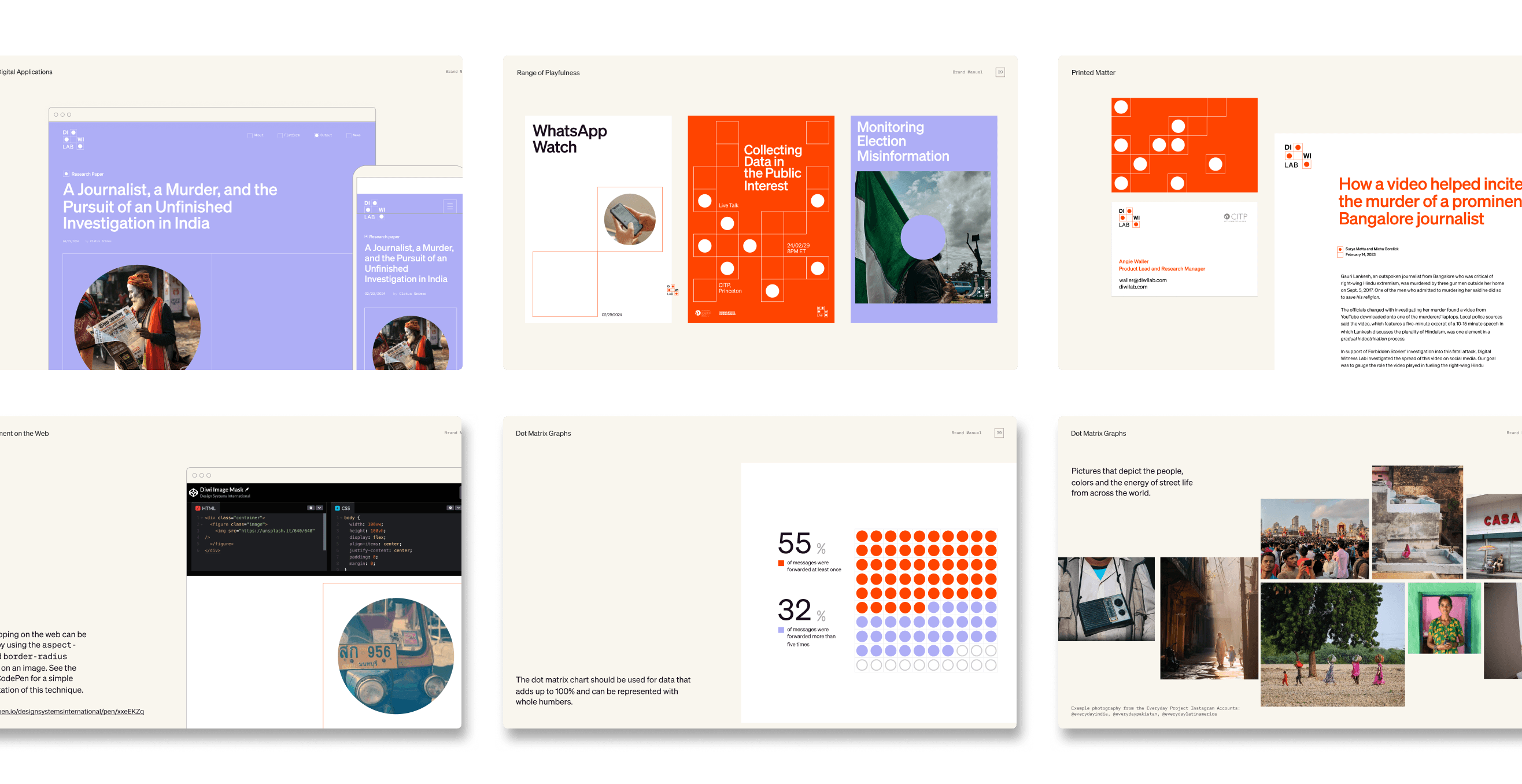
Defining a compelling narrative for the unique communication needs of the Lab , from graphs to strategies helped mitigate the complexity of the data. Effective compositions in line, bar, and dot graphs channeled the flexibility of the grid-dot structure.
“Our custom tools are in the service of workflows that make people’s lives easier. We don’t make them in a vacuum but rather see them as an extension of a brand’s core expression.”



MEASURING A SYSTEM'S SUCCESS
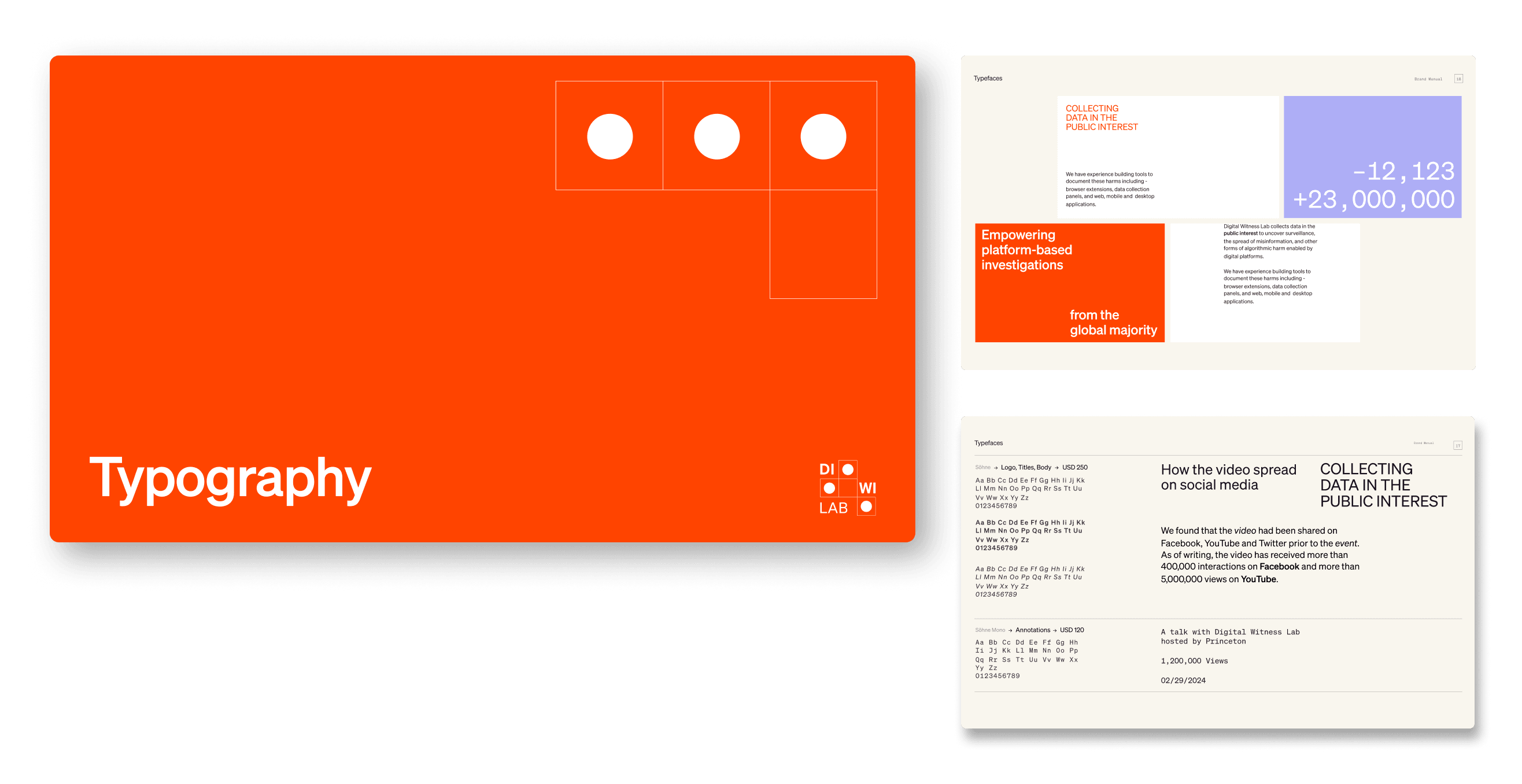
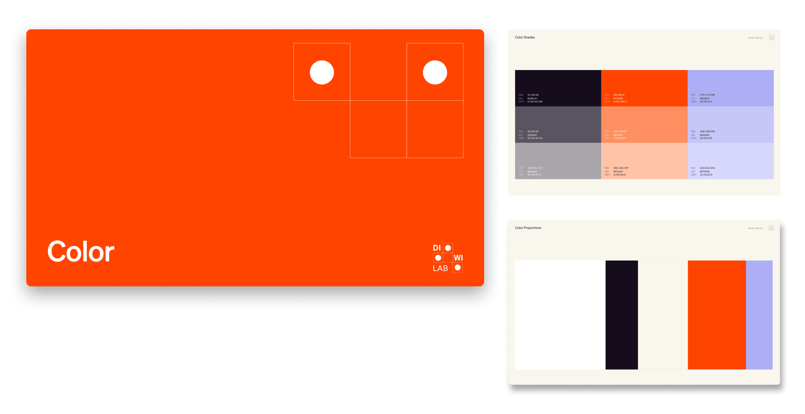
The equal parts design and data-driven systems approach allowed for a seamless handoff process. Both internal and external teams can successfully adopt the brand and own the system as it evolves across touchpoints. You see this in applications across the web from social media to the website and blogs.
“It is always our goal to design forward-looking visual systems that have longevity. As DiwiLab grows and reaches new heights, so too can its brand.”
