Systematizing Byrne's The Elements of Euclid
While working at DSI, an activity that has come up in a couple of projects is what I call to "systematize" visual design. We're used to design systems over here, but we usually come up with the system alongside the design. This specific activity puts an emphasis on a starting point where the system, or "rules" that govern the system, don't exists or are unknown. The goal here is to uncover these rules based on example cases.
Systematizing is an activity I personally enjoy. It's about finding visual patterns, understanding them, and testing what else can be created from them. It's like trying to discover a hidden truth behind visual clues. This post is about a little systematization exercise I did based on a book I got a couple of years ago.
Byrne’s Elements of Euclid
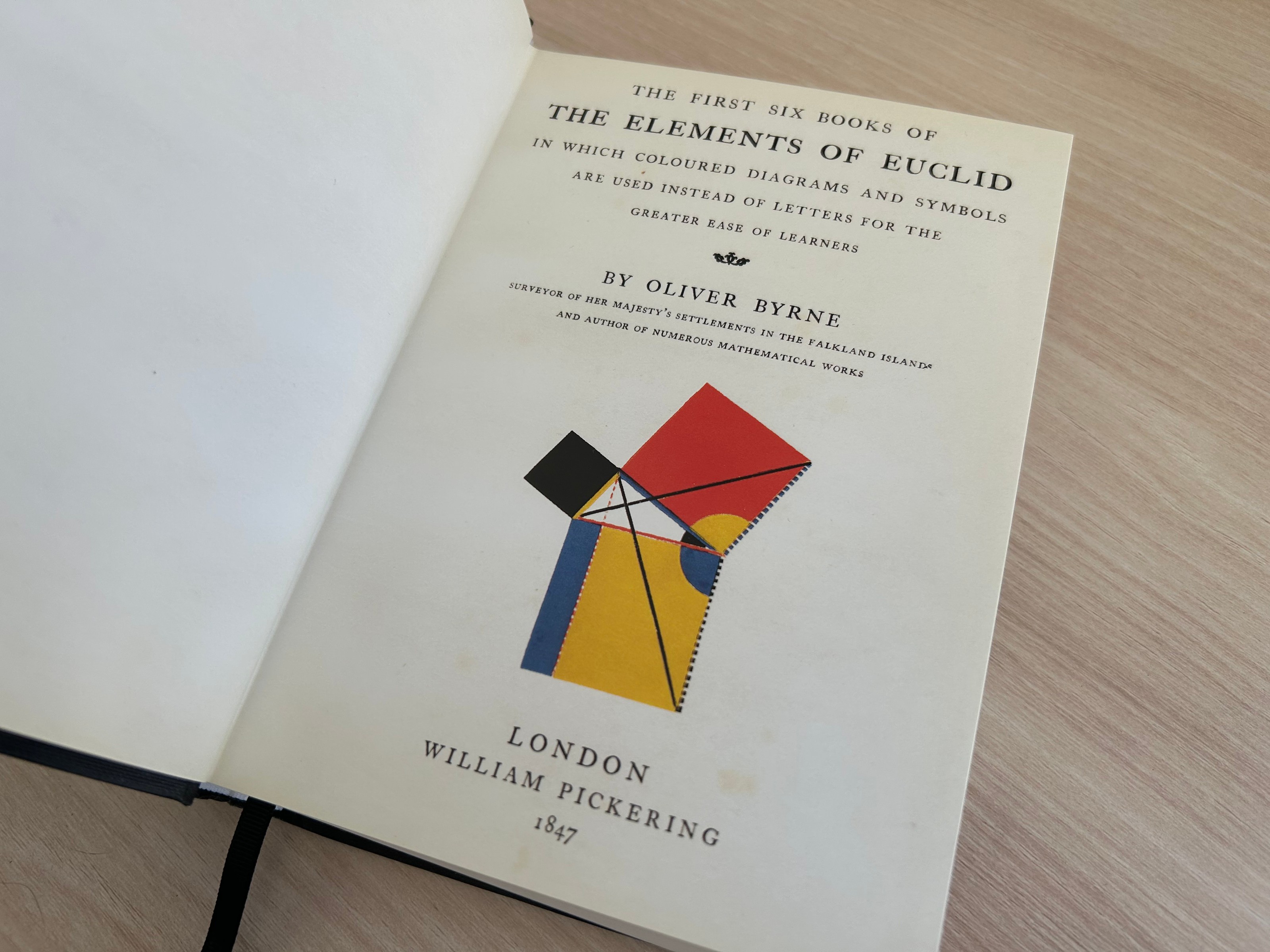
The cover page of my copy of Byrne’s Elements of Euclid.
Byrne’s Elements of Euclid in a re-edition of the first six books Euclid, which was originally written around 300 BC. The original 13 books are one of the oldest and still standing math books, and talks about geometry and number theory.
David Byrne’s edition was published in 1847, and it's a striking piece of literature. Not only is it faithful to the original piece, but extends on it's readability by adding beautiful and colorful illustrations to demonstrate proofs, instead of the original plain soup of letters that can be hard to read.
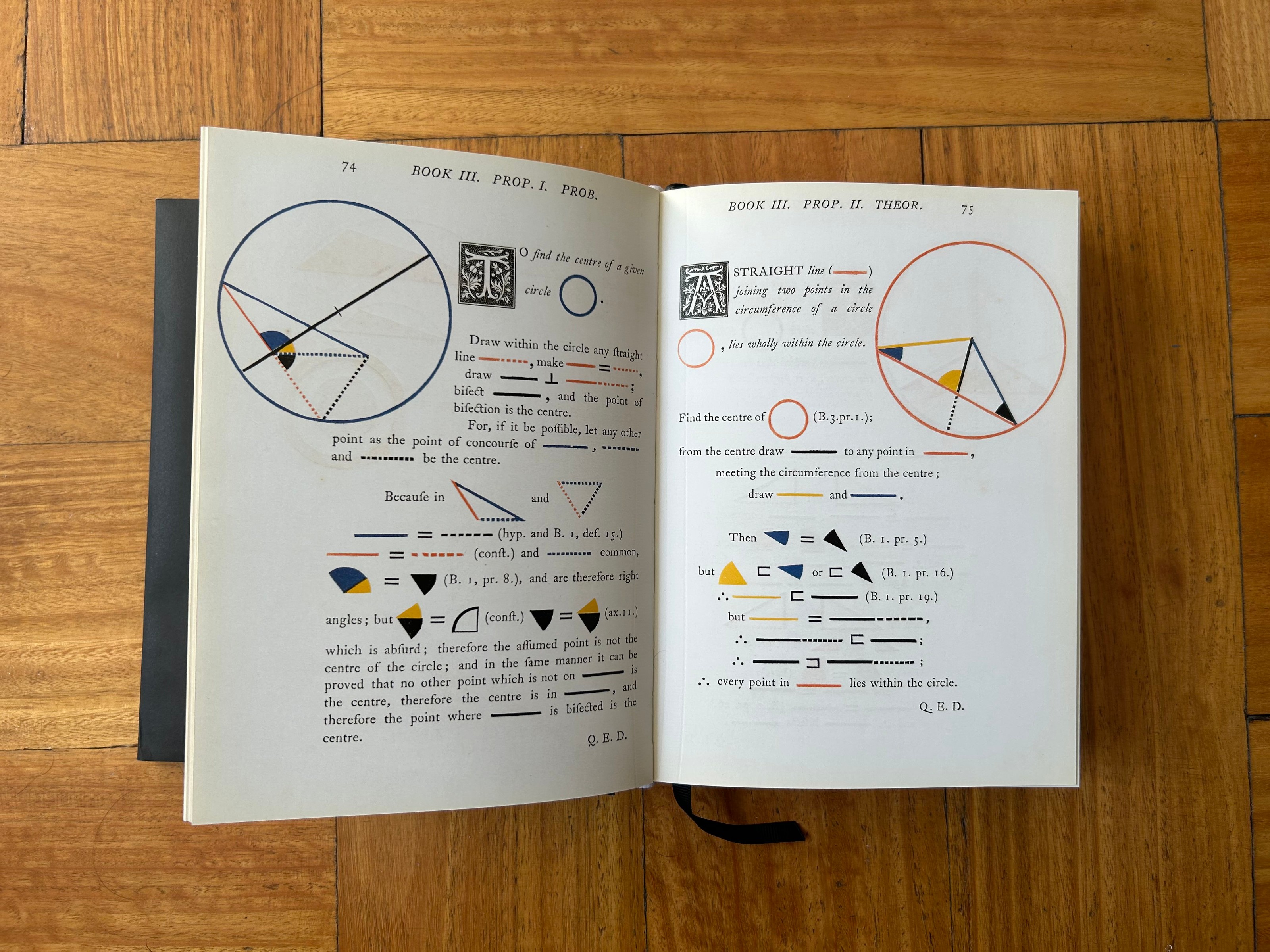
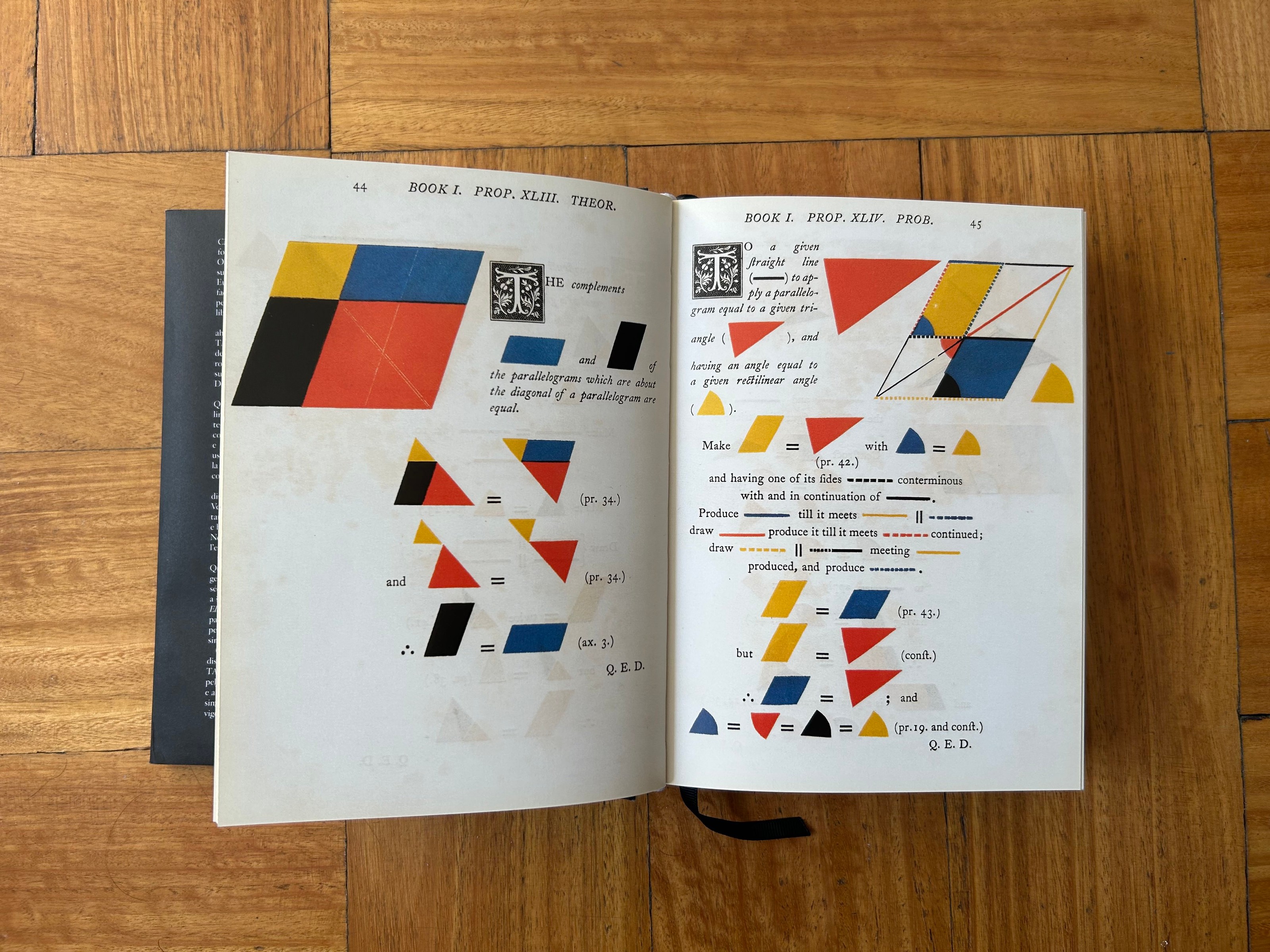
I was captivated by these bold illustrations of geometric shapes, and took it upon myself to try to build some kind of system for it and gain the ability to generate these kind of diagrams.
Systematization
My goal wasn't necessarily to create an all encompassing graphing system, since there are way too many types of diagrams in this book. Instead, I tried to build something that would produce interesting results or where I could learn about the system itself. Those are still big goals.
I had to start somewhere, and as with any task that seems too big or broad, I started off small. First, I decided to use React and SVG as my rendering mechanism inside of a Mechanic project, and I figured out how to render the basic graphic elements needed, which were just basically two: straight lines and arcs. These seemed to be the building blocks of the system.
Both of these can be achieved pretty directly using SVG paths and lines. Arcs were tricky initially, trying to figure out a way of defining paths based on center coordinates, spanning angles and spanning radii. To achieve creating them, I would create simple scripts that randomize basic aspects like position, angles and colors, which helped stress test the underling components.
Exports from building blocks explorations.
After these basic exercises, I felt comfortable enough to try creating my first diagram. I went with a simple one: line intersection and angle diagrams. I chose these because in a similar way to the building blocks, they felt like a pattern that also repeated in a multitude of diagrams. Broken down, these consist of lines that meet and form angles between each other. The lines are usually different colors, and the angles are sometimes marked with arcs which usually have their own colors, and sometimes are fully filled or are annular.
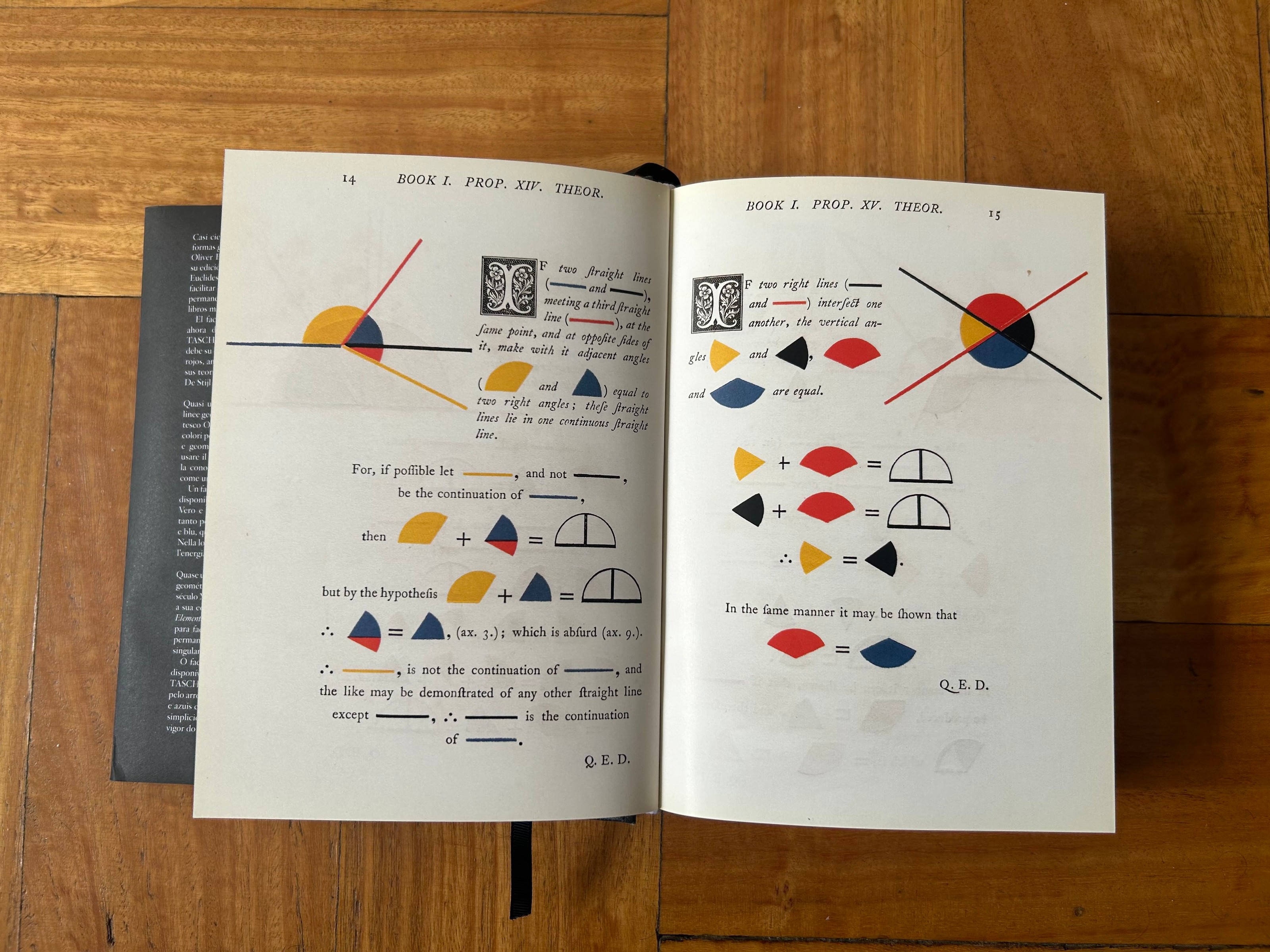
Photo of page 14 and 15 of my copy of the book, showcasing two line intersection and angle diagrams
To better explore and test the results, I took a generative approach to structuring the scripts. This meant a lot of work on randomization while adding safeguards to ensure the results felt close to the inspiration. Some of these limitations included: making sure angles between lines weren't too small to be appreciated, that there aren't repeating colors in intersecting lines, repeating colors in adjacent arcs, or making sure there's at least two lines and one angle in every output.
Four different exports for line and angle diagram function.
The randomization work got pretty tough, but when achieved, the results were very satisfactory. This type of diagram felt like a great result on it's own, and a great representative of what it would take to code some of the more complex diagrams.
We've included a little generator of this diagram in this article, feel free to explore and check how the randomization constrains are met in different outputs.
After completing it, I was curious to see how placing multiple of these diagrams side by side would look like, so I built a separate poster function.
Export of poster function that fills space with simple diagrams.
I then plotted these diagrams in different scales with my pen plotter to see how they looked printed out. The very small ones felt the best, probably because of the nice ratio between the trace width and the overall shape.
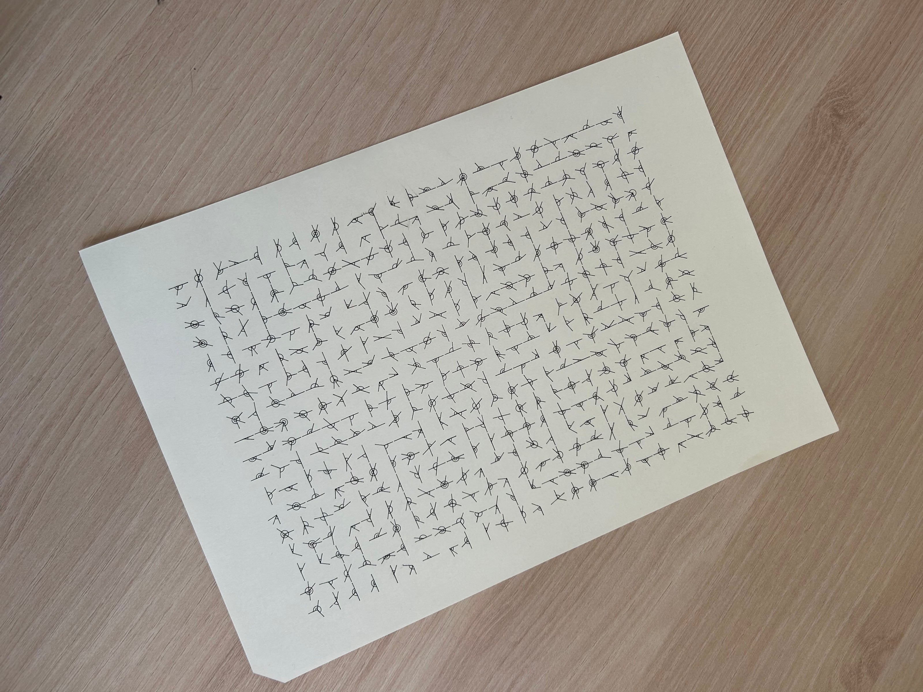
Black pen plot of poster variation.
After this, I tried with two shape diagrams, triangles and circles. These felt like the natural next step to understand how building shapes in general would look like. A lot of the randomization work was indeed especially useful and reusable for these diagrams.
There might be more to come, but the base work to build larger and more complex diagrams is somewhat done. I envision the next step could be creating shape diagrams with extra appendages or internal dissections, which at the end of the day are all lines and arcs. After this, most of the diagrams seen in the book should be achievable.
Mechanic as an exploration tool
The original objective of Mechanic was to be able to create tools more easily, but through this experience I realized it's also a great sandboxed environment that allows for easy and rapid iteration, testing, and explorations.
A Mechanic project is made up of "design functions", and in this context, each function can be thought of single exploration, and a UI will be created for each one that allows to see how the code and results look.
Screen recording of running project showing all functions created.
To summarize, my approach was to start off with the core building blocks, creating a couple design functions to incrementally build and test them. I then created a function per diagram or composition, which I could extend upon in the future.
You can find the source code for the Mechanic project and the overall progress made (and any updates) in this repository. Below, you can find case studies on client projects that also involved systematization and the use of Mechanic for tool building.
