The User Experience of Design Systems

Thanks so much. Tries to tell joke. I’d like to thank the organizers for inviting me to come and speak. I’ve lived in New York City for the past 8 years, and enjoy coming back to Denmark to meet other designers. This event is especially interesting to me, because I used to work at O’Reilly Media who …

… who organizes FOO Camp – which I believe is the original unconference – and many of the ideas I’m going to talk about today were informed by conversations I had over the years at FOO Camp. So I’m really excited to participate in this event and talk to a bunch of you.

Before we dive into the talk, I want to briefly introduce myself. My name is Rune Madsen, and I call myself an artist, designer and educator who use programming languages to automate systems in art and design.

I have worked at the New York Times developing interactive features for nytimes.com…
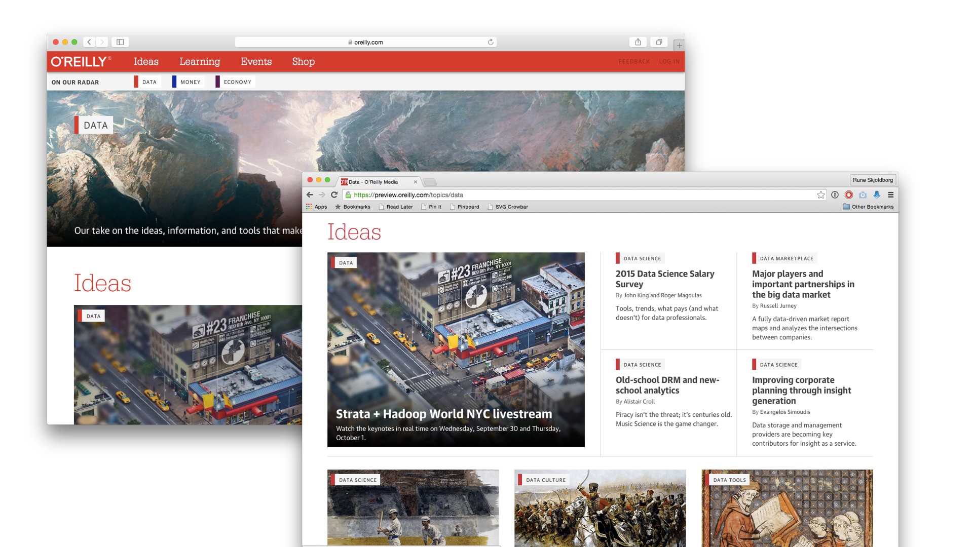
… and up until last year, I was Creative Director of O’Reilly Media’s digital design team, where I helped create their new design system, and started redesigning their digital products around it. Although much of my professional work centers around web and mobile products, I also do quite a lot of work in the arts...
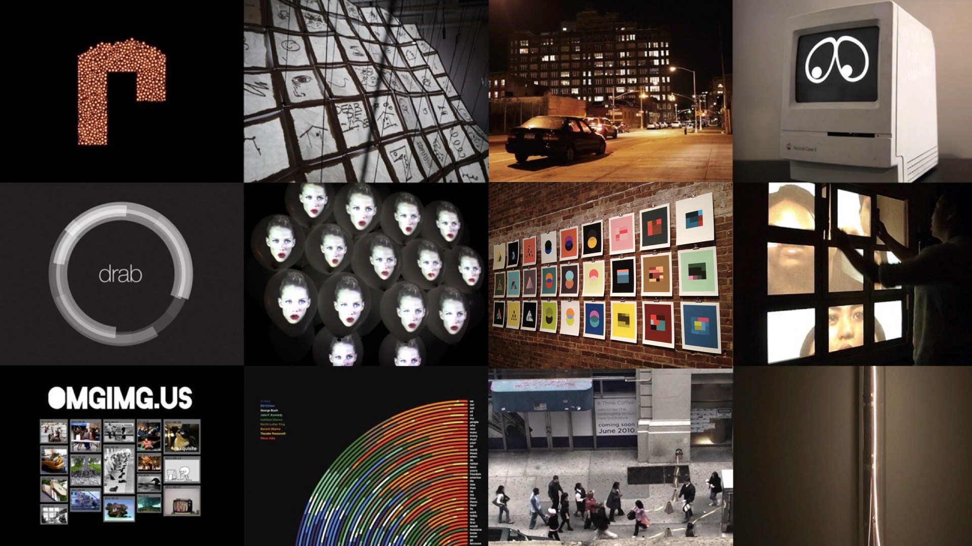
… that being projection mapping, physical installations, or generative print work. I don’t really distinguish much between my art and design work, because they all share the same common idea of using code to write creative systems.

For the last five years, I have also been teaching graduate classes at The Interactive Telecommunications Program at New York University, which is a two-year graduate program that accepts students from all over the world, and where they explore the creative use of technology. The program have students from pretty much every field, and teach them how to use programming, physical computing, and digital fabrication just to see what happens. One thing that we’re particularly proud of is that it’s a technology program where 60% of the students are women, and we do a lot of work trying to make technology accessible to people who wouldn’t normally be interested. Both the Processing and the Arduino foundation has roots at ITP.
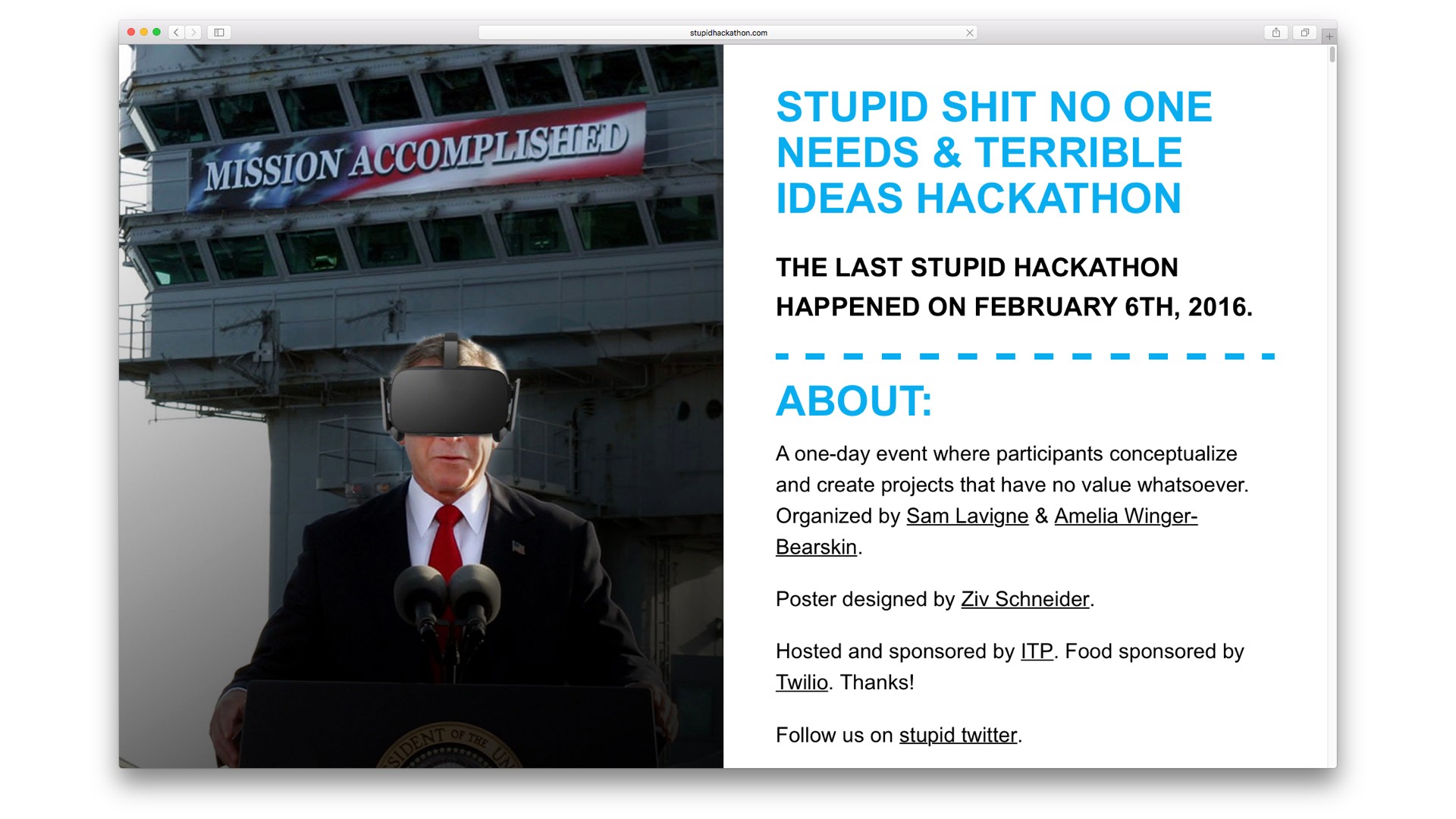
When people ask me what ITP is like, I always show them this yearly hackathon run by ITP alumni called Stupid Shit No One Needs and Terrible Ideas Hackathon, which is a one-day event where participants conceptualize and create projects that have no value whatsoever. A few of my favorite projects include…

The non-ad blocker chrome extension that blocks everything but ads on a webpage…
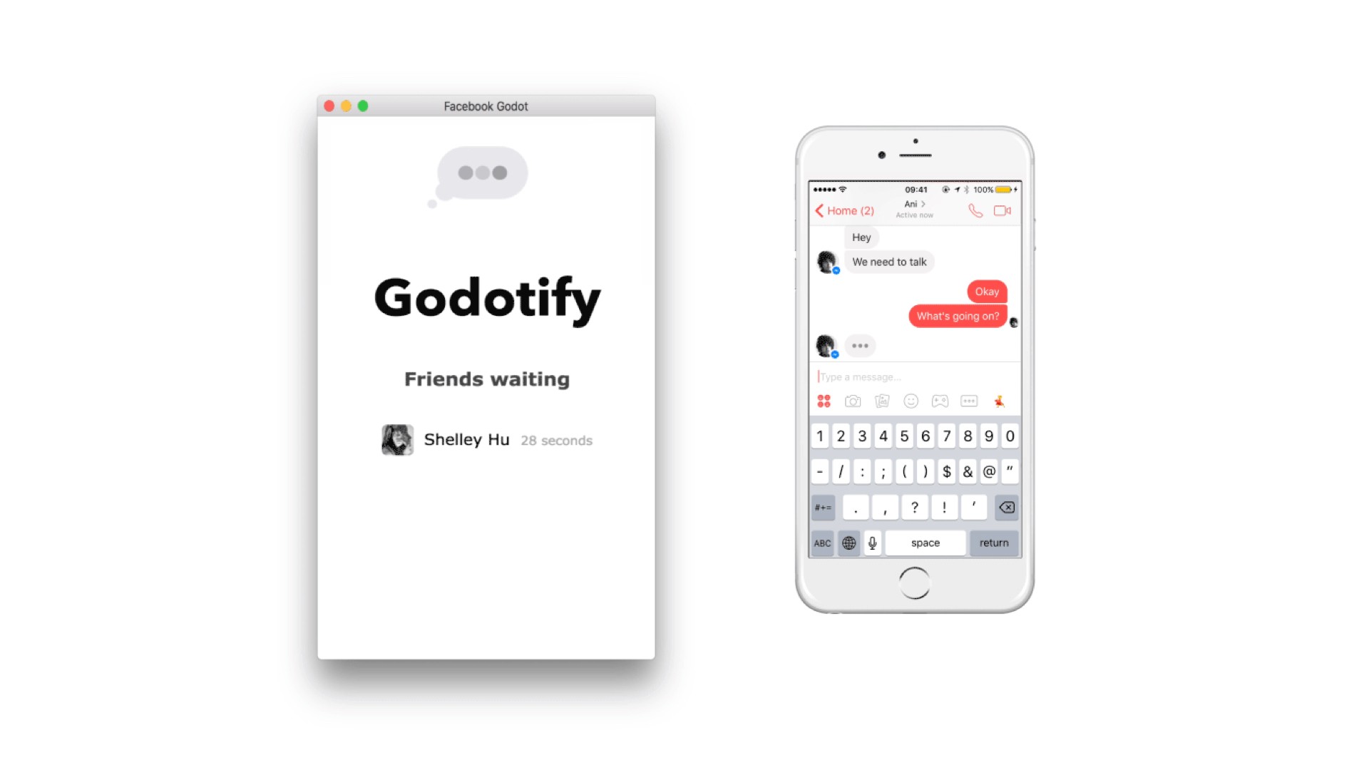
… or the Godotify facebook messaging app that keeps users waiting forever. These are very silly projects, but I think they speak to what makes ITP such a special place: We often work with technology to question the current role of technology in our lives.
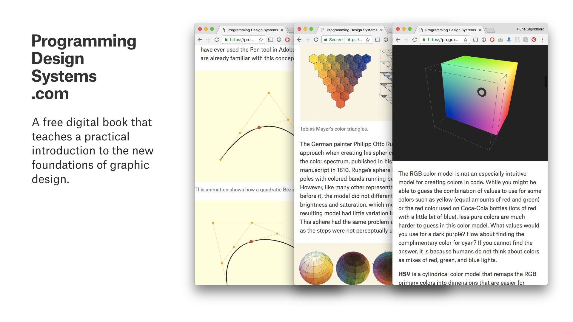
At ITP, I have been teaching a class called Programming Design Systems, that teaches the fundamentals of graphic design, but instead of using traditional design tools like Illustrator or Sketch, students write code to create programmatic designs. I’m now turning this into a book that I’m publishing for free online, and I actually originally planned to give this entire talk about the contents of the book and how I think that designers need to embrace new tools. However, when you start writing a book, your mind quickly drifts to something else, and I want to use my time today to talk about something that has been in the back of my mind for a while. This is the first time I’m trying to articulate these ideas, so I hope they make sense. But if you’re interested in the contents of my book, you can find it on programmingdesignsystems.com, or find the video of my talk at last year’s Design Matters conference.
Today I want to talk about design systems, but rather than encouraging you all to use them – which is what I normally do – I want to try to answer this question: Are there negative effects of using design systems in digital products? I think that this question is particularly important to the field of UX, and I’ll try to show you why over the next 40 minutes. So, this is going to be a critique of the use of design systems in digital products, and I’ll use Google’s Material Design language as a specific example later on. Even though most of you probably know this, I wanna spend a few minutes talking about design systems and the benefits of using them – just so we’re all on the same level.
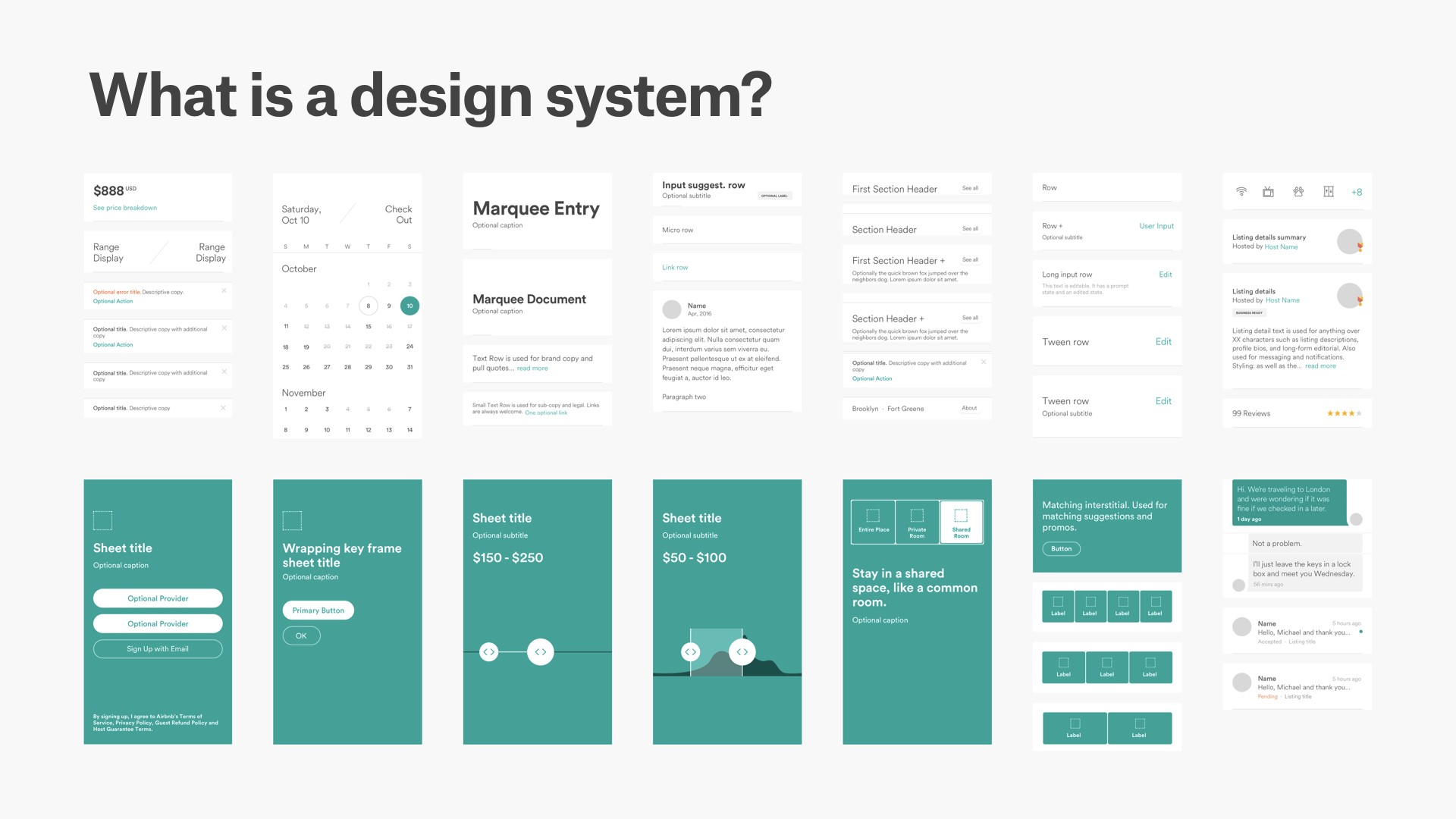
It was really hard to miss the fact that design systems became quite trendy in 2016. The term is used to describe a philosophy that encourages designers to define the rules of their designs as instructions that can be used on more than a single product.
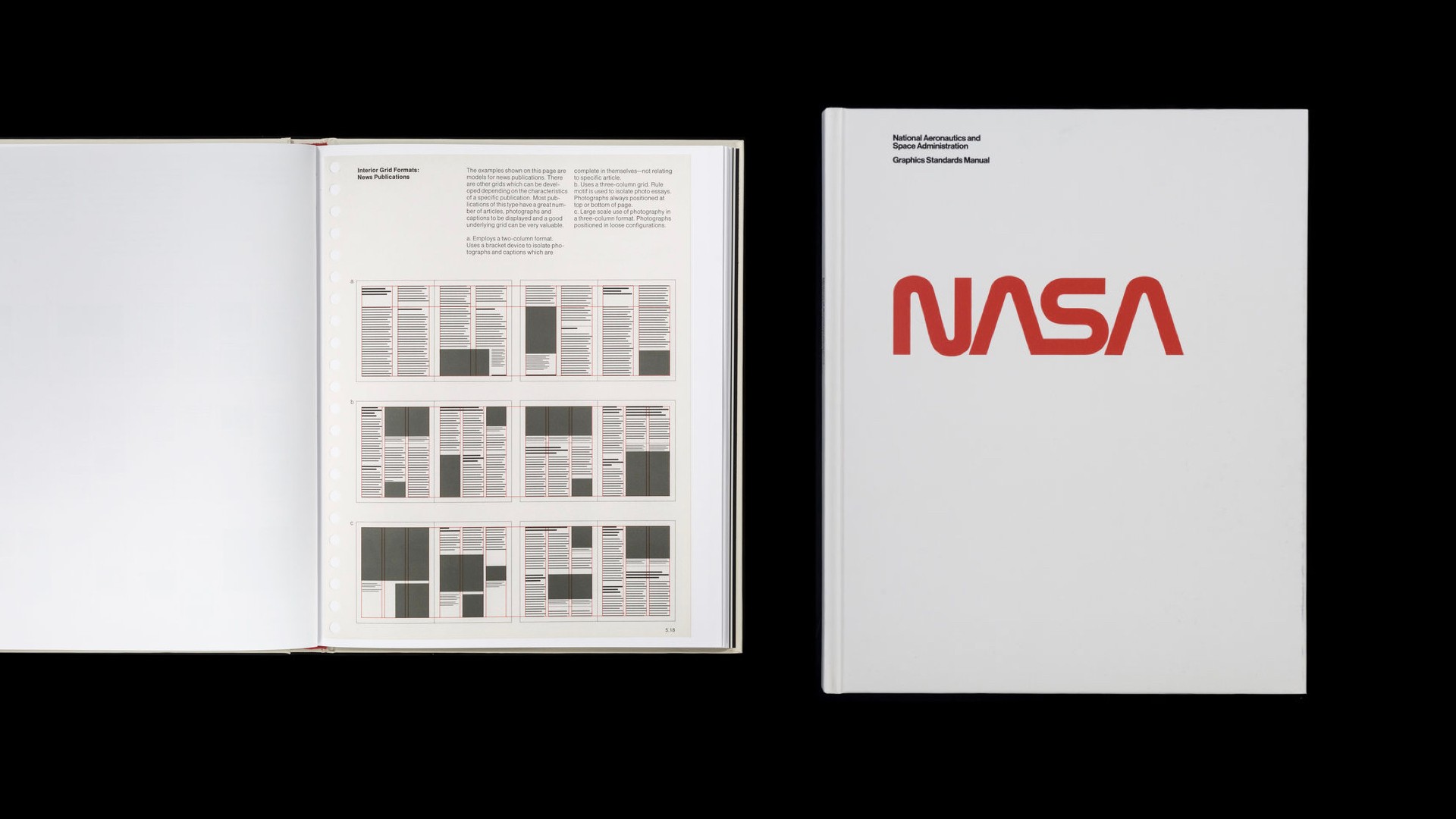
This is of course not a new thing. Thousands of design systems have been created over the years, from the NASA’s Graphics Standards Manual to Google’s Material Design.
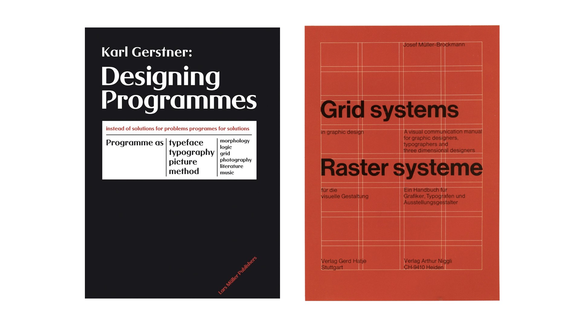
Swiss designers from the 1970’s really explored these ideas, like Karl Gerstner who wrote the book Designing Programmes. He’s not talking about computer programs, but rather the design system as a program.
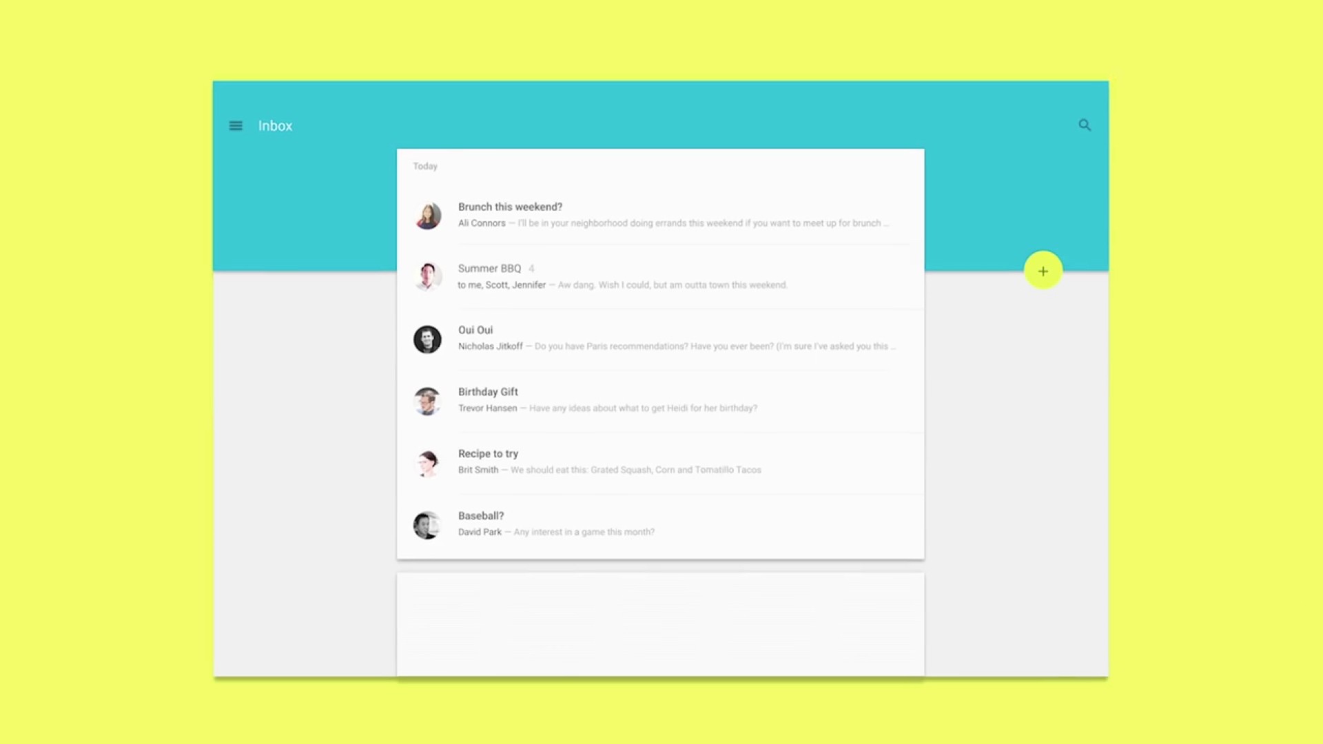
What is new is that today design systems can be more than printed design manuals. We have the ability to write design systems in code and use them directly in digital products.
I prefer to talk about this in terms of what Donald Knuth calls meta-design.
![Quote by Donal Knuth: “Meta-design is much more difficult than design; it is easier to draw something than to explain how to draw it. [...] However, once we have successfully explained how to draw something in a sufficiently general manner, the same explanation will work for related shapes, in different circumstances; so the time spent in formulating a precise explanation turns out to be worth it.”](/static/b06cbf5b3342634a4c05817ce875d670/9d72c/slide_017.jpg)
This idea of designers transitioning from people who draw things to people who write code that draws things is really powerful.

The reason I like this term is that it defines this idea of systematic design as something much broader than web development – or even digital design. Because it touches all of the arts. This is a logo done by the agency Sagmeister&Walsh. Instead of simply designing a logo, they created this very expressive grid system based on the idea of hinges, which can be used to create everything from …
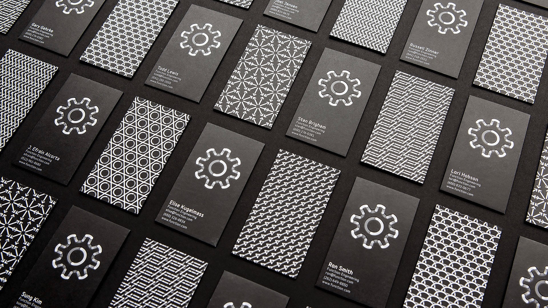
… graphic patterns to …
… to iconography and …

… typefaces
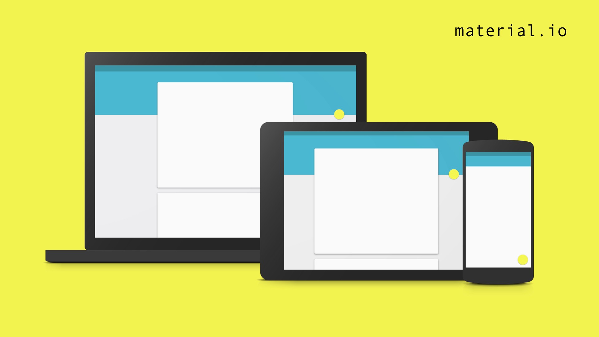
Especially interesting to UX designers is that this trend has been really apparent web and mobile products over the last five years, where companies like Google and Microsoft are investing heavily in the creation of design systems. The most famous one is probably Google’s Material Design, which is a set of guidelines of how Google thinks everyone should create user interfaces. It has rules for everything from use of color and typography to interaction patterns and animations in digital products.
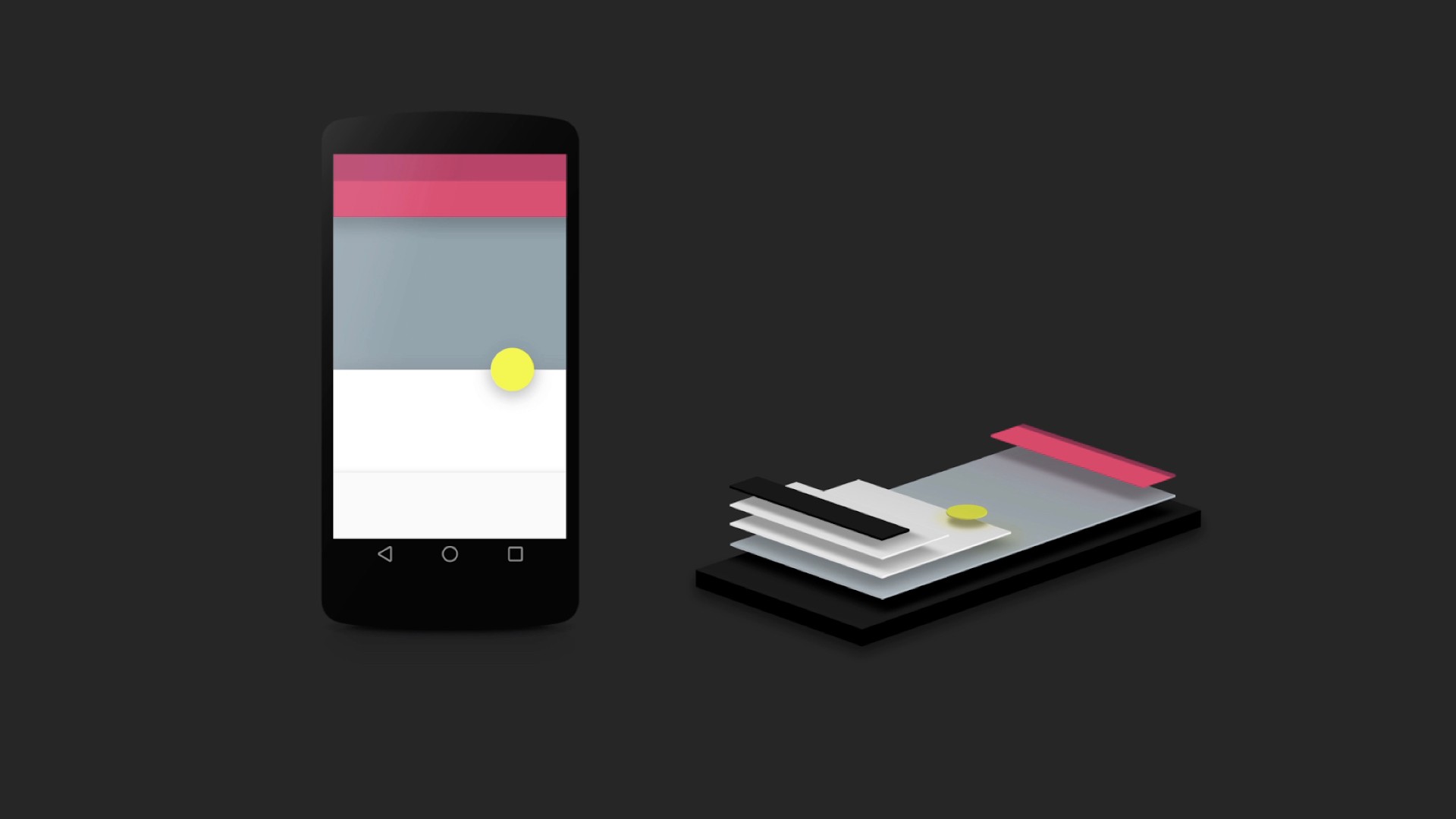
The core of Material Design is this idea that user interfaces should be based on how material behaves in the real world, with depth and motion.
So here are a few of the benefits of using design systems for digital product design:
One of the biggest headaches when leading digital design teams is ensuring consistency across all the products that a company owns. When so many departments are involved in day to day production of content, it’s really challenging to make sure that everyone conform to the same design patterns. A design system can provide a central set of guidelines that everyone can look at and apply.
Another huge challenge of digital design is systematizing the production of design assets. Many designers work in traditional design tools, and the finished designs are then delivered to a dev team for implementation. This creates a waterfall process that might not seem bad when starting a project, but it’s really unhealthy for the later stages of a project. Design systems built in code can be built just like any other piece of software. It introduces a single source of truth, version control, etc.
Design systems are also very effective at standardizing interface elements, which allows designers to spend more time on features that actually matter. If we need to spend time on redoing the same interface elements over and over for different pages, we have less time for rethinking the key elements that actually matter.
One of the best arguments for using a design system is that standardization of interfaces is a good thing for users. So take the New York City subway signage system: If every subway station whipped up their own signs, it would take much longer to figure out how to read them. In this sense, templatization is a good thing. Likewise, if a button looks the same everywhere, it will be a familiar interaction pattern.
Now that I’m using Material Design as an example, I want to make sure to mention that I have great respect for Google investing so heavily in design research. Even though I have a lot of criticism when it comes to Material Design, it is in itself a very important document, because it forces the designer to think about depth, motion, and interactivity as a part of the design process.
With that in mind, I want to talk about some of the negative effects. You can argue that some of these problems are inherent to the general concept of design systems, but much of my critique is pointed towards how we use design systems today. First I’m going to go through some overall concerns, and then show some specific examples from Material design.
The first concern, which is also the main argument of this talk, is that humans – especially designers and engineers – are obsessed with creating systems of order. This is not really driven by a demand from users, so they often tend to benefit the designer, not the user.

I did many years ago in New York, where we placed these really obnoxious cones on the sidewalk, only to have people completely obey them without questioning why they had to walk through these silly obstacles. The moral of the story is that when we eventually create systems that are not beneficial to users, we won’t get a flood of angry users. Rather, users will just silently obey our horrible system. This is also what scares me about Material Design as a global design language, but we’ll get back to that.
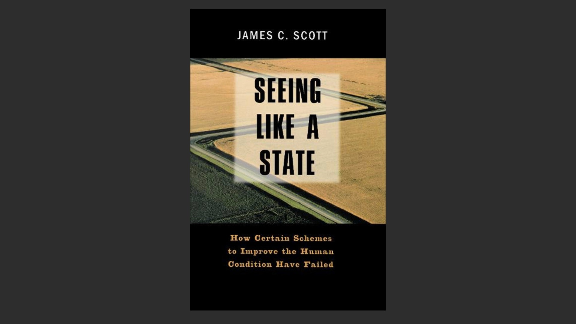
I was originally introduced to this idea by Kevin Lynagh who recommended that I read this book, Seeing Like a State by James C. Scott. He does a fantastic job articulating why I’ve grown so sceptic to the idea of design systems. In the introduction of the book, he talks about how …

German scientists in the mid-1700’s decided to redesign the german forests into a strict system to make it easier to plant and maintain the forests. So they decided to…

… clear the underwood and only plant a special type of tree to maximize wood production. In the beginning, this seemed like a huge success because it was much easier to maintain, and the first generation of trees drastically increased wood production and therefore revenue. However, after the first generation (), the forests started to ...

… look like this. What they eventually realized is that they had completely destroyed this very delicate balance of nutrients created by the animals living the forest, and trees simply couldn’t grow anymore. They were essentially ignoring their users. This is a very simplified version of what happened, but I really think there are parallels to the use of design systems today. Many of these systems are driven by a need to simplify the product design process, and in many cases, these systems do terrible things to the user experience.
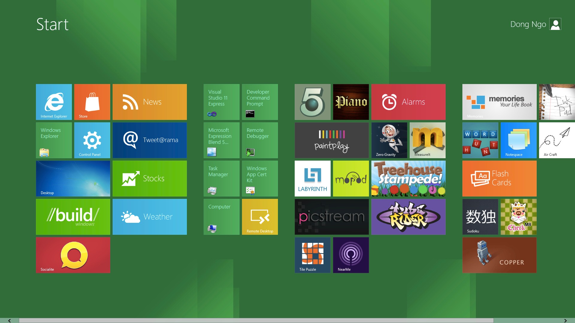
There are many examples of this, but a famous one was when Microsoft released their Metro Design Language in Windows 8, and decided to remove the start menu in order to fit the entire operating system into their new tile-based design system. It’s pretty obvious that a decision like that is not based on user demand, but on a need to simplify beyond anything reasonable.
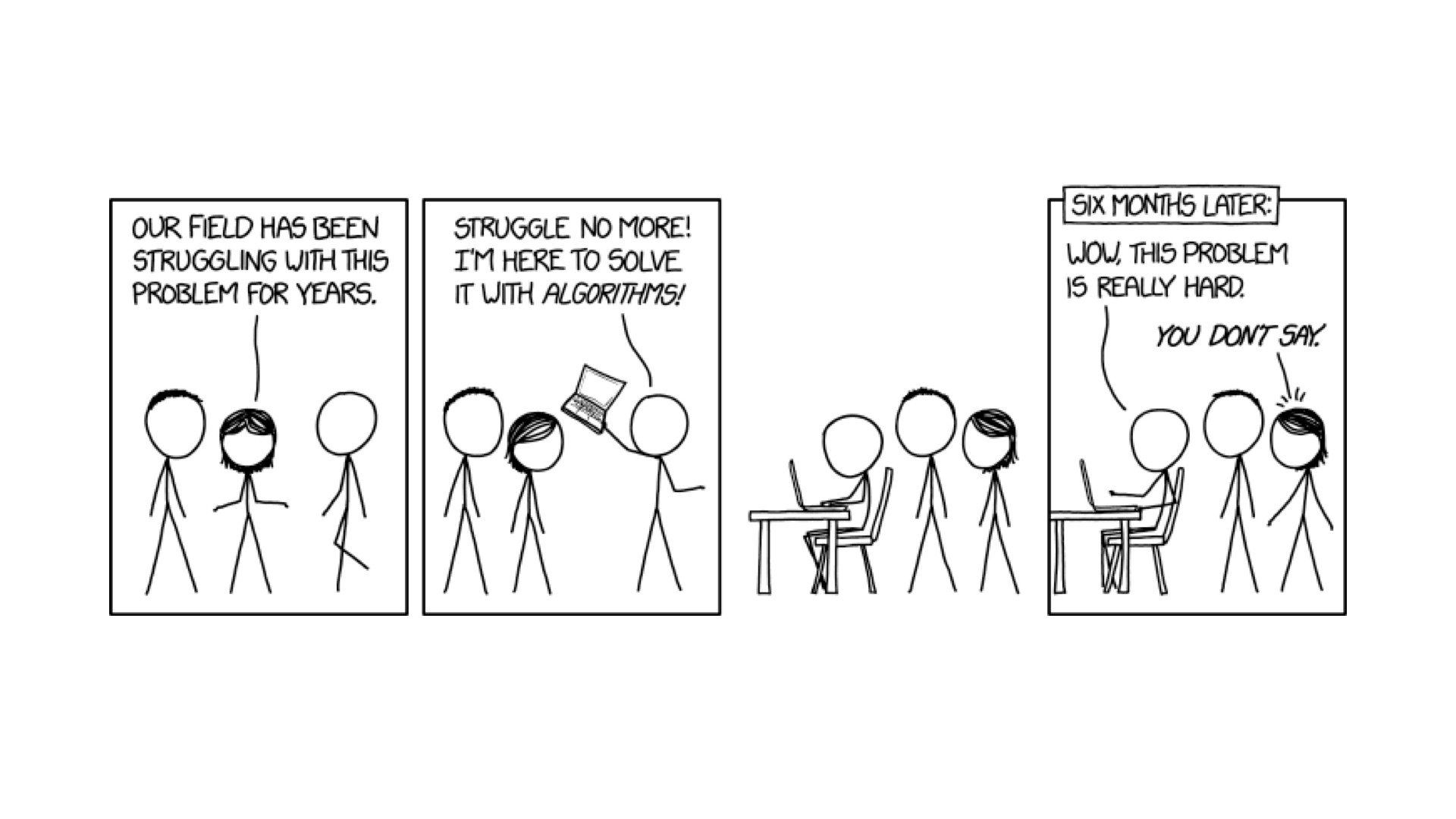
I recently saw this XKCD comic, which talks about this exact problem. Reads comic. When you start a redesign process for a company, it’s very easy to briefly look at all their products (apps, websites, newsletters, etc) and first of all make fun of how bad it all looks, and then design this one single design system for everything. However, once you start diving into why those decisions were made, they often reveal local knowledge that your design system doesn’t solve. I see this so often where a new design system completely ignores for example the difference between platforms because they standardized their components to make mobile and web look the same. Mobile design is just a different thing: Buttons need to be larger, elements should float to the bottom of the screen so they are easier to reach, etc.
My second concern relates to what I believe design systems is doing to our digital experience. We’ve always had trends in graphic design (Swiss design, Flat UI, etc), but I’m getting increasingly concerned that this broad adoption of design systems is creating a design monoculture that really narrows the idea of what digital products can be.
Going back to our german forest example from before, James C. Scott says:
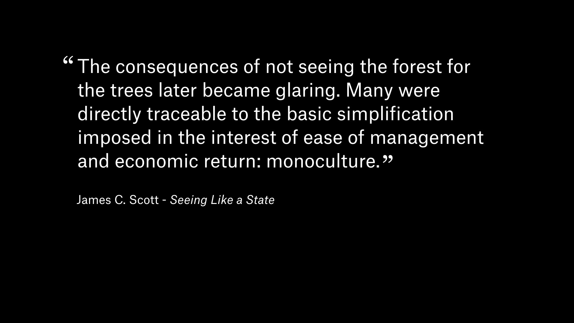
I think we have a similar problem today. Many design systems look the same because they are adopted by companies to treat design as a checkbox.
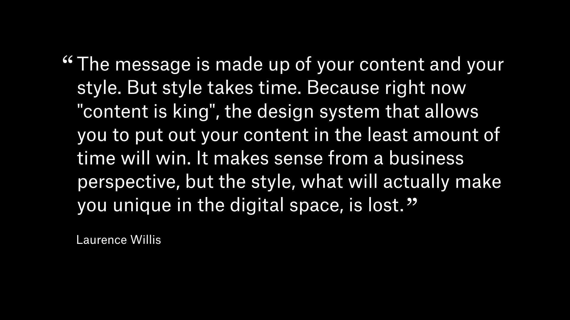
I really like this quote by Laurence Willis. Reads quote.
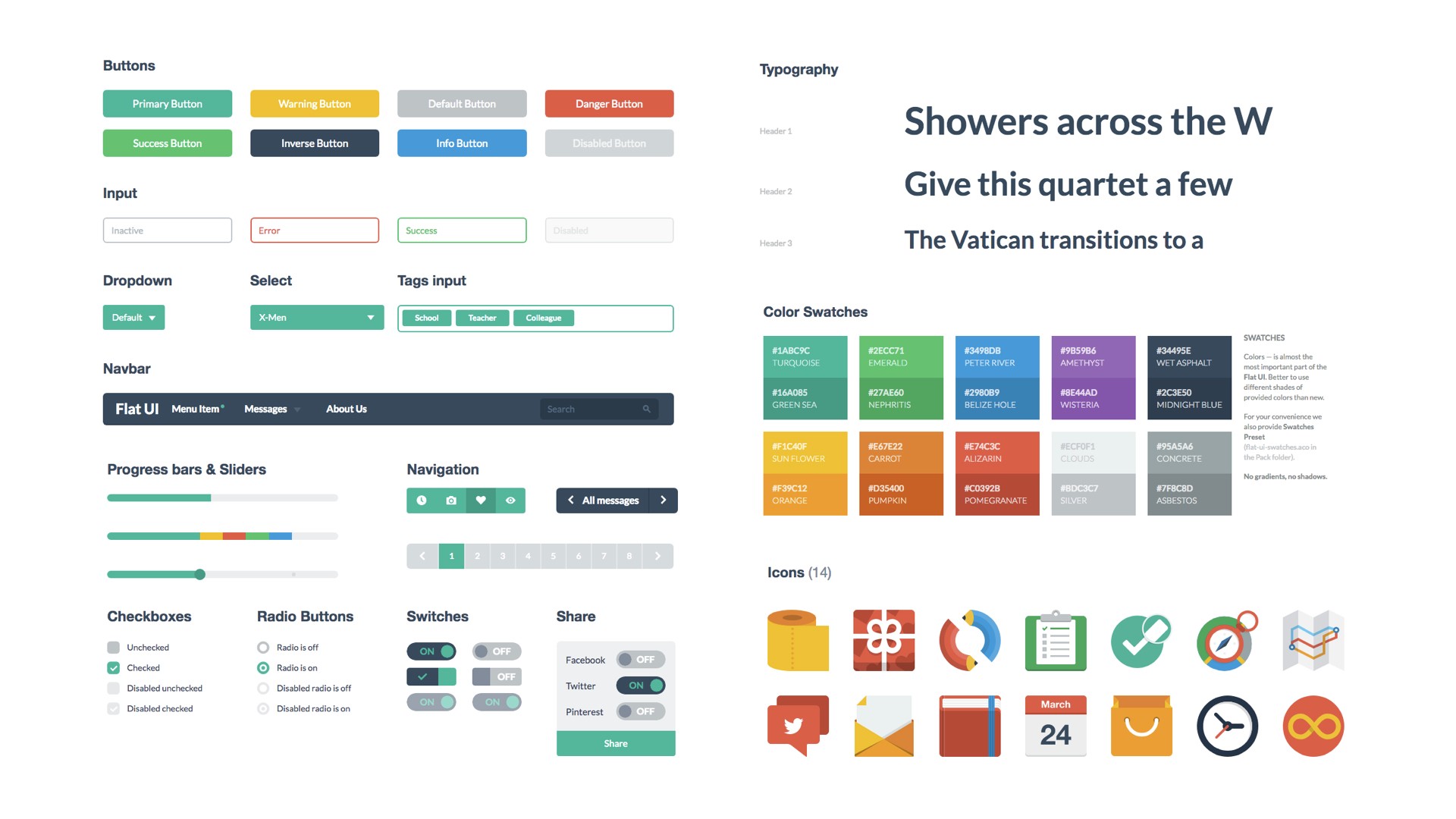
I have helped a few companies start the process of creating a design system, and there is this tendency to start with whatever components Material Design or Bootstrap use, and then just reskin them to fit your brand. This is what I mean by the ‘templatization’ of digital products. The problem is that if you equate a design system with an already defined set of components, you have already made pretty drastic decisions about your product: That it should be a user interface navigated with the mouse or the finger. You won’t start with your business goals and shape an entirely new product based on those goals.
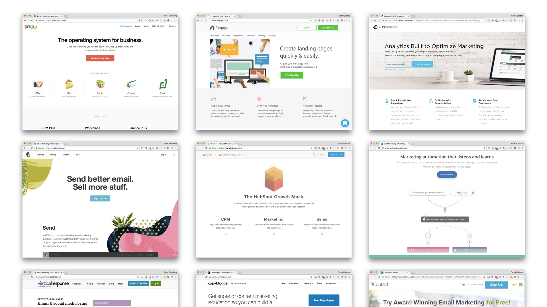
So what we end up with are all these companies introducing design systems to not only create a unified experience for their own products, but also forming a single, uniform experience for all digital products. We don’t want to confuse our users by always coming up with our own random ways of doing things, but that’s very different from arguing that our entire digital experience should be transformed into a single, unified blob. Marcus also talked about this yesterday, but we’re pretty much seeing the entire field of interface design being boiled down to choosing the color of your rectangular button.
My third concern is that with all this talk about design systems, there’s very little talk about the real problem in digital design, which is processes and tools. Designers love making design manuals, but any design system will completely and utterly fail if it doesn’t help people in the organization produce faster and better products.
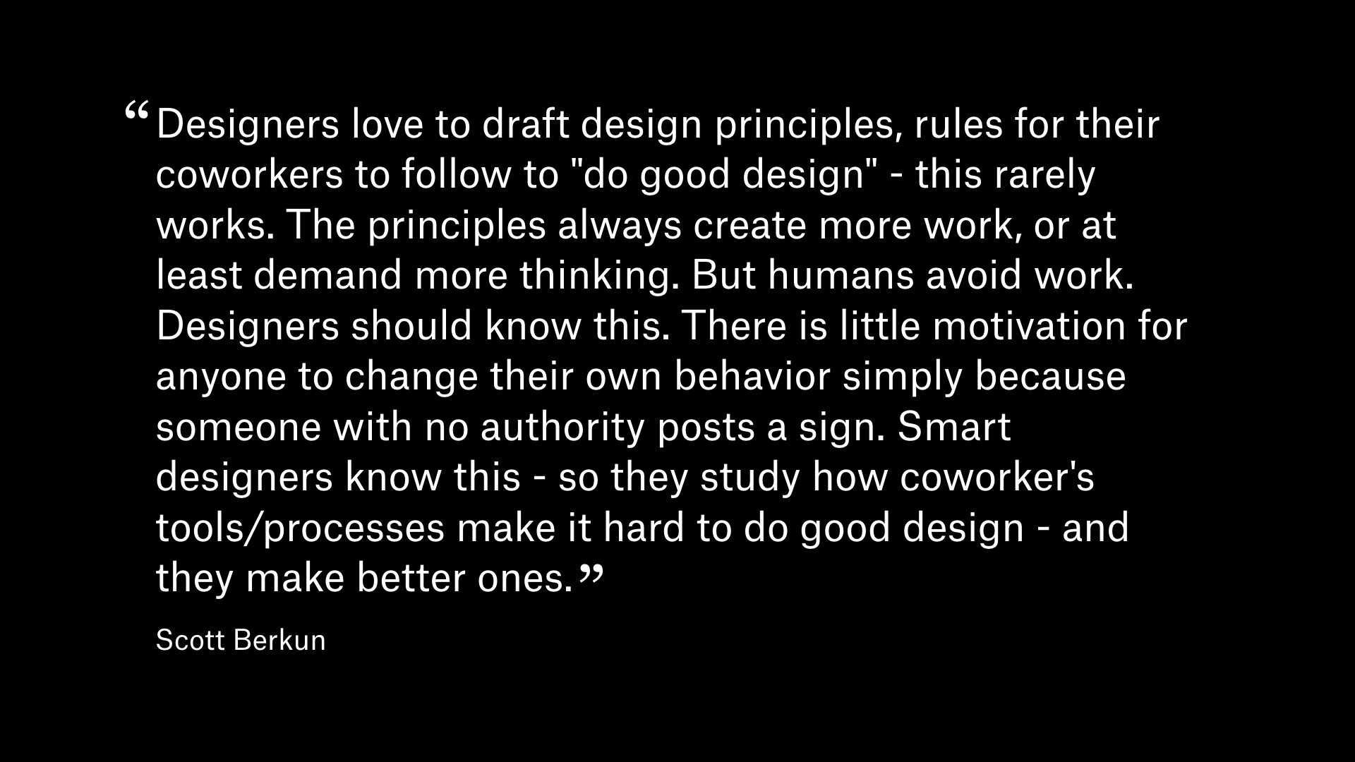
Scott Berkun says (reads quote).
I find this to be such an important comment. Consistency doesn’t come from making some kind of bible that everyone has to look in before doing any work. It comes from making the rules of the design system an integral part of the workflow – and very few people are talking about that.
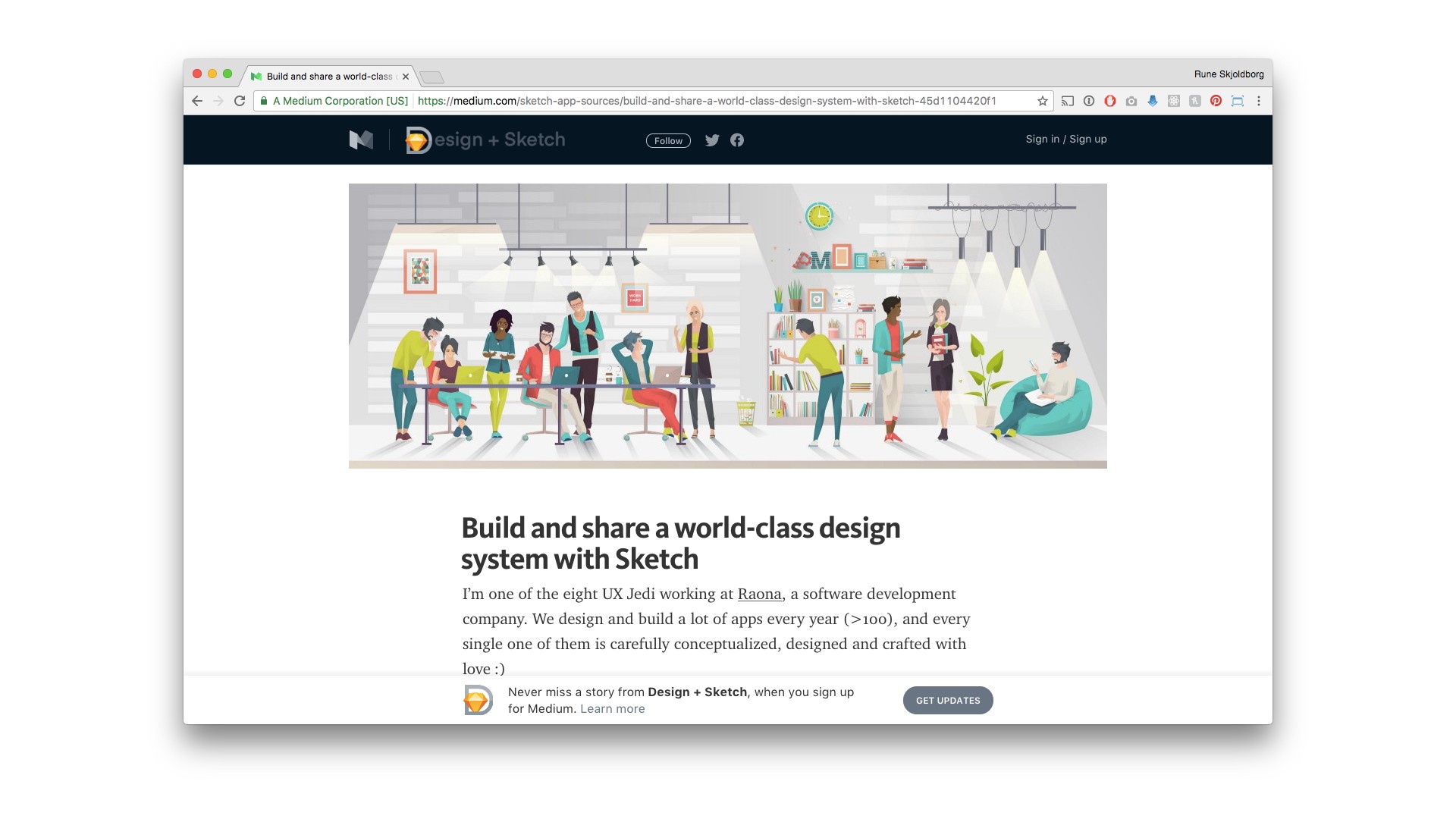
I find it really fascinating when I see some new blog post announcing a company’s new design system made in Sketch. And I cringe a little bit on the inside, because that project is going run into such problems when that design system is implemented in code, and there’s suddenly two sources of truth: Sketch and the code implementation. Then you’re suddenly faced with a situation where your teams have to do double work to keep the design system up to date.
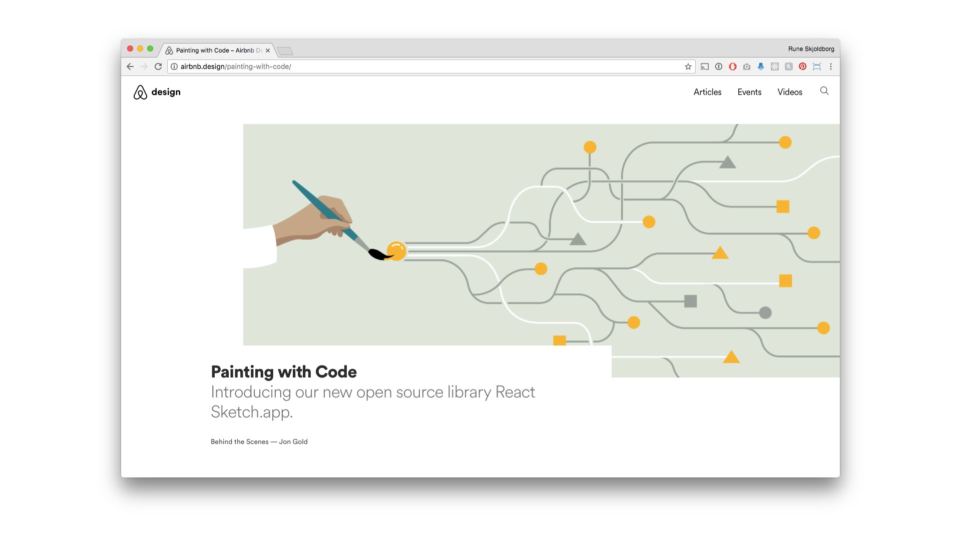
This is why I was super excited to see Jon Gold at AirBnb release React Sketch App, which is one of the first projects I’ve seen that actually try to tackle this problem. It’s a library that allows you to automatically generate Sketch symbols based on React components, and auto-fill them with dynamic data from your code. So you can have a single source of truth, but still allow designers to make page designs in Sketch. The lesson here is that it’s really not that hard to whip up a design system, but it’s very hard to have it deliver consistency over time, and that only happens if you provide value for everyone.
Those were a few overall areas of concern, but I’d like to be a little more specific by showing some examples on the negative consequences of using Google’s Material Design in digital products.
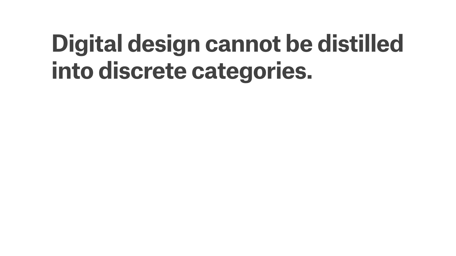
Much of my criticism today is about this modernist idea of trying to boil a very complicated field like digital design into a simple set of instructions. Material Design tries to do this by making everything into a list of do’s and dont’s, and I think this is highly problematic.
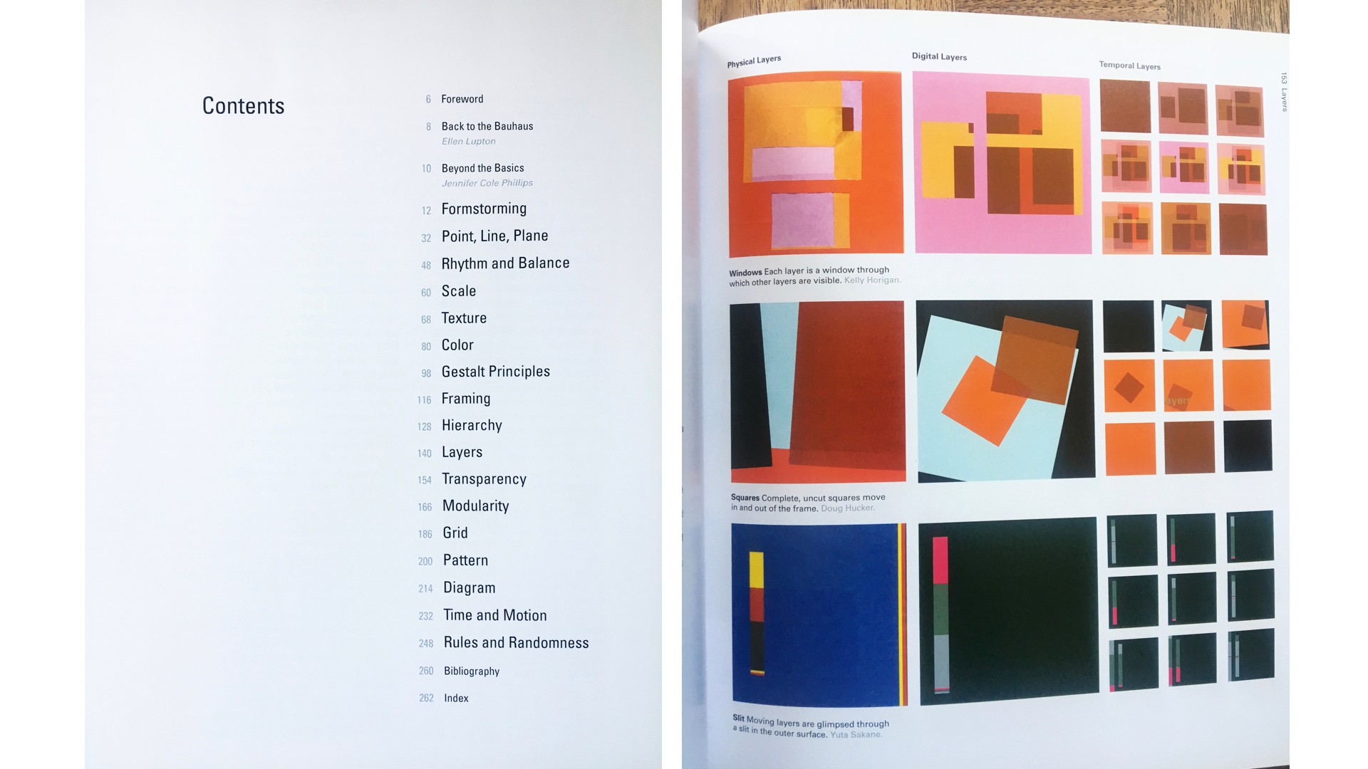
This is problem known from many graphic design books, where the author starts writing the book by dividing the material into categories (shape, color, etc), and this might seem like a good idea in the beginning, but as you go along, it gets increasingly hard to fit everything into just a few categories – so your only solution is to create more categories. So you end up with books like this that have all sorts of weird categories that has no relation to how designers actually work – and the problem is that new design students think that learning how to be a designer is about memorizing all these crazy categories instead of using their eyes. Material Design has the exact same problem.

For example, Material Design operates with three different kinds of buttons: flat buttons (text only), raised buttons (rectangular), and floating buttons (circular button). This rule states that you should not use raised buttons when they seem too prominent. Explain interface. Okay, that’s fine. What’s interesting is this other rule….
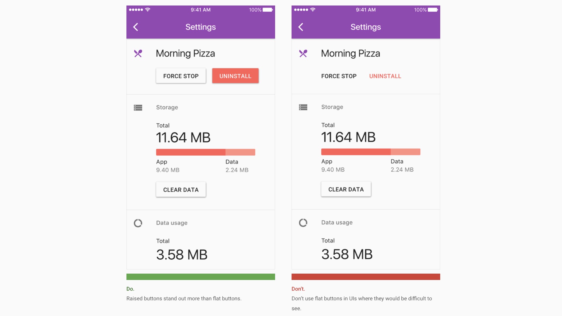
… that says that flat buttons shouldn’t be used where they are difficult to see. Explains interface. It’s not that I don’t agree with this, but consider these two examples next to each other.

On the left is a button style that Material Design says you that you absolutely should use, and on the right is a button style that you absolutely shouldn’t use. This is such a simple, basic layout with two completely contradictory rules. How does this in any way help designers make better decisions?
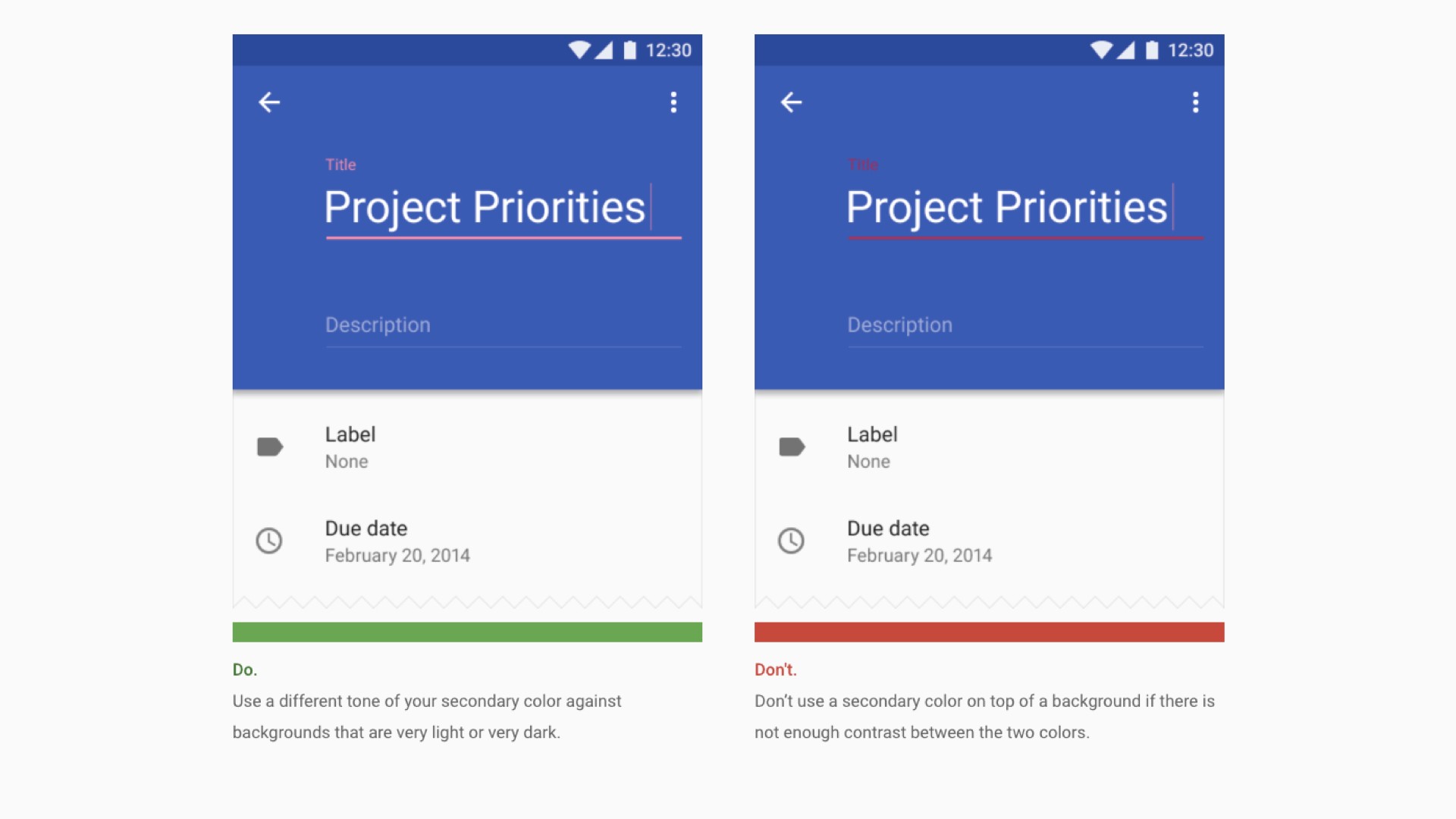
I find Material Design really weird because sometimes these rules are just very basic lessons from any UX curriculum, and sometimes they are completely random decisions that seem to be based only on personal preference. As an example, this rule states that you should not use two colors on top of each other if there is not enough contrast. I completely agree with this. Who wouldn’t? But then this other rule …
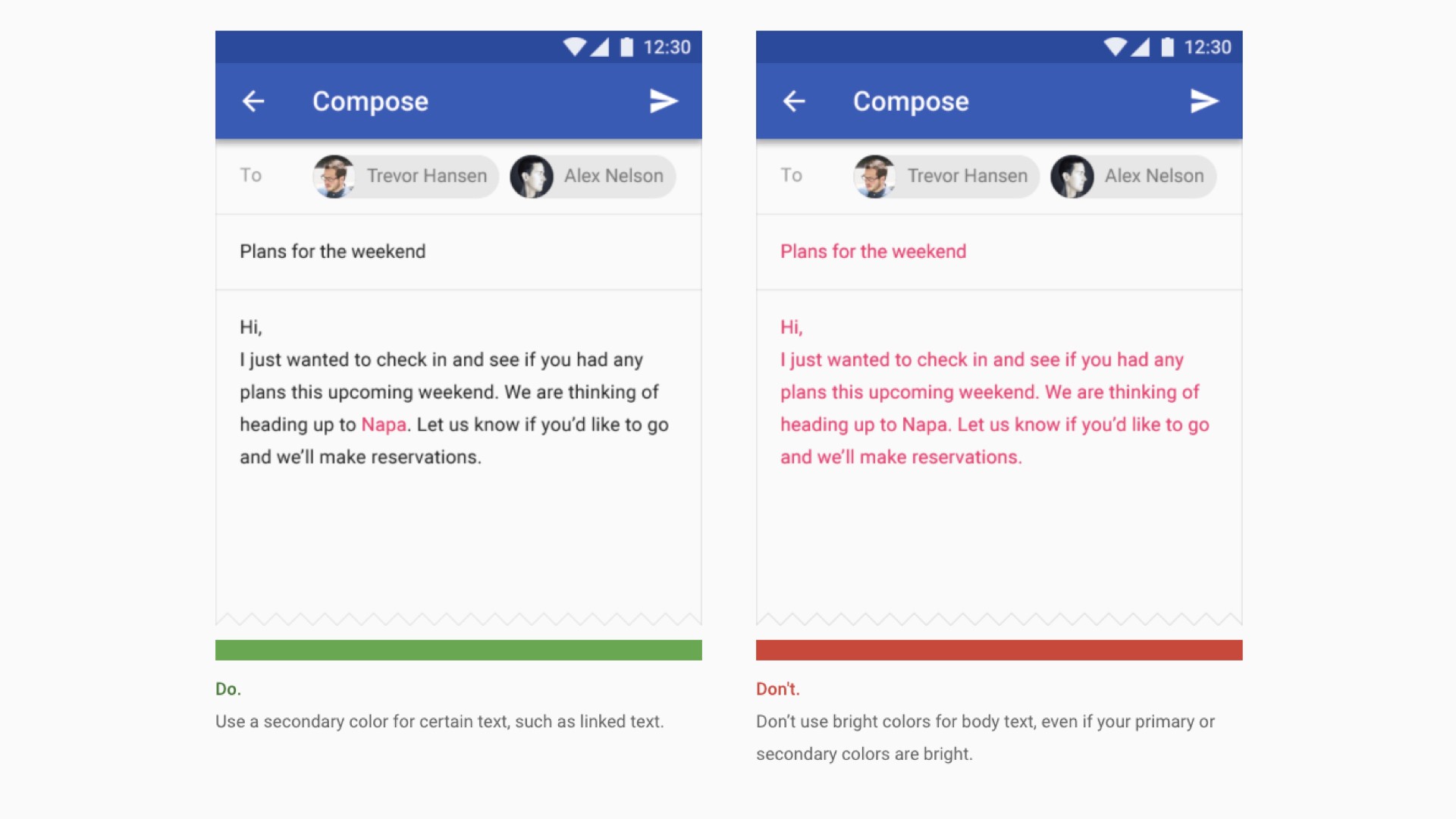
… that says not to use bright colors for copy text. That might not work for Google, but as a generalized design system for everyone, that’s completely random. So we can’t use color for body text?
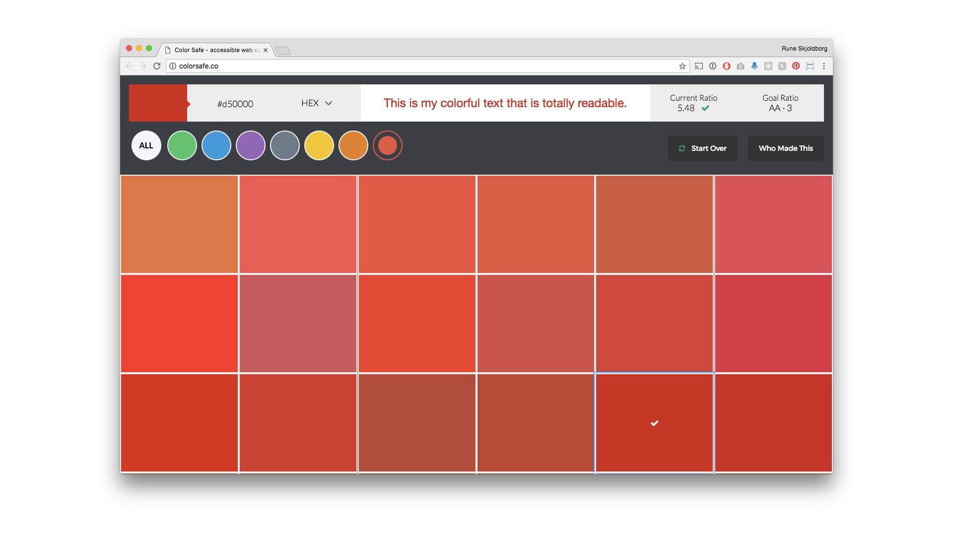
I looked it up, and there are thousands of colors that are perfectly readable against a white background. That rule is not created because of accessibility concerns. It’s a purely subjective thing.
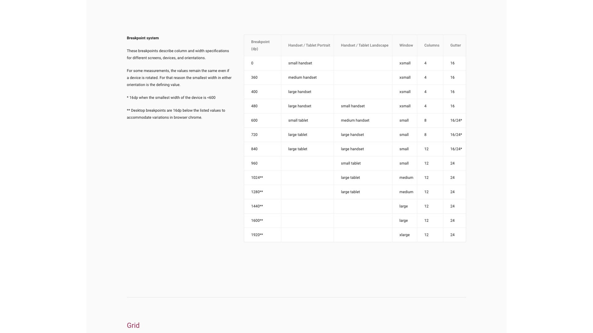
As you scroll through the Material Design guidelines, you realize just how much it suffers from over-categorization. There are table after table …
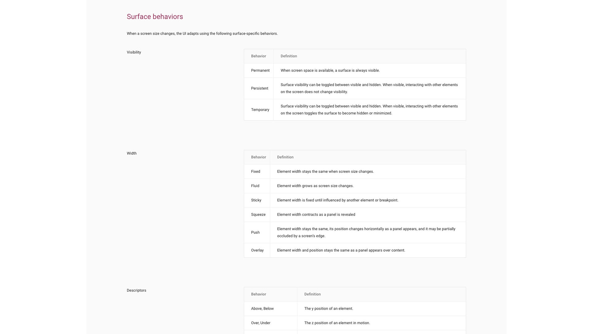
… and graphic after graphic that tries to make these rules work for every single device and screen. The truth is that you can’t work with product design like this. Every project needs to make its own decisions based on the users of the product.
My final – and probably biggest – concern with Material Design is that is mixes up style and interaction patterns. I think that Google did some really amazing research when it comes to the use of motion and interactivity in interfaces, and Material Design is actually a really great document to showcase best practices for web and mobile user interfaces. However, you also get a big load of Google’s brand with it, and these styles are so deeply connected to the rest of the research that you cannot get rid of it.
It’s funny when I read about Material Design, many designers describe it like a broad set of principles that won’t dictate the style of your interface. That’s simply not true.
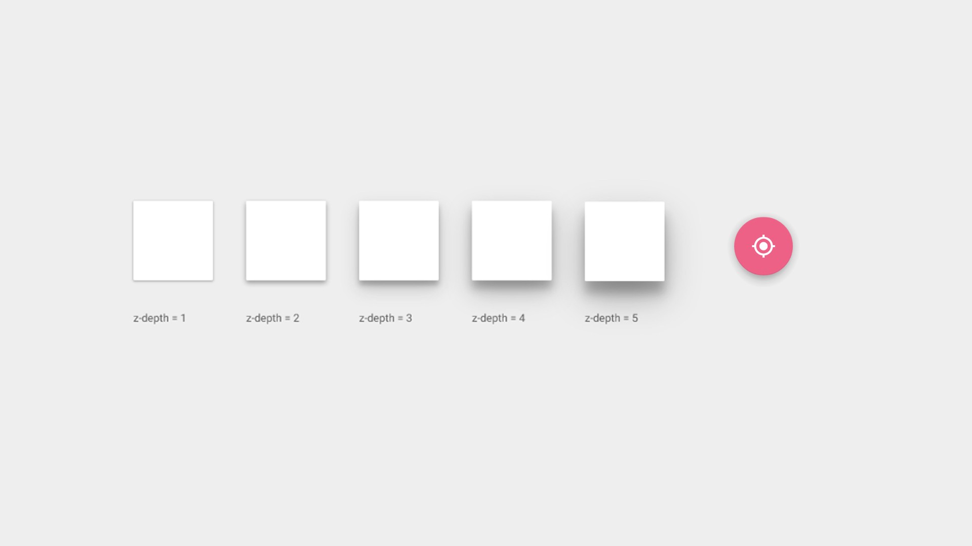
The core idea of Material Design is that interface elements should behave like physical material. So to create layers and depth, they have a heavy use of drop shadows. Without drop shadows, you don’t have depth. The same it true for many of the other components. You simply cannot change the style while keeping the other principles, so it’s a design system that cannot evolve beyond its current style, and as digital products evolve around it, it’ll be stuck.
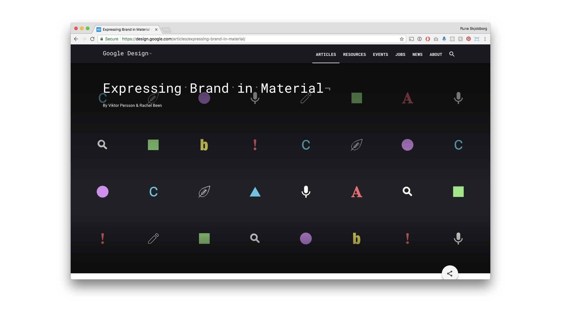
So Material Design takes an already narrow definition of interface design and makes it even slimmer to just mean Google’s brand. I think Google realized this, so they dedicated lots of resources to write, design and develop a guide for companies wanting to use Material Design for their own brand. It’s called Expressing Brand in Material Design, and it’s a really interesting document where they try to stretch these rules to achieve different expressions. What I find really interesting is that the project examples that actually demonstrate a bit of variance are also the ones who have to ignore the Material Design rules the most. For example…

… this example follows most of the rules, and it looks almost identical to any Google product. However …
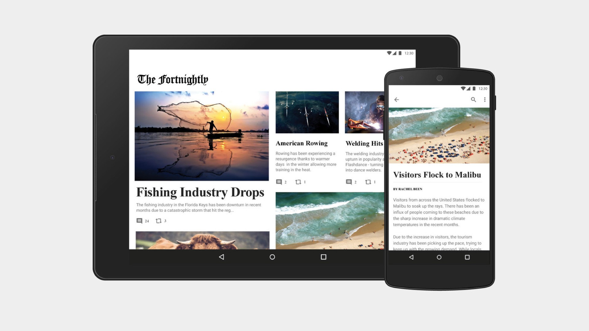
… this example looks much more traditional, and even though they say that it uses Material Design colors and typography, there’s absolutely nothing in this design that is Material Design specific. So, these arbitrary rules are not only hard to write, but they are also extremely limiting for even the simplest of designs. At the moment you have to make something unique, you have to break the rules of the system, and because those rules are already very convoluted, what’s the point of the system in the first place?
I have a lot of other things to say about Material Design, but there’s really no time for it all. If there was, I would talk about how animations are not really used to provide clarity, and how Material Design makes it hard to distinguish between interactive and static elements, etc.
What does this means to the field of UX design?
So, I’ve talked about some of the negative effects of this design systems gold rush, and I want to summarize what I think you as UX designers should take away from this. I briefly mentioned this before, but I believe that one contributing factor to the state of things is that we have built a digital design and user experience practice that in many ways operate in a vacuum with very little understand of what came before us. There’s an amazing book called …
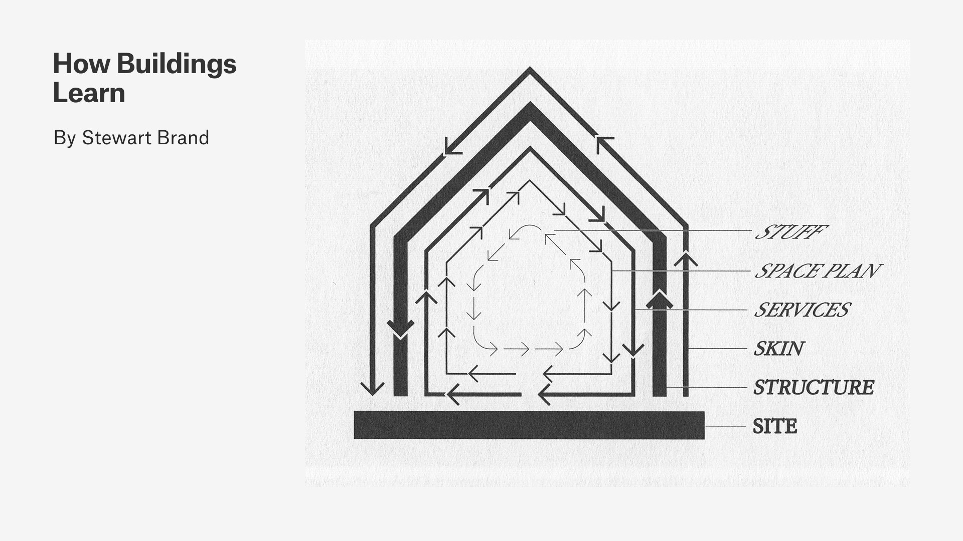
… How Buildings Learn, where Stewart Brand talks about how modernist architecture was built on the same belief that we as designers can sit back and make finite systems that users will just embrace. As we know, this led to some really horrible problems in architecture, because those buildings can’t adapt to the space plan and things that the users bring to it.
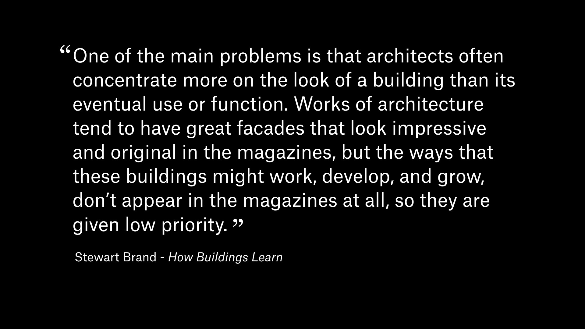
Here’s a quote from the book, and let me know if this sounds like something you recognize from product design.

One of Stewart Brand’s main argument is that buildings that work well embrace time as a key factor in the development of the system. As an example, he talks about what he calls “Low Road” buildings, which are these cheap, forgotten houses that over time were changed to reflect its users. Christiania, which is not far from here, is a great example of this. The difference between these buildings and big, systematic architecture, is that they easily change over time to accommodate users. I think this is a really important lesson, and it prompted me to think about...
And I immediately thought of Amazon.
Amazon is a company that for years have embraced listening to users and tweaking its interface to reflect user intend. (They are also doing horrible things to push consumer behavior, but put that aside).
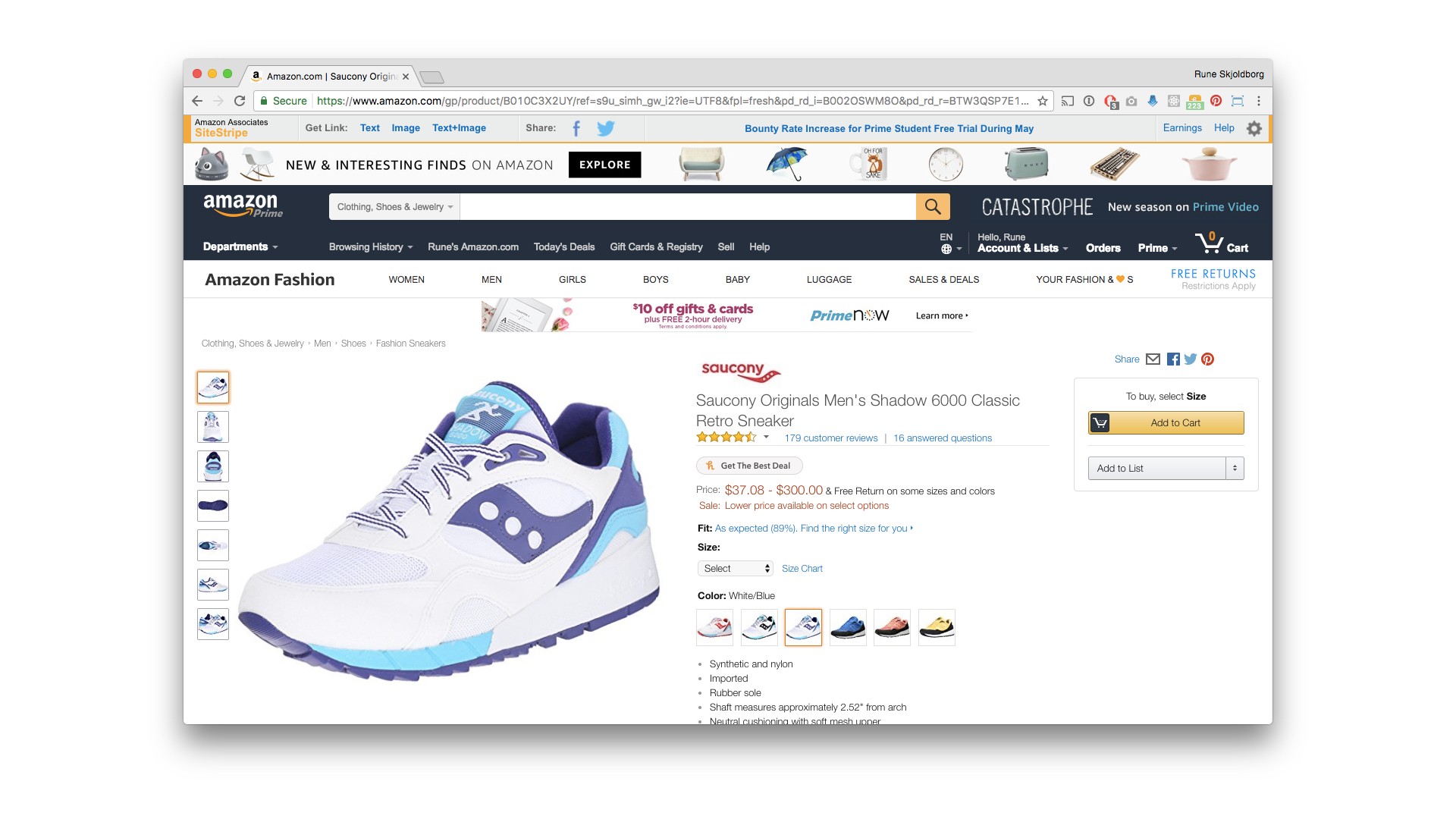
As a website that allows itself to grow with its users, Amazon is a really great example. There wasn’t some grand Amazon design system to start with. Instead, they launched many years ago and have established design patterns based on user behavior. That’s also a design system, but using machine learning and data to inform their decisions again and again. Rather than this modernist idea that we can solve it all by design thinking, Amazon is a result of a continuous cycle of user feedback. It might not always be pretty, but it’s very effective.
![Quote by James C. Scott from 'Seeing Like a State': If the natural world is [...] too unwieldy in its 'raw' form for administrative manipulation, so too are the actual social patterns of human interaction [..]. No administrative system is capable of representing any existing social community except through a heroic and greatly schematized process of abstraction and simplification.](/static/e8322651040a6c791aa3a455687ee61d/9d72c/slide_073.jpg)
So this is my conclusion: All this critique of design systems is essentially an argument for UX designers to create design systems that grow from user-centric research. As UX designers, you are here to bridge the aesthetics with the functionality of digital products. Rather than starting with a fascination of design systems, you have to first of all focus on the user and let that inform your design system – and keep doing that over time. You have to argue for the process of understanding your users, talking to them, learning from them, and drawing up coherent systems that work on behalf of them. If you do this, systems are an incredibly powerful way of creating products that are beneficial to both companies and users. I’d like to end the talk with another quote from Seeing like a state …
That is UX design.
Much of this talk is based on my own experience creating design systems for companies. This is a bit of news, but I actually just co-founded Design Systems International, which is what we call a deeply technical design studio. So I’d love to talk to those of you who are currently working with these things in the real world.
Otherwise, thank you so much. I’m not sure if we have time for questions, but you can also just come up and chat afterwards. I’m going to be hanging out for the rest of the day. If not, feel free to reach out on any of these channels.